


![]() Wake Forest Demon Deacons PNG
Wake Forest Demon Deacons PNG
The Wake Forest Demon Deacons logo represents the university’s affiliation with the sports movement and is displayed with honor. The emblem displays the strength of metal, the composure, and the precision of action characteristic of the university’s teams.
The history of the Wake Forest Demon Deacons began in 1834, when the Baptist church in North Carolina founded Wake Forest College in the town of Wake Forest. Early student sports were informal, with college teams playing football and baseball against nearby schools in the late 19th and early 20th centuries. The Demon Deacons nickname appeared in 1923 after a local sports editor used it in a report on the basketball team, linking “Deacons” to the university’s Baptist roots.
In the 1930s, the nickname became official. In 1953, Wake Forest helped create the Atlantic Coast Conference with North Carolina, Duke, North Carolina State, Clemson, Maryland, and South Carolina. ACC membership shaped the university’s athletic life for decades. At the same time, rivalry with Duke and the University of North Carolina became a constant part of its sports setting.
In 1956, Charles Hugh Babcock’s donation supported the move from the small town of Wake Forest to Winston-Salem. The new campus gave the university more room for athletic facilities and recruiting. In basketball, the strongest period came in the late 1990s and early 2000s under coach Dave Ogden. The 1995-1996 team reached the NCAA Elite Eight, and Tim Duncan played all four undergraduate years from 1993 to 1997 before entering the NBA with the San Antonio Spurs.
Wake Forest football had fewer resources than many ACC programs. Still, in 2006, coach Jim Grabb led the team to the Atlantic Division title and the Orange Bowl. In 2000, Joel Coliseum was renamed LJVM Coliseum in honor of a local donor’s contribution. In 2020, Truist Field opened as a new baseball stadium as part of the university’s investment in sports facilities.
Meaning and History
![]()
Football was the first sport that students participated in. The team began competing in 1888. Other sports emerged in the 20th century. Women’s field hockey and men’s golf are the most successful teams, having won three NCAA national championships.
The logo of the university’s sports movement has changed at least three times, coinciding with leadership changes.
What is Wake Forest Demon Deacons?
A small but active sports movement at the university in Winston-Salem, consisting of 8 women’s and eight men’s teams. The main sports include football, basketball, field hockey, and golf.
1968 – 1992
![]()
The first team logo resembles a seal, linking the emblem to the nickname derived from print publications. The outer circle of the emblem features the sports movement’s name, while the center shows a very eccentric gentleman who represents the Demon Deacon prototype.
Initially, the teams were named after their colors: “Black and Gold” and “Baptists,” since Baptists founded the institution. In late-19th-century university prints, there is evidence that the first team logo was a circular emblem featuring a tiger’s head and the university’s initials, designed by Mr. John M. Heck. It was executed in old gold and black, as these were the colors of the animal’s fur.
The sports movement got its current name 90 years after the university’s foundation, thanks to newspaper reporters who emphasized that, despite their religious roots, the athletes fought like devils.
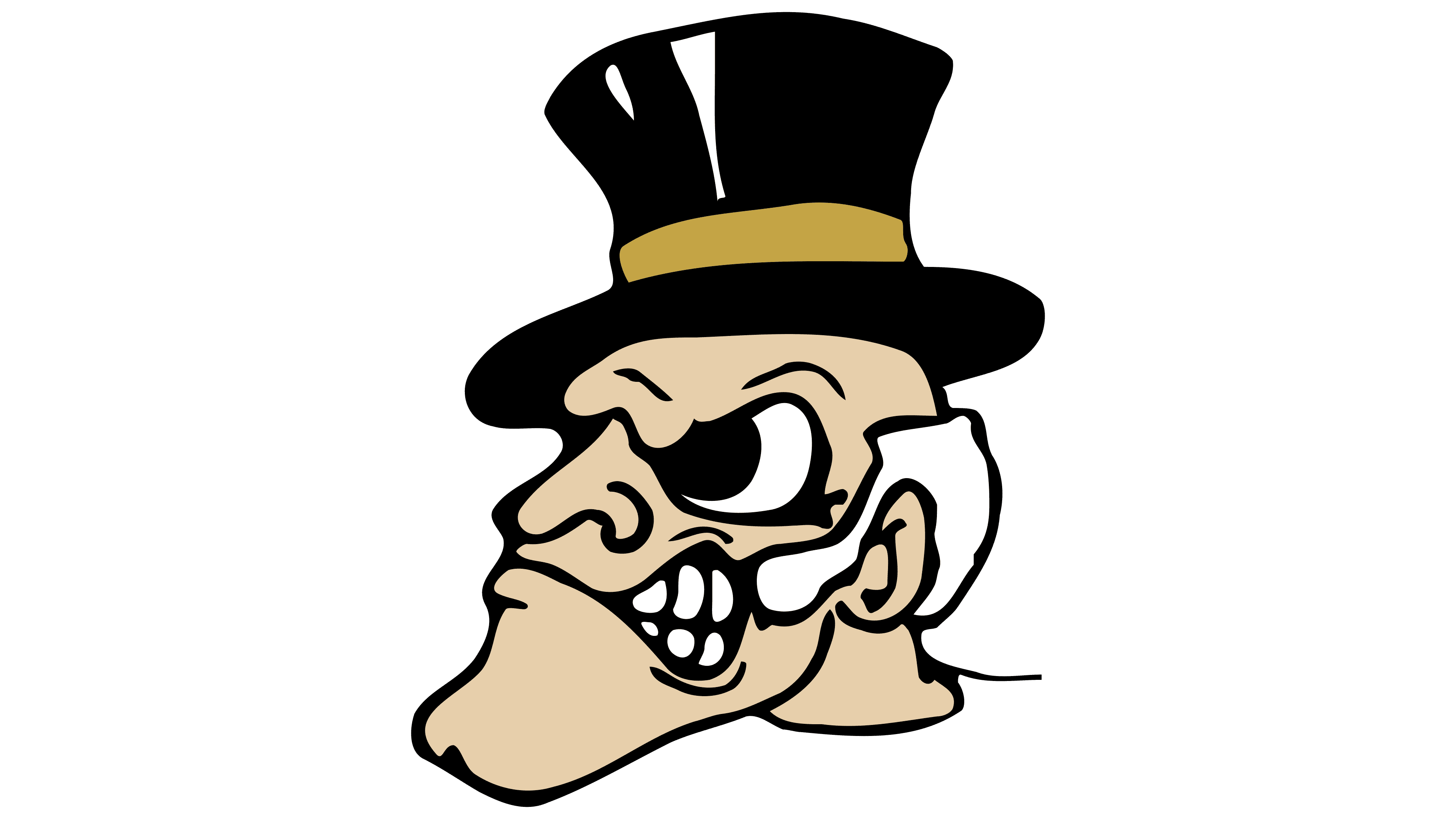
As a result, the nickname “Demon Deacons” stuck to the team. The first embodiment of the devilish old Baptist deacon was student Jack Baldwin. He was the first to wear a top hat and collar and lead the team onto the field.
Interestingly, despite the rather heretical approach to the name and the possessed priest’s chosen symbol, the two parts of the Wake Forest and Demon Deacons inscription are separated on the emblem by eight-pointed stars, which are considered embodiments of the Star of Bethlehem and signify eternal life.
1993 – 2006
![]()
The next emblem was quite cartoonish. It was done in a Wild West style. The inscription curved like a horse stopping after a sharp turn. The black background resembled road dust. Instead of a cowboy, the face of an obsessed, growling priest appeared next to the name.
The entire sign is infused with ferocity, movement, and momentum, conveying the team’s fighting spirit.
2007 – 2019
![]()
The team’s logo changed with the arrival of the new athletic director, Ron Wellman, who later received awards for his contribution to the sports movement.
The heretical image was replaced with two capital letters representing the university’s name. This was a complete shift in symbolism, as it did not include the team’s name or any hint of sports.
The accepted colors were used for the emblem: gold filling and black outlining for the letters.
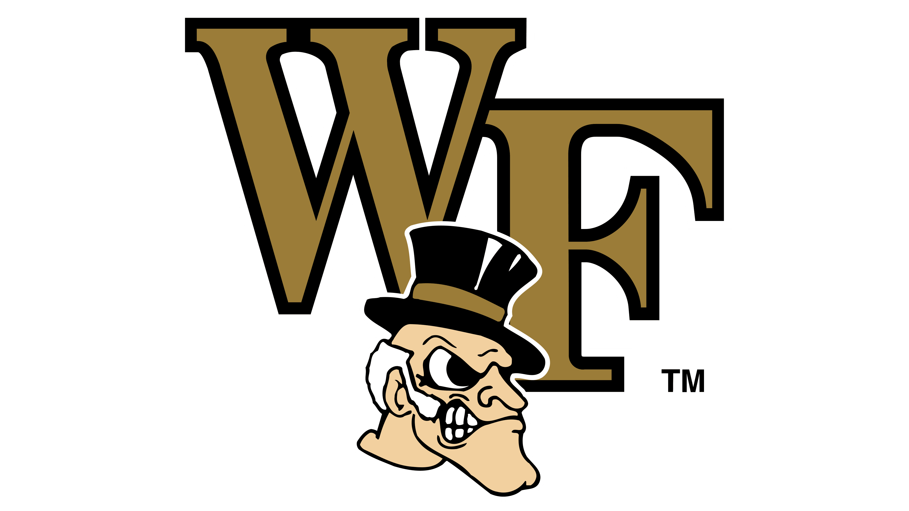
2019 – today
![]()
Another change in leadership, with John Currie becoming the director, led to an update to the team’s visual identity.
The gold in the acronym letters went from a saturated hue to a lighter, almost white gold. This marked a new era in the history of the sports movement. It signified the athletes’ youth, energy, and strength.
Font and Colors
The teams’ main colors and visual signs are black and gold, the same as those of Wake Forest University.
- Black symbolizes hard work and countless training sessions.
- Gold represents the rewards for their efforts, such as medals and trophies.
The choice of shades is believed to be related to religious views. Black represents sin and the sinful person, considered “earthly dust,” and gold is the color of faith, saving a person from the abyss of sin.
One theory about the choice of colors for the sports movement connects gold and black with the shades of a tiger’s fur, which was the team’s first mascot.
The letters with varying glyph thicknesses and serifs make the inscription elegant.