The Warhammer logo is both martial and cosmic. The emblem transports the viewer into a fictional future world where wars rage. It tells a tale of extraordinary empires, technologies, and materials unknown to mankind.
Warhammer: Brand overview
| Founded: | 1987 – present |
| Founder: | Games Workshop |
| Headquarters: | United Kingdom |
| Website: | warhammer40000.com |
Meaning and History
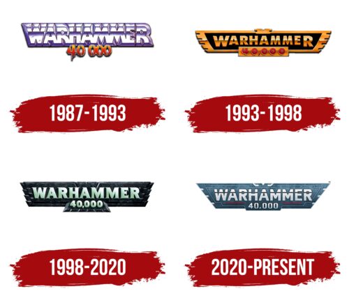
Despite the logo’s appearance in 1987, the game’s history started four years earlier. The first Warhammer was offered by Games Workshop in 1983. However, few remember the initial version nowadays. Fame came to the game precisely in 1987 when a spin-off appeared. It featured the same heroes but living in a different, entirely revamped world. The game’s rebranding was called Warhammer 40000. The version’s logo has changed four times but always maintained the fantasy flair and bird shape.
What is Warhammer?
A unique board game where entire armies of miniature figures battle. Two players move figures in turns, determining the outcome of the action by rolling dice or through tables.
1987 – 1993
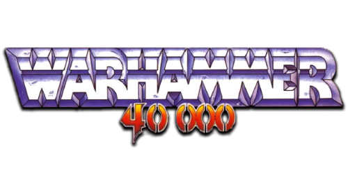
The first logo is executed in the form of a bas-relief of the name, the letters of which are bisected by a line into two parts. The symbols, flat at the bottom and protruding on the face, remind one of the game pieces standing on the table on flat pedestals.
The game’s name indicates combat action. The addition of “hammer” is more indicative of a significant emphasis on weapons than specifically on axes. The game features infinite rifle variations, such as the lasgun, bolter, and melta, as well as psychological weapons and others. However, blade models are also present in the arsenals, for example, the chain weapon, in the form of a chainsaw cutter or orc hatchets and cleavers.
The word “Warhammer” is associated with ferocious close combat, which the logo tries to convey.
The line in the center of the letters is like a demarcation between two armies. Each incision in the symbols is made as part of a weapon, which enhances the connection with military themes.
The number 40000, stated below the inscription, has a specific meaning. The game’s history begins on the threshold of the 41st millennium. Therefore, 40 thousand is the age of the Warhammer world with its races.
1993 – 1998
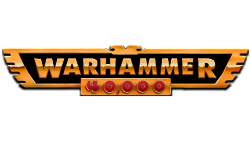
The second edition, with a more detailed set of rules, came out in 1993. The game came in a box with figurines. The symbol of the second generation becomes the image of the Imperial Eagle. It points to the Imperium – a vast empire uniting millions of galaxy’s planets. It predominates in the Warhammer Universe. Its subjects are human subspecies that have evolved over the past millennia: Ogryns, beastmen, and squats.
The empire is ruled by the emperor, who is worshipped. A bird is depicted on the leader’s armor. The eagle on the logo points to the empire and the emperor, whose life has been artificially sustained for more than 1000 years. The imperial eagle also implies that in the game, different empires and races battle against each other: Tau, Orks, Eldar, Chaos, Necron, and Tyranids.
The black color inside the bird conveys the idea of space, the galaxy. It points to dark times and constant battling. The orange edging in the shape of an eagle indicates a closed universe, a special world where events take place. The color of the inscription and the outlines hint at the fires of battle.
1998 – 2020
The third edition improved the rules for large battles and detailed the codex system. The version’s emblem seems carved out of stone. The eagle has a double row of feathers, which signifies the battles of two armies. The lower section, where the number 40000 is located, is designed in the shape of a bird’s tail.
The dark color shows the addition of the Dark Eldar army figures to the collection. The coloring matches their black-green clothing.
2020 – today
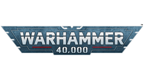
In 2020, the ninth edition appeared with four new sets. The eagle figure in the updated logo resembles the blade of a double-sided axe, which evokes associations with metal, weapons, and war. The red stripe underlining the word Warhammer hints at bloody battles. The logo brings back the feature that splits the letters into two parts, returning the sign to the theme of confrontation between the Imperium and other races.
Font and Colors
The blue-green color of the logo resonates with the idea of the digital world. Displays for controlling spaceships and weapons. It hints at extraterrestrial materials unknown to modern humanity. Blue-green also speaks of unusual forms of life. Some races, especially those introduced in the game along with the latest logo, have bodies transformed with metals (Necron) or are dressed in suits made of super-materials (Chaos Space Marines).
The inscription’s font is strict and bulky, indicating armor and equipment, heavy weaponry. If we discount the dividing stripe, the letters are similar to the bold symbols of the Verdana font.
Warhammer color codes
| Squid Ink | Hex color: | #162630 |
|---|---|---|
| RGB: | 22 38 48 | |
| CMYK: | 54 21 0 81 | |
| Pantone: | PMS 5395 C |
| Teal Blue | Hex color: | #4a738b |
|---|---|---|
| RGB: | 74 115 139 | |
| CMYK: | 47 17 0 45 | |
| Pantone: | PMS 7698 C |
| Cadet Gray | Hex color: | #98acb6 |
|---|---|---|
| RGB: | 152 172 182 | |
| CMYK: | 16 5 0 29 | |
| Pantone: | PMS 5503 C |
| American Rose | Hex color: | #f73950 |
|---|---|---|
| RGB: | 247 57 80 | |
| CMYK: | 0 77 68 3 | |
| Pantone: | PMS 1788 C |
