The Warner Brothers logo represents the impregnable empire. The film company dominates the blue screens of viewers. Novelty can be traced in the emblem. The firm regularly offers new programs and films.
Warner Brothers: Brand overview
| Founded: | April 4, 1923 |
| Founder: | Harry Warner, Albert Warner, Sam Warner, Jack L. Warner |
| Headquarters: | Burbank, California, US |
| Website: | warnerbros.com |
Meaning and History
The founders of America’s premier entertainment conglomerate have Polish roots. Their parents came to the North American continent from the town of Krasnosielc. Gradually, the family adapted and received the English-language spelling of names and surnames. Some brothers were already born abroad. At first, older children became interested in cinema: they bought a projector and began to show films in remote places in the mining regions of the United States. Over time, they opened their cinema, which they called Cascade. It was 1903, in New Castle, Pennsylvania. The brothers founded a film rental company a year later, calling it Duquesne Amusement & Supply Company.
The activity intensified during the First World War when Warner began filming their films. To do this, in 1918, they established their first studio in Hollywood, on Sunset Boulevard. The two brothers (Jack and Sam) were involved in the creative process and preparing the films, while Albert and Harry dealt with the distribution and funding. During the war, their debut work, based on the book by Ambassador James W. Gerard, was released. It was called “My Four Years in Germany.”
In the spring of 1923, the brothers officially registered Warner Bros. Pictures, Incorporated. But in fact, the film studio considers the date of its formation to be 1905 – the period when the first film distribution company appeared. Now it is a film giant, part of the American film studios Big Five. He is also a member of the MPA (Motion Picture Association) and owns an animation studio, publishing, video game development and distribution, television channels, theaters, amusement parks, and television companies. All have the same logo – a shield with the initials “WB.” There are twelve of them in total.
1923 – 1925
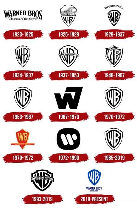
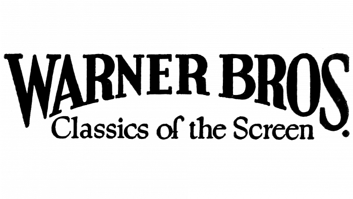
The personal identity mark of the film group appeared immediately in the year of its registration. It was just text arranged accordingly. Above was the name of the Warner Bros. company. The words were large – widening from the middle to the edge. Below was a line with the phrase “Classics of the Screen” in a standard serif font. The background was white space.
1925 – 1929
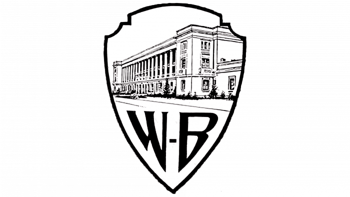
After being renamed Warner Brothers Productions, the firm undertook the first redesign of its identity. It was during this period that the famous shield appeared, which has never disappeared from the emblem. He received the nickname, Brain Shield. The upper area of the interior space consisted of an image of the house in which the film studio was located. The building was painted in monochrome with thin black lines on a white background. Below is the abbreviation for the name “WB” with pointed ends. Between the letters, there was a small strip that resembled a miniature rectangle.
1929 – 1937
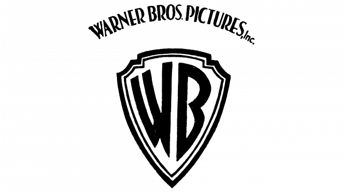
In 1929, the logo was introduced, where the abbreviated company name occupied the entire space of the shield, which received a double edging. The reason for the update of the emblem was another renaming of the studio – this time at Warner Bros. Pictures Inc. The text was high above the shield and had an arched shape. The words “WARNER BROS. PICTURES “were written in capital letters, and” Inc.” – lowercase.
1934 – 1937
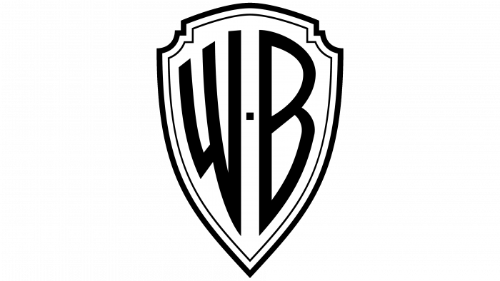
In parallel, there was another version of the logo – without the company’s name, with narrower letters, and with a separating sign between “W” and “B.” This emblem is nicknamed the Zooming WB Shield.
1937 – 1953
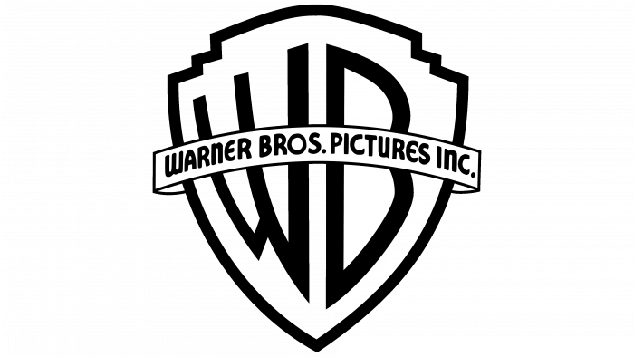
In 1937, a banner with the words “WARNER BROS. PICTURES INC. “The tape was located across the shield and ran in the middle from left to right. The designers expanded the shield itself and removed one edging line.
1948 – 1967
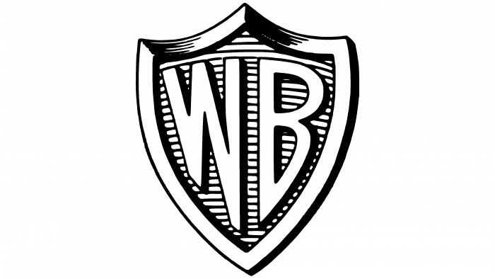
This logo has a wide border and ribbed surface formed by horizontal stripes on the shield. The letters were white, the shadows black.
1953 – 1967, 1970 – 1972, 1985 – 2019
The designers returned the double edging of the shield, and the interior was painted black. It has been redesigned for printing and uses on stationary media. Judging by the number of periods, he returned several times.
1967 – 1970
This version lacks the traditional abbreviation “WB.” Its place was taken by the sign “W7”, which reflects the merger of the Warner Brothers film company with Seven Arts.
1970 – 1972
This was the first time the emblem was colored. The shield was red, and the edges were yellow (two shades). The letters in the central part got the same color. The main element intersected an elongated rectangle with the full name of the movie studio. The inscription, like the abbreviation, was colored yellow-orange.
1972 – 1990
The emblem, proposed by designer Saul Bass, was not liked by anyone, so it received two nicknames at once: Big W and Worm. The logo did indeed depict the first letter from the name of the film company. It consisted of three separate pieces that resembled white sausages on a black background. By the way, the background was also incomprehensible – it was either an irregular circle or a square with rounded corners. Now this futuristic mark is used in other projects of Warner Brothers.
1993 – 2019
After an unsuccessful attempt to update the logo, the film company returned the old version of 1937-1953 with a horizontal tape, which contains the full name of the studio – “Warner Bros. Pictures. ” The difference between the new and old emblems was only in the color of the inscription (it was painted white) and in the width of the lines (they became thicker than before).
2019 – today
The current logo was unveiled in the fall of 2019. This is the second color version, but blue is now used instead of red. The abbreviation in the center is the same – elongated, with a sharpness at the ends. Outwardly, this option resembles a sign that first appeared in 1929-1937. It has no edging – only a shield and two letters in the center. The text is out of the frame of the graphic image and is located below. The inscription spans two lines: at the top – “Warner Bros.”, at the bottom – “Pictures.” All words are blue too.
Warner Brothers: Interesting Facts
Warner Bros. Entertainment Inc., started by Harry, Albert, Sam, and Jack Warner in 1923, is a giant in the entertainment world known for its movies, TV shows, and music. Over more than 100 years, Warner Bros. has greatly impacted Hollywood and worldwide culture.
- First Talkie: Warner Bros. made history with “The Jazz Singer” in 1927, the first feature-length film with synchronized sound. This film shifted movies away from silence and set new standards.
- Famous Studio Lot: Its studio lot in Burbank, California, established in 1926, is iconic in movie history, hosting numerous classic productions. Tours there let fans see behind-the-scenes of both active and historical sets.
- Animation Legends: It’s the home of beloved animated characters like Bugs Bunny and Daffy Duck. The Looney Tunes and Merrie Melodies cartoons are pivotal in American animation history.
- DC Comics Movies: Owning DC Films, Warner Bros. produces films about superheroes like Batman and Wonder Woman, making the DC Extended Universe a key competitor to Marvel.
- Hit TV Shows: It produces series such as Friends, The Big Bang Theory, and ER, which are favorites worldwide and have won many awards.
- Distribution Innovation: Warner Bros. leads in film distribution, including a 2021 move to release new movies on HBO Max the same day they hit theaters, responding to the COVID-19 pandemic.
- Academy Awards: Its films have won numerous Oscars, including Best Picture for classics like “Casablanca” and “Million Dollar Baby.”
- Harry Potter Series: The studio brought the “Harry Potter” books to life, creating a hugely successful film series, which expanded with the “Fantastic Beasts” movies.
- Theme Parks: Warner Bros. also ventures into theme parks, like Warner Bros. World Abu Dhabi, one of the world’s largest indoor theme parks, based on its characters and stories.
- Diversity Efforts: It’s committed to diversity and inclusion, working to increase representation and support underrepresented talent in the industry.
From its beginnings as a small studio, Warner Bros. has grown into a leading force in global entertainment, constantly innovating and shaping the entertainment world.
Font and Colors
The identity of the film concern is stable. It was almost always associated with the image of the shield in which the abbreviated name of the company is located. Otherwise, everything is variable, since from time to time, a tape, then a text, then an edging, then an image of a building appeared on it. The exception was two periods when there were attempts to replace the shield with the W7 and Big W signs.
Several types of fonts resemble the various lettering on the Warner Brothers emblem. These include the eponymous font, Goudy, Charter, Dubba Dubba, and Seven Arts.
The color scheme is stable and most often consists of a combination of black and white. Red, yellow, orange, and blue were also used.
Warner Brothers color codes
| Absolute Zero | Hex color: | #0041b3 |
|---|---|---|
| RGB: | 0 65 179 | |
| CMYK: | 100 64 0 30 | |
| Pantone: | PMS 2728 C |
| Navy Blue | Hex color: | #000a75 |
|---|---|---|
| RGB: | 0 10 117 | |
| CMYK: | 100 91 0 54 | |
| Pantone: | PMS 2738 C |
