 Washington Commanders Logo PNG
Football players from Washington Commanders have a stylish logo. It is only the team to which it belongs that makes it sporty. After all, burgundy and golden colors are a sign of royalty. But in this case, the team thus inspires self-respect and conveys nobility and the desire for unlimited power in the sports arena.
Washington Commanders: Brand overview
| Founded: | July 9, 1932 |
| Founder: | Daniel Snyde |
| Headquarters: | Washington, United States |
| Website: | commanders.com |
Meaning and History
The countdown of the years of the Washington Commanders’ sports career begins in 1932 when it bore the name of the Boston Braves. Then it was renamed the Boston Redskins, and then the Washington Redskins. However, after desperate pressure from the public and some sponsors of the NFL, who considered such a name pejorative, the club adopted a new name – Washington Football Team. This happened in 2020. The players spent two seasons, after which they were renamed again. The rebranding occurred in 2022 and was accompanied by a complete change in visual identity, including the logo.
What is Washington Commanders?
Washington Commanders is a sports franchise formerly known as the Washington Redskins. It appeared in 1932 and was renamed in 2020. Its head office is located in Washington, DC. The home arena is located in Maryland. The football team is part of the NFL and plays for the East Division NFC.
2020 – 2021
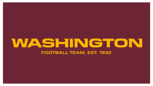
The emblem features a wide rectangle with the text aligned to the center. That is, the logo is verbal and consists only of the football team’s name. There are golden letters on the maroon field. The words are arranged in two levels. The first row contains the initial fragment of the name, type in a capital font with one-sided serifs directed to the left. The second line is occupied by the rest of the name and the real year the franchise was founded. There are small glyphs.
2022 – today
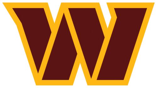
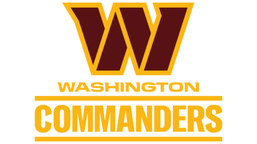
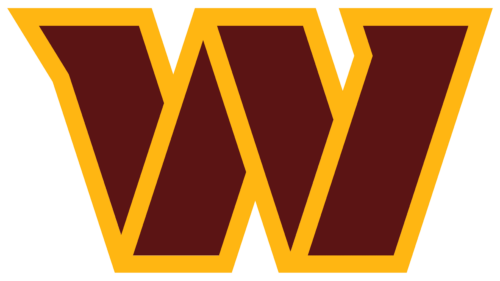
The modern Washington Commanders logo is maroon and yellow. It consists of a large glyph – the first letter of the football team’s name. The sign is enlarged, so it looks like a block. The inside of the stylized “W” is painted burgundy; the outside is gold. At the top left, the side elements have a one-sided spike – a sharp notch directed to the left side. Below is the full name of the sports club, divided into two levels.
The word “Commanders” is highlighted with horizontal lines – superscript and subscript. These stripes are a reference to the DC flag. An inscription in small print occupies the first line. She highlights the team’s close ties to the city of Washington, where it’s from, and where it’s headquartered, even though the franchise plays its home games in Maryland.
At first, “W” was a separate sign, not included in the official emblem, but then it became an independent identity element. Due to the specifics of the structure, it looks like a wide ribbon bent in three places. Similarities with the glyph are added to it by unusual serifs, turned by the tip to the left. Together with the angle cuts, they convey the players’ progress and purposeful movement forward.
In addition, the Washington Commanders emblem is a tribute to the military. As the representatives of the team themselves note, their logo is inspired by the signs of military ranks, so the massive letter has the shape of an inclined strip. Such block structures are typical for the sports environment, but in this case, the graphic symbol is supplemented with text, which is less common.
Font and Colors
As conceived by the developers, the logo’s typography reflects the players’ professionalism, so the word “Commanders” means “high and proud.” It is written in capital letters, stretched upwards.
The Washington Commanders logo uses several different fonts for the main text element of the logo, which includes the name of the team and its slogan; the Athlete Modern font is used. This typeface was designed by Eriq Jaffe and is a modern take on the classic Athletic typeface from the 1930s.
Athlete Modern belongs to the Sans-serif family of fonts, which are characterized by the absence of serifs at the ends of the letters and a more modern look. This typeface features simple and clean lines and has a strong visual contrast between thin and thick letter elements.
Overall, the Washington Commanders logo typography is a modern and clean style that suits professional teams in the sports world. In addition, the use of sans-serif fonts helps create a recognizable and easy-to-read logo that can be easily identified in various media formats.
The emblem of the Washington Commanders team has an official color scheme consisting of burgundy and gold. Despite the change in identity, the franchise retained them and used them in new logos.
Burgundy, the team’s main color, symbolizes strength, energy, passion, and dynamism. It is associated with ambition, determination, and courage, which reflects the main characteristics of the team.
The gold color, which is used as a secondary color, is commonly used in the team’s logo and uniforms. It symbolizes confidence, nobility, success, and wealth.
Washington Commanders color codes
| Rosewood | Hex color: | #5b1414 |
|---|---|---|
| RGB: | 91 20 20 | |
| CMYK: | 0 78 78 64 | |
| Pantone: | PMS 1815 C |
| Selective Yellow | Hex color: | #ffb612 |
|---|---|---|
| RGB: | 255 182 18 | |
| CMYK: | 0 29 93 0 | |
| Pantone: | PMS 7549 C |
