 Washington Football Team Logo PNG
Football players represent a certain region, bring its inhabitants joy and defend the city’s honor on the field. The Washington Football Team logo indicates a cohesive team capable of operating as a unit.
Washington Football Team: Brand overview
| Founded: | 1932 |
| Founder: | George Preston Marshall |
| Headquarters: | Ashburn, Virginia, U.S. |
Meaning and History
The team’s old nickname has always been a cause for controversy and protests over the interpretation of the word. It was originally called the Boston Braves, but Marshall did not want to be confused with the same name from Major League Baseball franchise. The owner thought the Redskins were a great alternative. He played with this title in every possible way, forcing the players to wear feathers and other attributes of the American Indians. And sometimes, the players came to the stadium smeared in the dark paint.
In 1967, the nickname became the official trademark. By that time, the football club had many logos associated with it. In 1971, critics publicly spoke out for the first time about the offensive meaning of the word Redskins and demanded to stop using it. Perhaps there was some truth in this because George Preston Marshall became famous as a racist during his lifetime. The team responded to all claims by changing the emblem, choosing a detailed image of the head of an Indian. Walter Wetzel created this symbol.
Subsequently, the football franchise several times fell into similar scandals. Native Americans protested, signed petitions, and sued the Washington Redskins to get it renamed. The new owner of the club, Daniel Snyder, vowed that he would never allow this, although even President Barack Obama advised him to listen to the activists.
Opponents of the Redskins name won in 2020. After the assassination of George Floyd, investors demanded that sponsors stop financially supporting the franchise as long as it bears the offending name. And large online retailers refused to sell her products. Amid growing and widespread pressure, Daniel Snyder was forced to change his oath. This gave the club a new temporary name, Washington Football Team, and the same temporary logo. The final rebranding is expected to take place in 2022.
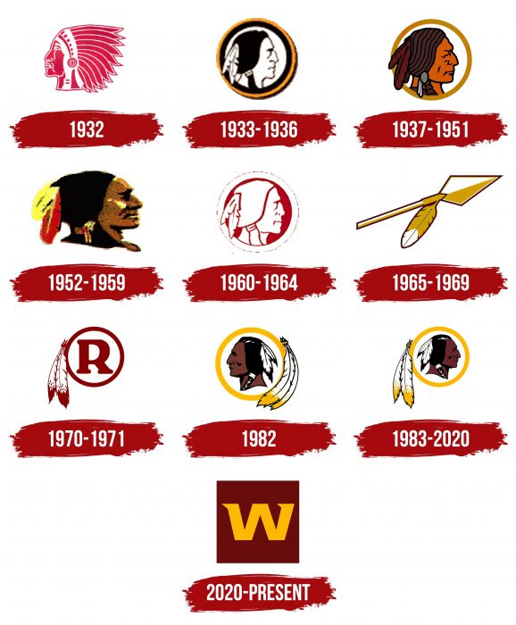
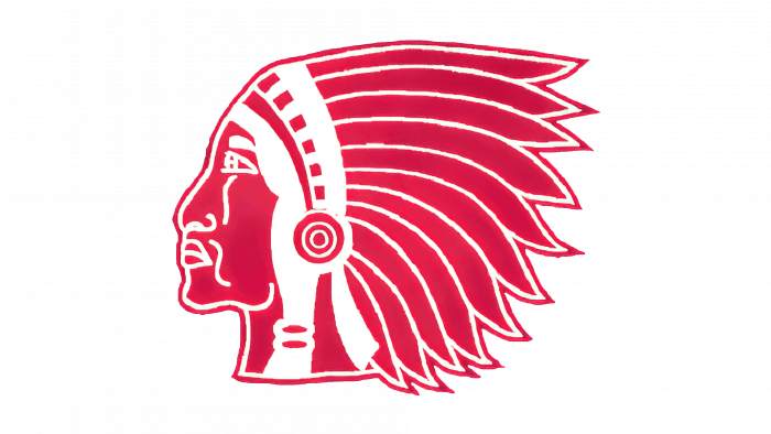
1932
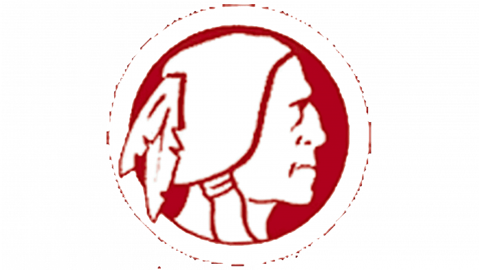
In 1932 the Boston Braves club was founded. Its logo looked like a stylized Indian head turned to the left. The main color was red, and white was used for the inner contours. The artists depicted the feather headdress in detail so that it was clear that this was the leader of the tribe.
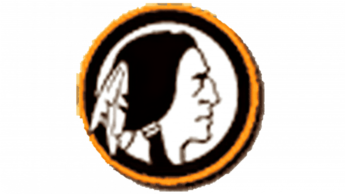
1933 – 1936
Following the renaming, the team updated the emblem with a portrait of the Native American inside an orange ring with a white center. The full crown was replaced by two feathers in the hair, and the head was turned to the right. The main palette is now black and white.
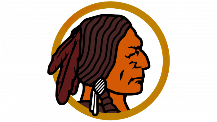
1937 – 1951
Marshall felt that the fans in Boston were not active enough, so he moved the franchise to Washington, leaving the old nickname. The logo has remained the same, apart from the changes in style and color palette. The artists have detailed the image, added more vibrant hues, and made the feathers red.
1952 – 1959
In the middle of the 20th century, another redesign took place. The developers paid attention to the realism of the image. The Indian’s face has become three-dimensional due to the superimposed shadows. The feathers in the dark hair have been enlarged, and the yellow frame ring has disappeared.
1960 – 1964
In 1960, the designers returned to the old color scheme, which was used in 1932. Only the tribal chief this time turned white, and all the outlines and background were repainted in burgundy.
1965 – 1969
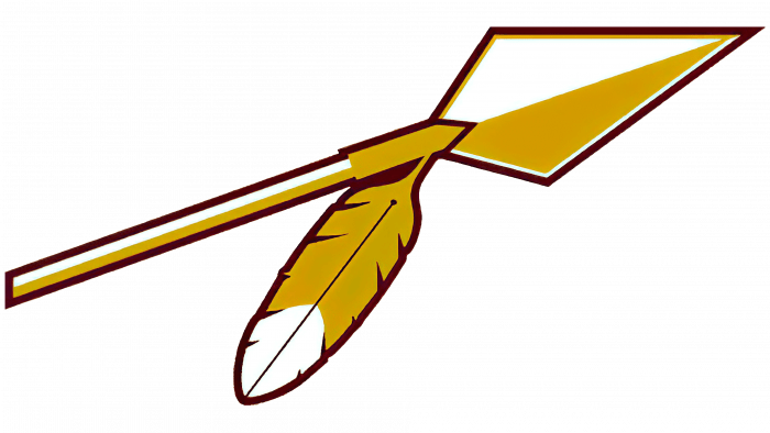
The most notable change occurred in 1965 when the developers of the team emblem depicted a spear with a feather instead of an Indian. They felt that these attributes were enough to underline the Washington Redskins’ identity. The spear was white and yellow, with a short shaft and a sharp diamond-shaped tip.
1970 – 1971
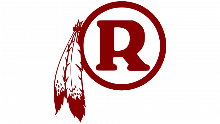
Coach Vince Lombardi inspired the new logo. On his initiative, in 1970, the team abandoned the usual images, leaving only two feathers as a reminder of the Indian theme. A small tuft of feathers was attached to a burgundy ring with a capital “R” inside.
1972 – 1981
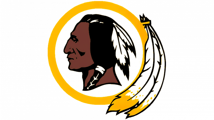
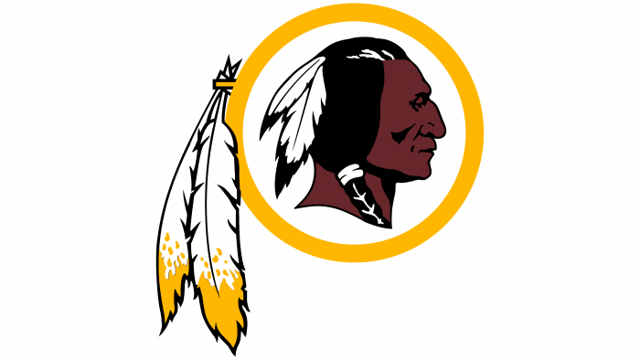
The emblem, which became the basis for all subsequent marks of the Washington Redskins football franchise, was designed in 1972 with Native American leaders. Its author is Walter Wetzel. The design was inspired by the Buffalo nickel, a five-cent coin featuring the famous leader John “Two Guns” White Calf.
The logo featured an Indian face in profile, with prominent cheekbones, a straight nose, and two white feathers in black hair. The head was inside a yellow ring, which on the left side was decorated with two more feathers but of a larger size. At the same time, a word sign appeared – the burgundy inscription “REDSKINS”, executed in bold sans serif type.
1982
To fit the logo onto the helmet patches, the designers pressed the outer feathers against the ring. And at the same time, they turned the leader’s head to the left (before that, the Indian’s gaze was directed to the right) and slightly changed the shades of colors.
1983 – 2020
The team brought back the 1972 logo by Walter Wetzel after the helmet sticker maker adopted a more flexible base. This version completely repeated the original. All the details matched, right down to the loose feathers and turning the head to the right.
Over the 37 years that the Washington Redskins have worn the themed logo on their uniforms, they have been criticized for both the name and the graphic symbol. However, the leaders refused to change anything. They argued that the franchise, on the other hand, glorifies the Indians and reminds them of their existence. Despite this position, they still had to rebrand.
2020 – today
Under pressure from the community, the Washington Redskins were reorganized into the Washington Football Team. National protests in 2020 led to this. The new name was chosen by trainer Ron Rivera and owner Daniel Snyder. It was originally planned to be temporary, only for the 2020 NFL season. As it became known later, it will be replaced along with graphic symbols by September 2022.
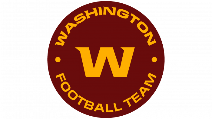
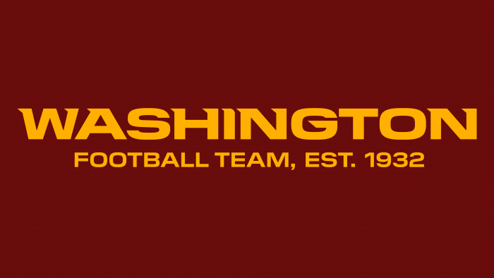
The temporary logo is in the team’s traditional colors, with a jagged yellow “W” inside a red-brown square. There is also a wordmark with a yellow inscription “WASHINGTON FOOTBALL TEAM, EST. 1932 “in a burgundy rectangle.
Washington Football Team: Interesting Facts
The Washington Commanders, previously known as the Washington Football Team, have been part of the NFL since 1932, starting as the Boston Braves. Their journey includes several name changes, significant victories, and moments that have shaped the franchise.
- Early Days: The team was first called the Boston Braves in 1932, became the Boston Redskins the following year, and moved to Washington, D.C., in 1937, later changing to the Washington Redskins. 2020, they were known as the Washington Football Team before becoming the Washington Commanders in 2022.
- Wins and Championships: They clinched NFL Championships in 1937 and 1942 and have won three Super Bowls (XVII, XXII, and XXVI), making them one of the NFL’s most successful teams.
- Broadcasting Milestone: In 1939, their game against the Eagles was the NFL’s first live radio broadcast of a regular-season game, a landmark in sports broadcasting.
- Racial Integration: The team was the last in the NFL to integrate, signing Bobby Mitchell in 1962 after pressure from the Kennedy administration. This move highlighted the team’s complex history with race.
- Offensive Innovation: Under coach Joe Gibbs, the team introduced innovative offensive strategies, including “The Hogs,” a formidable offensive line, and the “Fun Bunch,” celebrated wide receivers known for their group celebrations.
- Iconic Players: Legends like Sammy Baugh, John Riggins, and Darrell Green have left a lasting legacy and contributed to the team’s rich history.
- Loyal Fans: The Commanders have a strong fan base, evidenced by a long streak of sold-out games, showing community support despite various challenges.
- Fight Song: “Hail to the Redskins,” one of the first fight songs in professional sports, has been a part of the team’s tradition, though it was modified following the team’s name change.
- Leadership Pioneers: In 1989, the team made history by hiring Bobby Mitchell as the NFL’s first African American Assistant General Manager.
- Mascot Changes: The franchise has seen various mascots, including Chief Zee (Zema Williams), a superfan. With the recent rebranding, the team wants to establish new traditions for its diverse fan base.
The Washington Commanders’ history is a blend of on-field achievements, evolving traditions, and a journey towards greater progress and inclusivity, reflecting a complex but significant part of American sports history.
Font and Colors
The executives of the football franchise took the time to come up with a more creative nickname and a matching logo. Until then, they use the standard icon with a “W” in the square. The classic image of the Indian is finally a thing of the past.
The word “WASHINGTON” uses an unusual, bold typeface with sharp serifs, and the phrase “FOOTBALL TEAM” uses a sans serif version. The colors of the team remained traditional: gold (FFB612) and burgundy (5B2B2F). The logo with the letter “W” has a red-brown square.
Washington Football Team color codes
| Chocolate Cosmos | Hex color: | #5a1414 |
|---|---|---|
| RGB: | 90 20 20 | |
| CMYK: | 0 78 78 65 | |
| Pantone: | PMS 1815 C |
| Selective Yellow | Hex color: | #ffb612 |
|---|---|---|
| RGB: | 255 182 18 | |
| CMYK: | 0 29 93 0 | |
| Pantone: | PMS 7549 C |
