The Wawa logo promises reliable assistance on the road. Visiting shops and gas stations will bring joy to travelers, replenish their strength and help them continue their journey with ease, having received the necessary energy. “Good luck!” the emblem wishes.
Wawa: Brand overview
| Founded: | April 16, 1964 |
| Founder: | Grahame Wood |
| Headquarters: | Pennsylvania, United States |
| Website: | wawa.com |
Wawa is a U.S. retail chain of convenience stores and gas stations that serves the East Coast. In 2008, it was recognized as the largest retail system within walking distance of home. The basic assortment of stores is related to various foods: salads, dairy products, snacks, beverages, ready meals (lunch and dinner), deli meats, french fries, and several kinds of coffee. It also offers car refills. The main company came into existence in 1890, the repurposed one in 1964. The headquarters are located in Chester Heights, Pennsylvania.
The Wood family originally owned this firm. But in the early years, it was engaged in the steel industry (from 1803 to 1890). After moving from New Jersey to Delaware County, Pennsylvania changed to milk production, creating its farm and factory. George Wood started the business. A born marketer, he successfully promoted the business by offering hygienic and safe specially treated milk. He gained his place on the dairy products market with home delivery.
Later the entrepreneur refocused the business and opened his stores, gradually forming small outlets in places far from supermarkets. In 1964 Grahame Wood greatly expanded the family business. In 1977, partners were added to the chain’s management, dividing profits on a distribution basis. In 1996, the mini-mart chain combined food outlets with gasoline dispensers. In 2010, it began filling vehicles with diesel fuel.
Meaning and History
The company’s name comes from the city in which the first dairy and its headquarters appeared – Wawa, Pennsylvania. And it, in turn, is named after Ojibwe, the Canada goose. The Wawa is mentioned in Longfellow’s book The Song of Hiawatha (in part two, The Four Winds). So the image of a goose flying high became the corporate emblem as a symbol of the area where the company originated.
What is Wawa?
Wawa is an American company that owns a chain of convenience stores and gas stations. It started in 1964 when Grahame Wood opened his first grocery store. By 1972, the number of outlets had increased to one hundred. They did not look like traditional supermarkets because the owners initially focused on the catering industry.
1890 – 1964
According to official data, Wawa was founded in 1964. But few people know that its history began about 200 years ago. Once upon a time (from 1803 to 1890), it was an iron foundry. Then its owner, entrepreneur George Wood, bought the farm and started delivering milk to homes, naming the new business the same as the previous one: Wawa.
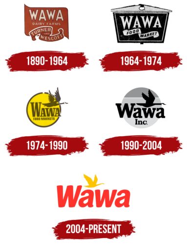
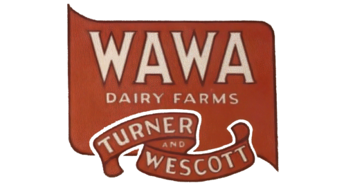
Around that period, a logo appeared featuring an asymmetrically shaped brown polygon. The brand’s name is written inside it, for which the designers used a capital font with sharp serifs. The second line is occupied by the phrase “DAIRY FARMS,” aligned in the center. And at the bottom, on a curved ribbon, is the phrase “TURNER AND WESCOTT.” All letters are beige, and only the word “WAWA” has thin dark brown outlines around them.
1964 – 1974
When people stopped using home delivery services for milk, the owners of Wawa had to open their first grocery store. It was supposed to be popular due to the brand’sbrand’s good reputation.
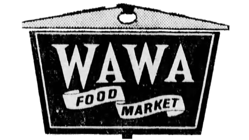
The logo of that period looks like an advertising plate, consisting of two elements: a large black trapezoid and a small spotted triangle with a round hole. The composition of geometric shapes contains the light gray word “WAWA” in triangular serifs and the black phrase “FOOD MARKET.” The latter is written in bold sans-serif inside a curved gray ribbon.
1974 – 1990
The logo shows the legendary goose associated with the city where Wawa dairy first appeared. The goose is depicted in flight. His neck, torso, and tail are extended in one line, which indicates his determination and persistence. The bird’s wings are up as it flaps, and its head is outside the background circle. The goose is positioned above the three letters, “awa.” The top of the first “W” is flush with the bird’s body. Below, in small serif type, it says “Food Markets.” The color scheme of the emblem is yellow.
1990 – 2004
At the end of the 20th century, a new version of the goose logo appeared. The original, created by a student at Villanova University and a part-time one of Wawa employees, turned out to be so successful that the designers changed only a few details in it. In particular, they corrected the shape of the flying bird: they added graceful curves to the wings, connected the feathers, and reduced the body. Because the tail, body, and neck are aligned in a straight line, the goose looks more confident and purposeful.
The artists kept the image of the bird because it is directly related to the brand name. Few people know, but the word “Wawa” was taken from the language of the Lenni Lenape Indian people living in the Delaware Valley. It literally translates as “Canadian Goose.” By the way, store chain officials often compare themselves to a flock of geese that settle in new territories. Here, analogies are drawn with opening new outlets in different cities.
The background for the bird is not the golden sun, as in the original, but the gray sky, presented in three shades – from the darkest at the top to the lightest at the bottom. Under the black silhouette of a goose is the same black two-level inscription. The first line contains the word “Wawa,” and the second line contains “Inc” with a dot at the end. The designers used a bold font with massive rectangular serifs in this case.
2004 – today
As a result of expanding the range of goods and services, the retail chain received an updated logo. It is more colorful than the previous one: it has no grey monotony. The letters are bright red now; the goose is yellow. And the designers slightly changed its location in the picture, placing it diagonally as if it soars in height. They also changed the font: classic serif letters were replaced by modern symbols with smooth sans serif lines.
Font and Colors
The chain of Wawa stores and service stations has the same logo. It is just presented in two modifications – early and current. The revisions mostly concerned the mood of the logo, but not its key elements, which include the eponymous goose and the brand’s name. The big bird was depicted seated, multicolored, with luxuriant plumage in the earliest emblems.
Early logos (late 19th and early 20th centuries) contained two types of lettering – printed and handwritten italic type. In the current interpretation, the inscription on the emblem is in a font reminiscent of Gotham Bold. Then came the individual version, which refers to the drawn letters. The brand’s signature palette consists of three shades of red, yellow, black, and gray.
Wawa color codes
| Red Brown | Hex color: | #ab1b2c |
|---|---|---|
| RGB: | 171 27 44 | |
| CMYK: | 0 84 74 33 | |
| Pantone: | PMS 186 C |
| Cinnabar | Hex color: | #e9362f |
|---|---|---|
| RGB: | 233 54 47 | |
| CMYK: | 0 77 80 9 | |
| Pantone: | PMS Bright Red C |
| Saffron | Hex color: | #f6c32a |
|---|---|---|
| RGB: | 246 195 42 | |
| CMYK: | 0 21 83 4 | |
| Pantone: | PMS 7408 C |
