


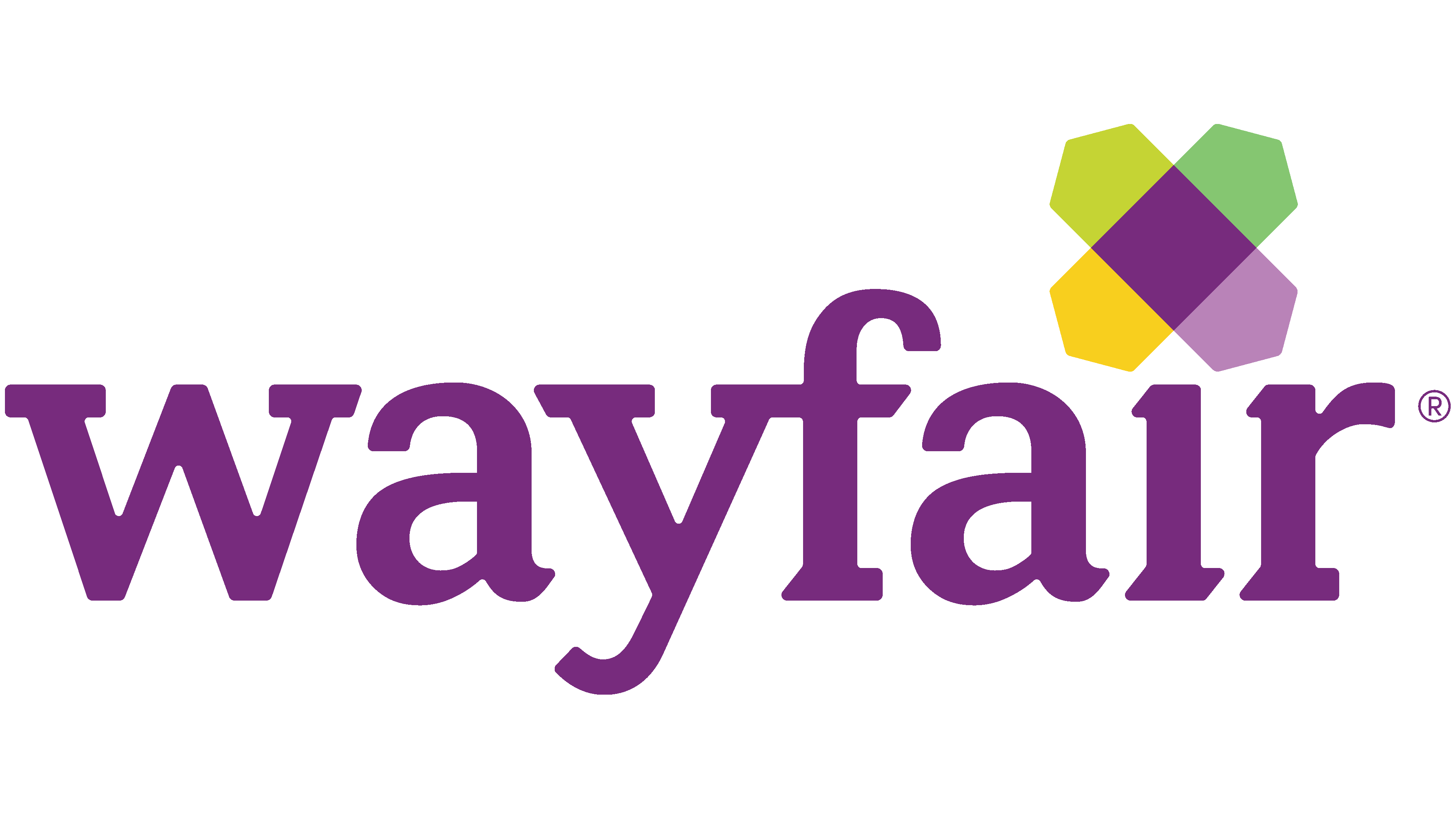
![]() Wayfair Logo PNG
Wayfair Logo PNG
The emblem’s bright elements encode a wide range of goods that can be shipped anywhere in the country. The Wayfair logo signals fast delivery, thoughtful logistics, and maximum customer convenience.
Meaning and History
![]()
The online store’s debut name was CSN Stores. But it wasn’t the first organization created by two Cornell University graduates: at the time, they had two firms (Simplify Mobile and iXL). So, the young entrepreneurs already had experience. They opened a joint venture and began selling racks and storage systems online. One of them took on the position of chairman, and the other the CEO. They didn’t think long about the name; they used the letters of their initials.
A year later, the company expanded substantially, hiring employees and adding garden and garden products to the range to sell at three new sites. Gradually, the catalog included all types of furniture, household products, decorative elements, and repair supplies, including bedding and bath accessories. Then the company began expanding into foreign markets, and by 2011, it owned more than 200 online stores. At the same time, it changed its name to Wayfair. The word carries no conceptual meaning; it consists of two easily pronounced bases. A branding agency from Newton proposed this version.
Around 2019, the firm began to have problems, leading to gossip and scandals. Because of this, many employees left: some resigned in protest, others were fired due to falling profits. Despite this massive staff loss, the company still has enough people, with 2,300 data engineers and over 3,000 helpdesk representatives. Worldwide locations share a common logo, altered only once.
2002 – 2011
![]()
The debut version of the logo does not resemble the current one and consists of two text elements. On the left half is the abbreviation “CSN,” which is formed from the initials of Niraj Shah and Steve Conine. The word “Stores” is on the right with the miniature prefix “shop easy.” A thin vertical line separates them. All letters in the name are lowercase, with a slight slant.
2011 – 2016
![]()
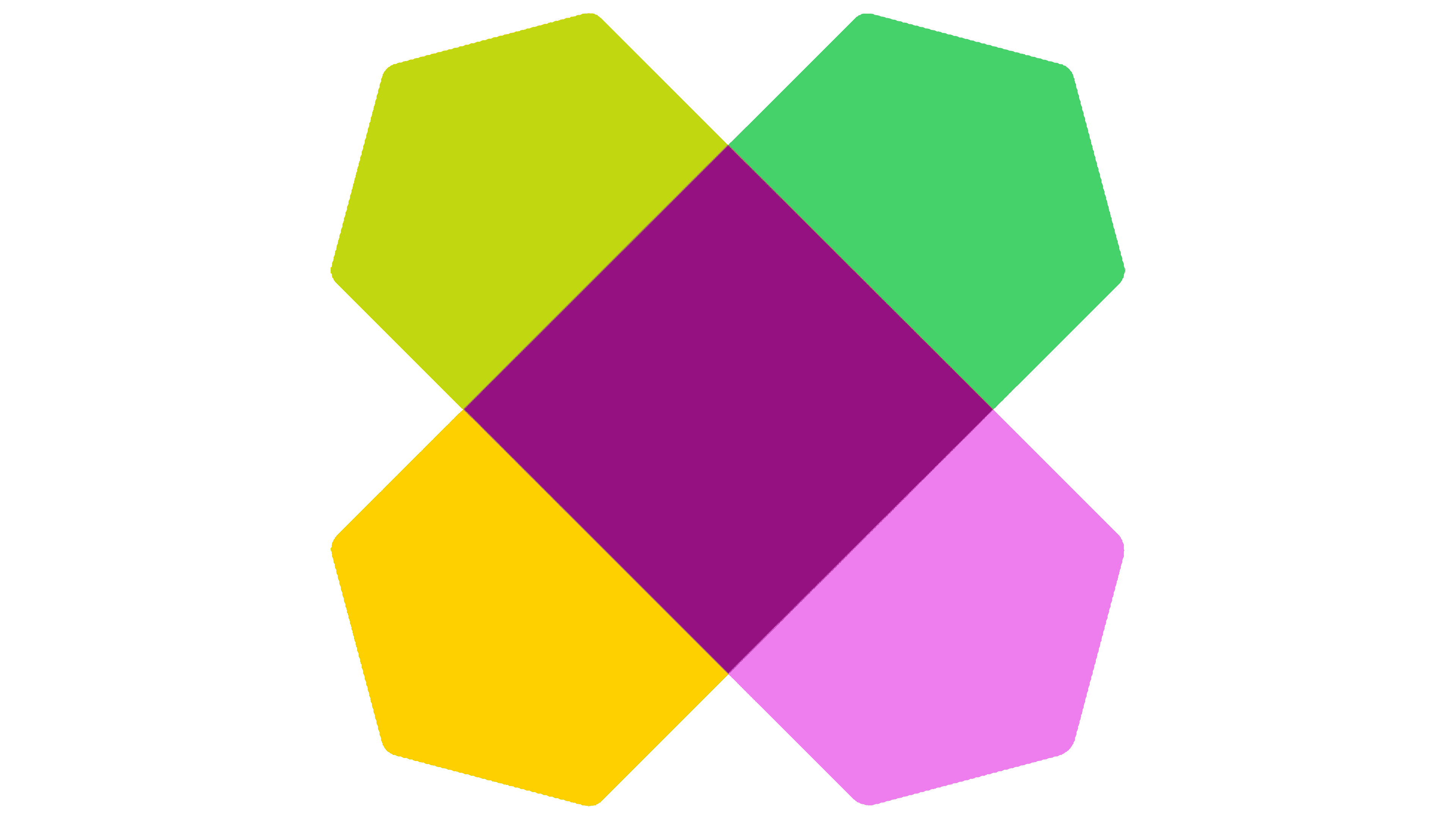
The logo design has become friendlier following the rebranding, reflecting the company’s transition to foreign markets. The excessive severity has disappeared, and a friendly graphic element has appeared, formed by two overlapping hexagons. They have an elongated shape and different colors on opposite sides: purple, olive, mint, and yellow. At their intersection is a dark purple diamond, colored to match the brand name. A geometric figure with a complex shape replaces the dot above the letter “i.”
2016 – today
![]()
The current Wayfair logo uses a different font. It is softer and more rounded than the previous version. The trademark connection between the “yf” and the bright geometric element is preserved. Its designers moved it to a different position, placing it before the company name, and used the classic dot over the “i.” They also replaced the dark purple color with bright lilac.
Font and Colors
This retail chain’s brand identity has several distinctive features: first, lower-case letters instead of traditional capital letters; second, a commitment to soft pastel colors; third, a ligature of “y” and “f.” Fourth, a complex figure consisting of two elongated hexagons.
The earliest emblem’s lettering was in thin italic type with a minimal slant. Then came the typographic typeface with strict geometric characters and sharp, flat serifs. The third version of the logo uses a soft lettering style with smooth transitions and roundings. The corporate palette consists of several shades of purple, olive, mint, and yellow.