


![]() Webtoon Logo PNG
Webtoon Logo PNG
The Webtoon logo is visually pleasing, but it doesn’t capture the essence. It doesn’t adequately convey the culture of South Korean digital comics. The service has a simple sign, the main characteristic of which is two-dimensionality. The emblem represents both the website and the application, so it must be visible on the screens of any media device. This criterion is definitely met.
Webtoon grew out of a crisis in South Korea’s printed manhwa industry in the late 1990s and early 2000s. Magazines were closing, circulation was falling, and many artists were losing paid outlets. At Naver, Kim Jun-koo noticed that internet users were already reading by scrolling vertically. He applied that habit to comics, replacing the magazine page with a long digital strip.
In June 2004, Naver launched Webtoon on its main search portal. Convincing artists was difficult at first because the format was new and the old industry still treated digital publishing with caution. The weak print market changed the balance. Creators began testing the platform, and as internet access spread, readership increased. In 2008, Naver added advertising as a monetization model, providing popular series with revenue and encouraging regular releases.
By the early 2010s, Naver Webtoon held about 80% of the Korean market. Tower of God, Noblesse, and The God of High School drew large audiences. They showed that unknown artists could reach readers without traditional publishers. On July 2, 2014, Line Webtoon launched internationally on Android, iOS, and the web. The first English catalog included 42 Korean series, while Canvas allowed creators worldwide to publish work and earn from views.
Expansion continued in 2016 with XOY in Japan, Dongman Manhua in China, a deal with Creative Artists Agency, and Patreon support within the app. Tapas became a Western competitor. Naver bought Wattpad in January 2021 and later formed Wattpad Webtoon Studios. A DC Entertainment partnership followed in 2021. In June 2024, Webtoon Entertainment listed on NASDAQ, and by 2025 it reported $2.7 billion in creator payments over five years.
Meaning and History
![]()
After the decline of the manhwa industry in the 1990s (manhwa is the term for South Korean comics abroad), JunKoo Kim refused to accept it and founded Webtoon in 2004. He aimed to compensate for the decline in the number of new manga. He expanded their reach by integrating them into the online space, believing the younger generation would gladly scroll through web pages filled with Asian comics. Initially, the platform was available only online, but later it became available on mobile devices as well.
Despite gaining adequate attention in its home country, the South Korean digital comics service gradually entered the international market a decade after its official launch, in 2014. Naturally, the project needed a logo that aligned with its concept of “drawn text.” As a result, a unique textual logo emerged, characterized by a relaxed atmosphere. Importantly, it remained verbal throughout.
What is a Webtoon?
Webtoon is a digital comics platform unique to Asian culture. It appeared in South Korea in 2004 and became known in foreign online spaces only in 2014. Its initial names were Naver Webtoon and Line Webtoon. The founder of this direction is JunKoo Kim. The current owners of the services are Naver Corporation and Line Corporation.
2014 – 2017
![]()
The worldwide launch of the Line Webtoon website and mobile app began with a white-and-green logo in a casual style. The background was unusual: a chaotically colored element resembling a circle with unevenly protruding edges. It looked like a brush-smeared blot, with the title in the middle. Due to limited space, the inscription occupied two levels aligned on both sides. The letters themselves appeared as if they had been painted on, making them unconventional. This casual style created an atmosphere far removed from rigid and formal design.
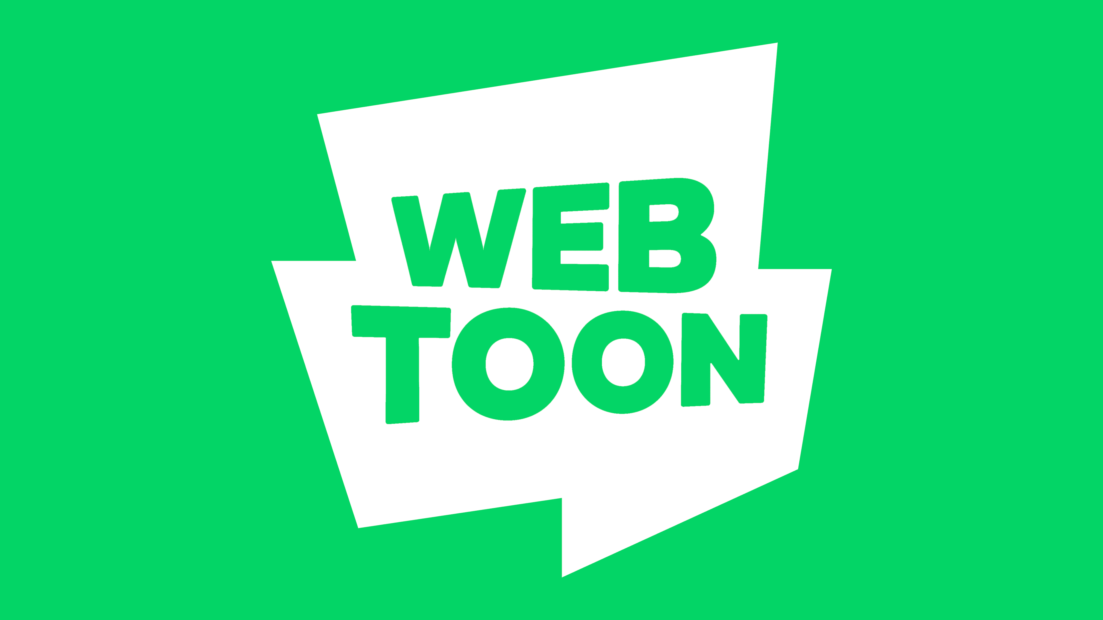
2017 – today
![]()
After its update, the Webtoon logo gained geometric features and a smoother look. It now has clear edges, even letters, a multi-layered base, and a restrained color scheme. Specialists from Troika Design Group crafted it this way. The background consists of an undefined shape that appears to be an assembly of different figures: rectangles and trapezoids with angled cuts.
Centered is the name of the website and the app, aligned by width. It is typed in white, sans-serif letters. The font is uppercase, bold, and even. It lacks the casualness typically associated with brush lettering. In this case, the glyphs are refined. Yet, they retain a unique touch. Upon closer inspection, one will notice that the symbols vary in height. In the top row, the characters on the left are shorter than those on the right, whereas in the bottom row, the opposite holds: the initial letters are larger than the rest. This results in a perspective effect in the emblem.
Font and Colors

The Webtoon logo uses two typefaces, both aligned with the concept of South Korean manga. One resembles Augie, a font used for comic books. It is casual and irregular, featuring letters of different sizes. The other version looks like Geometrico Ultra Black or Rational Text Extra Bold.
The corporate color palette consists of white (usually used for the name) and two shades of green: light green and dark mint. These colors symbolize growth, flawlessness, harmony, nature, and balance.