


![]() WeChat Logo PNG
WeChat Logo PNG
Typically, online chats use emblems that directly or indirectly indicate their line of business. The WeChat logo is no exception. The WeChat logo should be understood as a call to communicate in a friendly, pleasant atmosphere. The emblem invites you to open the application to stay in touch at all times.
WeChat was launched in January 2011 by Tencent, with Zhang Xiaolong leading development at the company’s Guangzhou R&D unit. In China, the app was released as Weixin, while WeChat became the name for international markets. Tencent already had messaging experience through QQ, its desktop chat platform launched in 1999. Still, smartphones required a product built around mobile habits.
The first version focused on voice messages, a simple contact system, and quick photo sharing. In 2012, Tencent launched Moments, a feed for sharing photos and status updates with contacts. In the same year, official accounts gave companies and media a publishing channel inside the app, turning WeChat from a messenger into a broader social platform.
By 2013, WeChat had passed 300 million registered users. Tencent then launched WeChat Pay, adding money transfers and in-app payments. In 2014, digital “red envelopes” during the Chinese New Year brought the payment tool to tens of millions of users. They intensified the rivalry with Alibaba’s Alipay in China’s mobile payments market.
In January 2017, Tencent introduced Mini Programs, which let users call taxis, pay restaurant bills, and shop online without installing separate apps. By 2018, WeChat had more than one billion monthly active users. In 2020, Donald Trump’s administration tried to restrict WeChat in the United States. The Biden administration withdrew that order in 2021. It replaced it with a broader review process for apps linked to foreign companies.
Meaning and History
![]()
WeChat is the main WhatsApp-like app, designed specifically for the Chinese market. The creation of the messenger was because many international messenger programs are not available to locals. Most users will immediately find similarities between the two applications. And it is not just about functionality but also about visual recognition tools. An identical color scheme is used for the logo. For all the time WeChat has been on the market, there have been only two logo variants. Moreover, the only redesign made only minimal changes.
What is WeChat?
First of all, it is the ability to write a message at any time, anywhere. The user-friendly interface and navigation only enhance the application’s appeal to the target audience.
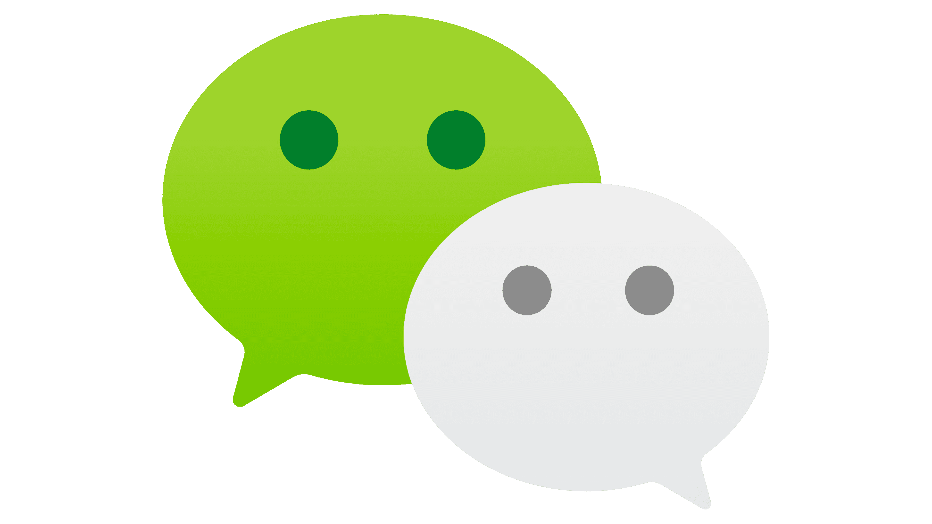
2011 – 2019
![]()
Messenger became available to the target audience in 2011. At the same time, the first version of the logo was also presented to customers. It depicts the same elements as the current version: a verbal inscription that repeats the brand name and the emblem. For the messenger’s name, a modern sans-serif font with rounded corners was chosen. In this case, the letter “e” is superimposed on the “C.” Thus, the logo looks playful and provocative. The first part of the inscription is presented in green and the second in white. The same color palette was chosen for the emblem. It is presented as two dialogue symbols superimposed on each other. Each dialogue depicts two dots, which can be associated with both eyes and a typed message. All of the logo elements, in turn, are contained within a dark gray rectangle that serves as the background.
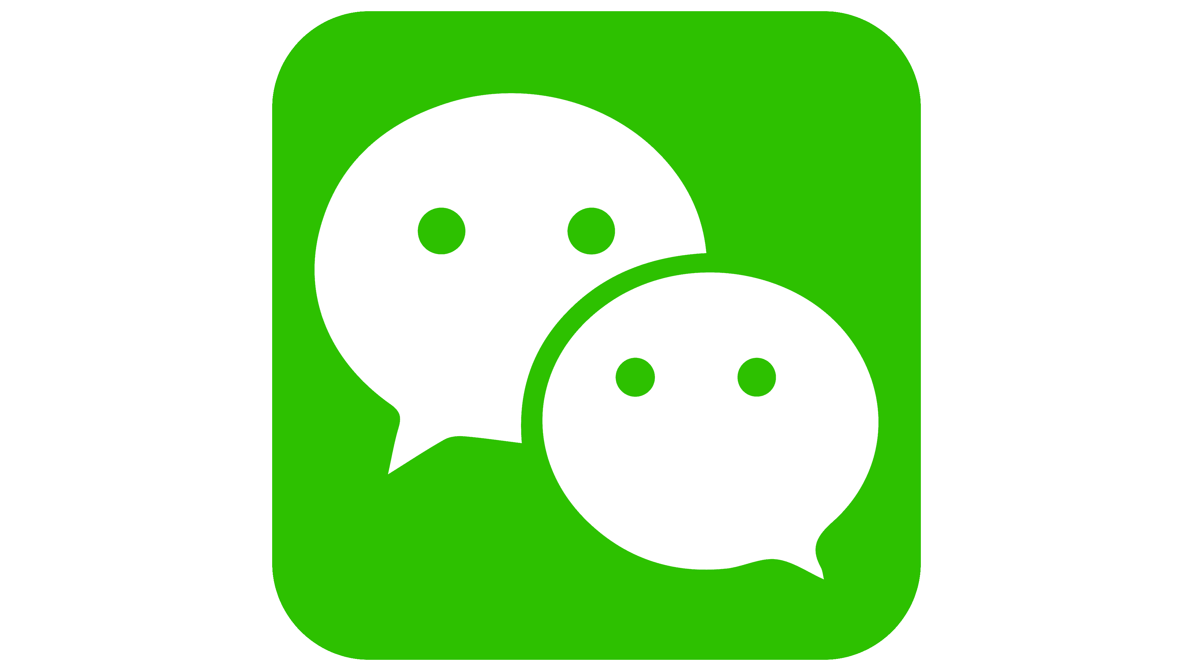
2019 – today
![]()
The 2019 redesign simplified the logo, while retaining all the main elements. At the same time, the background was removed, making the image even brighter and friendlier. The dialog symbols became identical in size to the verbal lettering. The green and white gradients were used to make the emblem more vivid. It is what is used as an icon for mobile applications and personal computer versions. A classic sans-serif font in dark gray with capital “W” and “C” was used for the lettering.
Font and Colors
The modern, unique style used in the first version of the logo was replaced by a simpler, more concise one in the subsequent redesign. At the moment, the logo font is closest to the classic Arial, made with thin lines.
Classic for the logo, WeChat is a green-white color palette. Many people associate green with life and communication, while white is associated with unity. The simplification of the verbal inscription, which is delivered in a single tone in the current version, further motivates users to pay attention to the emblem, the “highlight” of the application, and to a reference to the more famous WhatsApp.