![]() Wegmans Logo PNG
Wegmans Logo PNG
The visually clean, light Wegmans logo serves as a nonverbal invitation to pop into the supermarket to buy groceries. The designers created a neutral emblem so it can be used on signs to draw attention. It has an underlying dynamic that, in this case, embodies positive energy.
Wegmans began in 1915 in Rochester, New York, when John Wegman sold fresh fruits and vegetables from a street cart. On January 30, 1916, he opened Rochester Fruit and Vegetable Company in front of his family home. His brother Walter joined a year later, and the business focused on fresh produce sold at fair prices.
In 1922, the brothers moved to a separate location. They opened a full grocery store with canned goods, a bakery, a fresh-meat counter, and a small café. In 1930, they opened a large flagship store of nearly 1,900 square meters, unusual for food retail at the time. It had a 300-seat cafeteria, refrigerated displays, water misting over produce, candy production, and self-service shopping. In 1931, the company became Wegmans Food Markets, Inc.
Robert Wegman, John’s son, joined the company in 1937. In 1941, the ninth store opened outside downtown Rochester, bringing the chain into the suburbs. During the 1940s, Wegmans fully moved toward self-service and began selling frozen foods. Robert became president in 1950, raised wages across the company, and expanded operations through an egg farm, meat-processing facility, central bakery, and Wegmans Enterprises, Inc.
In 1968, Wegmans introduced its private-label products. In 1974, it became one of the first U.S. grocery chains to use barcode scanning at checkout. The company entered Pennsylvania in 1977, then New Jersey in 1993, and Virginia in 2004. Unlike Kroger and Giant Food, Wegmans expanded slowly, with large stores planned as major destinations. Danny Wegman became CEO in 2005, and Colleen Wegman took over as president and CEO in 2017.
Meaning and History
![]()
The format of today’s Wegmans outlets has changed significantly. Now they are megamarkets that offer a wide variety of products, not only fresh produce but also groceries. Many stores have pharmacies, dining areas, and cafes. In parallel, the identity was updated, but it remained minimalist so the signage would not be visually overwhelming.
What is Wegmans?
Wegmans is a privately owned chain of grocery hypermarkets from the United States that has existed since 1916. It was founded in Rochester. Its headquarters is now located in Gates, New York. The total number of stores reaches 107. The brand founders are brothers John and Walter Wegman.
1971 – 2008
![]()
From the beginning, the family company’s logo was purely textual: it listed only the store names. The lettering was predominantly in lowercase, except for the first one. The glyphs had a sharp overhang on the upper left, and only the “s” had it on the right. Otherwise, the lettering was classic, smooth, bold, and printed. There was no special background.
2008 – today
![]()
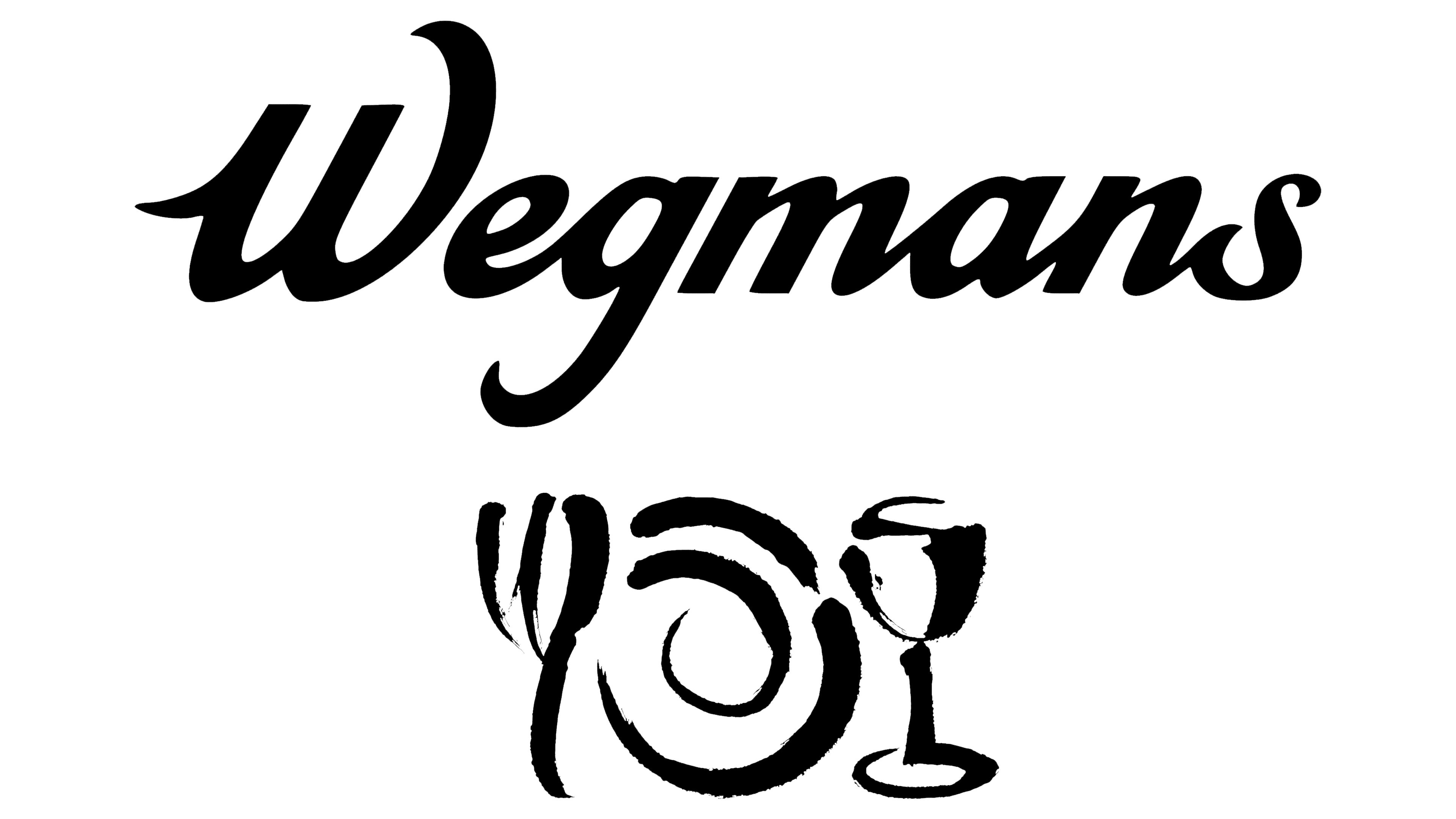
As a result of the redesign, the Wegmans logo got a new style, but it remained textual. It is now italicized, semi-coherent, and calligraphic. The letters have smooth roundings. Only the initial “W,” the “g,” and the “s” retain their sharp protrusions. There is no background, as before: a plain white space is used instead. This is because there is no large informational signage at the megamarkets, only letters above the entrance. The color of the bottom, respectively, depends on the material the wall is made of.
The visual identity of this brand is characterized by simplicity. The hypermarket network’s name is used as a sign. There are no other elements. This concept was chosen when the stores were opened and has never been changed. Only the style of the inscription was changed.
Font and Colors
The first logo used a custom-designed grotesque that resembles Peppermint Regular. In the second one, the designers settled on the italic font, which is calligraphic and smooth. The printed logo’s color palette is monochrome: black letters on a white background. However, in reality, they may differ depending on the wall design where the inscription is located.