The West Atlantic logo demonstrates the unity and cohesive work of the two companies that formed the carrier. A large fleet of airplanes flies to numerous cities to deliver important cargo.
West Atlantic: Brand overview
Originally from Malmö, Sweden, West Atlantic has become a significant force in the air cargo industry. As the holding company for two European cargo airlines, West Air Sweden and West Atlantic UK, the company has made its mark in the industry, cementing its status as a leader in the field.
In the early 1960s, a small air transportation company emerged in the Swedish city of Gothenburg. Initially offering air cab and ambulance services, West Air Transport, West Atlantic’s predecessor, soon expanded its operations to include cargo transportation.
In 1993, West Air Sweden underwent a revolutionary rebranding and restructuring, marking a turning point in the company’s growth.
As West Air Sweden rose to new heights, the company realized the potential for greater success. In 2008, the company began creating a subsidiary, West Atlantic AB, which became the parent company for West Air Sweden and West Atlantic UK.
In 2011, the company acquired the renowned British cargo airline Atlantic Airlines, giving West Atlantic a prominent position in British cargo aviation and expanding its operational capabilities.
Over the past ten years, West Atlantic has continuously invested in modernizing and expanding its fleet. The company operates 22 state-of-the-art aircraft with the latest technology and exceptional payload capacity.
Meaning and History
What is West Atlantic?
It is a European cargo airline based in Sweden and the United Kingdom. It specializes in air cargo and operates scheduled and charter cargo flights throughout Europe. The airline provides reliable and efficient logistics solutions, including express delivery of parcels, mail, and general cargo. The fleet has different aircraft types, including Boeing 737s and ATP freighters, which are well-suited for short—to medium-distance cargo operations.
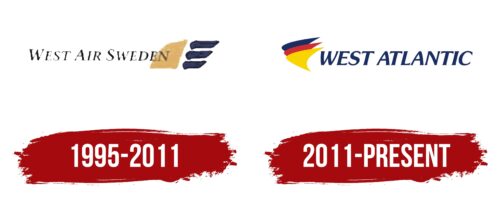
1995 – 2011
West Atlantic, registered from 1995 to 2011, initially used a logo that became the visual identity of one of its founders—West Air Sweden. The central element of this logo was an image of the rising sun, symbolizing hopes for flourishing and a successful future for the company and referring to the unique natural phenomenon of the polar day, characteristic of the northern latitudes where the Sun does not set for several weeks.
This depiction of the Sun emphasized the geographic location of Sweden and metaphorically represented the company’s aspiration to reach new heights in the air transport industry. The use of three blue lines of varying lengths in the logo, resembling wings, emphasized the strength and power of the carrier. These elements symbolize dynamism and might be important for a company specializing in cargo transportation.
The logo depicts West Air Sweden’s airplanes flying high in the sky against the backdrop of the rising sun, enhancing the impact of the entire compositional solution. This design aims to inspire and highlight the company’s ambition to be a leader in the aviation transport sector.
The delicate script of the company name adds lightness and elegance to the overall image. This font is visually light, airy, and practical, emphasizing aerodynamics and a high-tech approach to the airline’s operations. This aspect of the logo is aimed at associating with high-quality service and efficiency, which is critically important for cargo transport.
2011 – today
This cargo airline uses a vibrant blue, yellow, and red logo. These colors fill three curved shapes resembling arrowheads pointing to the left. These shapes also mimic the front of an airplane fuselage. The elements are superimposed on each other, so they are not fully visible. To the right of these shapes is the company name in bold italic type. All letters are uppercase, with slightly elongated ends in the form of miniature serifs.
Multicolored curved shapes give dynamism and symbolize movement and direction, which is quite appropriate for a cargo airline. The bold italic font used for the company name complements these colorful elements, exuding confidence and assertiveness. The slight elongation at the ends of the letters is a subtle detail that creates a layered design.


