The Western Airlines logo has always emphasized its love for America. The brand made a bold mark in the skies over the western lands. Although the range of routes was not extensive, the company provided first-class service.
Western Airlines: Brand overview
Founded in 1925, Western Airlines has played a significant role in connecting the western regions of the United States, cementing its position as a major player in the airline industry.
Western Air Express originated in California and specialized in mail and passenger transportation between Los Angeles and Salt Lake City. This crucial route became the foundation for Western Airlines, which quickly established its presence in the transportation industry.
In the 1940s, Western Airlines pioneered cabin pressurization and all-weather flying, revolutionizing air travel and providing passengers with a safer and more comfortable environment.
In 1959, Western Airlines embarked on an ambitious venture into international transportation with its first transcontinental flight to New York. This began an amazing journey as the airline expanded its network to include popular destinations such as Boston, Washington, D.C., Miami, Mexico City, London, and Nassau.
In 1987, Western Airlines faced financial difficulties that led to its merger with Delta Air Lines.
Meaning and History
What is Western Airlines?
It was a major American airline based in Los Angeles, California. It operated an extensive network of domestic and international flights, connecting the western United States to destinations across the country and routes to Mexico, Canada, and other international destinations. Known for its slogan “The Only Way to Fly,” it is a reliable service and was one of the airlines in the U.S. aviation industry. Despite its success, it eventually merged with Delta Air Lines, and its routes and services were integrated into Delta’s operations.
Old
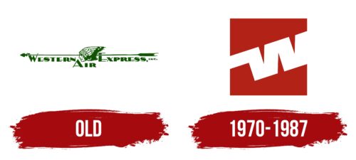
Western Airlines’ first logo deeply respects the country’s native traditions and historical past. The logo is rich in symbolism and cultural references. The central element of the design is an image of a Native American, referencing the rich history of California, home to about 70 tribes. This image serves as a bridge between the past and the present, emphasizing the company’s deep roots in this region.
Feather decorations depicted on the Native American add detail and authenticity to the figure and symbolize a combative and serious demeanor. These elements were traditional for many tribes and used for cultural and ritual purposes to boost warriors’ morale.
A long arrow in the background serves decorative purposes and conveys important characteristics such as speed and purposefulness. This element underscores the company’s dynamism, commitment to achieving goals, and drive to move forward and embrace new opportunities.
The westward orientation of all logo elements is significant, as this direction is associated with the future, exploration, and new opportunities in many cultures. For Western Airlines, which began operating in the western regions of the USA, this orientation emphasizes its commitment to this direction and its ability to meet the needs of a growing market.
The brand name Western Air Express is placed below the images. The emerald shade of the font and design elements is intentionally chosen. It recalls the evergreen giant trees, such as sequoias, cypresses, and pines, which are prominent and distinguished representatives of California’s flora. This color symbolizes vitality and resilience, fitting well with the company’s image, which aims for long-term development and prosperity.
1970 – 1987
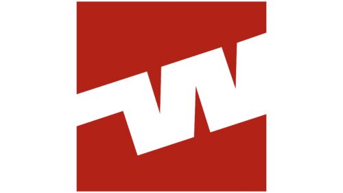
This logo is characterized by its simplicity. The company’s connection to aviation is subtly indicated by the diagonal orientation of the letters, which symbolically “take off,” starting from the middle of the left edge of the red rectangle and ending in the upper right corner. The lettering is a coded abbreviation of the name. The outline of the letter “W” is visible in wide, white curved lines, while the letter “A” is hidden in the central triangle and barely visible due to the lack of a crossbar. The outer sharp protrusions of the letters are trimmed, while the inner ones are retained.
The diagonal orientation of the letters creates a sense of elevation and brings an element of dynamism to an otherwise simple design. The use of red as a background evokes excitement and urgency, which fits well with the aviation theme. The coded acronym adds intrigue, inviting a closer look to decipher the meaning. The absence of a crossbar in the letter “A” and the trimming of sharp protrusions add minimalist details that enhance the overall aesthetic of cleanliness and simplicity.


