


![]() Wide Open West (WOW) Logo PNG
Wide Open West (WOW) Logo PNG
Bright emotions and impressions are contained in the Wide Open West logo. The firm offers more than the user might expect. According to the emblem, he can only admire and enjoy all this diversity.
WideOpenWest, later known as WOW, was founded in Denver in 1996 as high-speed internet was becoming a household need. The company used an “overbuild” model, entering markets where cable monopolies such as Comcast or Time Warner left customers with weak service and high prices.
WOW was incorporated in November 1999. By 2001, it had only about 200 customers in the Denver area, but growth came through acquisitions. That year, it bought Ameritech New Media cable systems from SBC Communications, gaining infrastructure in Michigan, Illinois, and Ohio, along with about 310,000 subscribers.
The deal moved WOW into markets around Detroit, Chicago, Columbus, and Cleveland. During the 2000s, the company competed on price and customer service. At the same time, investors, including Oak Hill Capital Partners, ABRY Partners, and Avista Capital Partners, rotated in and out of ownership. In 2011, WOW and Wave Broadband acquired Broadstripe’s assets. In 2012, WOW bought Knology, expanding its customer base and fiber network. NuLink followed in 2016, adding the Atlanta area. In May 2017, WideOpenWest went public on the New York Stock Exchange, selling 18.2 million shares at $17 each and raising about $310 million.
In 2018, WOW raised speeds to 1 gigabit per second for most customers. In 2021, it shifted toward new fiber builds, selling Cleveland and Columbus to Atlantic Broadband for $1.13 billion and systems in Chicago, Evansville, and Anne Arundel County to Astound Broadband for $661 million. On December 31, 2025, DigitalBridge and Crestview completed the privatization of WOW.
Meaning and History
![]()
The career of the sixth-largest TV and communications service provider did not start as he had hoped. But five years later, there were about two hundred employees on its staff. The company then became active and, in 2001, made its first acquisition by absorbing a competing service. Over the next few years, she bought specialized centers almost every year, expanding her services and increasing her employee base.
In its early years, its emblem was not distinguished by originality, while the name, by contrast, was bright and attractive. Subsequently, an interesting acronym served as the basis for wonderful logos that are hard to miss. In total, there are four personal visual identity marks in the history of this organization.
What is Wide Open West?
Wide Open West is a provider of telephone, internet, cable television, cloud computing, and website hosting services. Sometimes its name is shortened to WOW! to show its affiliation with the entertainment sector. The company entered the telecommunications market in 1996 and initially served only residents of Denver, Colorado. After acquiring Americast, Broadstripe LLC, Knology, and NuLink, it found new customers in more than 20 states.
1999 – 2003
![]()
After the network was optimally established, its emblem immediately stood out, distinguishing it from the backgrounds of many others. The opening version consisted of two parts: graphic and text. An icon of a tilted TV screen represented the first. The yellow frame on a white background contained wide and thin stripes that formed a horizontal rhombus. On the right were two phrases, each occupying two rows. On the top line, the expanded name “WideOpenWest” was written in one piece; each word is capitalized. Below, the small print was marked “Bringing Broadband Home.”
2003 – 2010
![]()
This is a turning point in a telecommunications provider’s work because, in 2003, it switched to Internet services and adopted the legendary logo. The branding symbol was a surprised exclamation composed of the first letters of the old name. The abbreviation “WOW” with an exclamation mark was very large and filled almost the entire space. At the bottom, “Internet and Cable” has been further refined. The phrase was made in black block letters and highlighted with two stripes.
2010 – 2017
![]()
With the acquisition of new services, the company increased its technical capabilities, expanded its service offerings, and entered new areas. She also redesigned it, adding three icons to the well-known “WOW!”: a computer mouse, a TV screen, and a telephone receiver. They symbolized the Internet, television, and telephony. The images were in color and black-and-white. The second row contained the phrase “It’s that kind of experience,” and the third row contained the provider’s domain name.
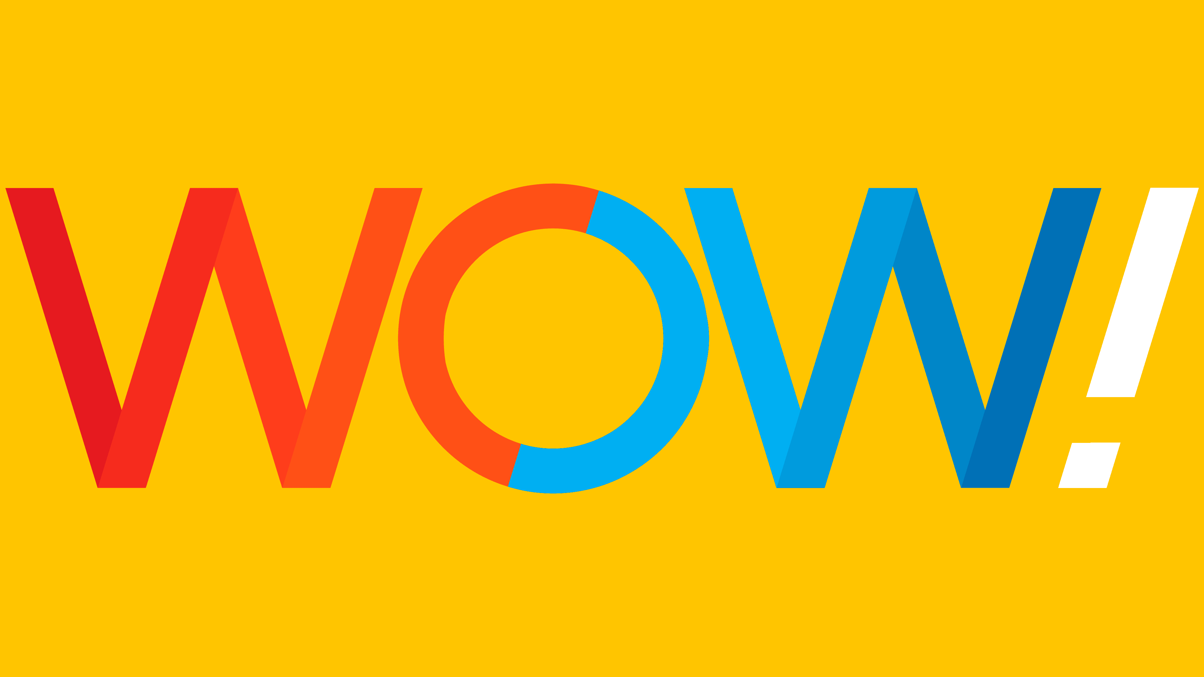
2017 – today
![]()
The modern version of the emblem is the most colorful and memorable. It consists of three large letters, executed in a thin grotesque font. Moreover, the abbreviation has an original color, divided into two parts: the left side is burgundy-scarlet, the right side is sky-cobalt. In both cases, the colors blend smoothly into one another, as they are designed as gradients. The central letter is two-colored. The exclamation point at the end of the name is slanted.
Font and Colors

The evolution of a telecommunications company’s personal sign moved from maximum to minimum. As a result, the short designation “WOW” remained from the expanded inscription “WideOpenWest.” This happened after expanding territorial coverage, when the existing name no longer reflected the services provided. The current logo is the most colorful and attractive of the four options.
Most of the designers used a custom typeface; a sans-serif typeface from the Sans Serif category was chosen. In the early years, Craft Gothic Heavy Condensed Italic was predominant, and then the era of individual symbols came. Now the inscription is smooth, grotesque, executed in lines resembling even ribbons.
The logo’s palette is varied. But earlier it was inclined to monochrome (black or yellow with white); now, almost a rainbow gamut prevails, with all shades of red and blue.