


![]() Wi-Fi Logo PNG
Wi-Fi Logo PNG
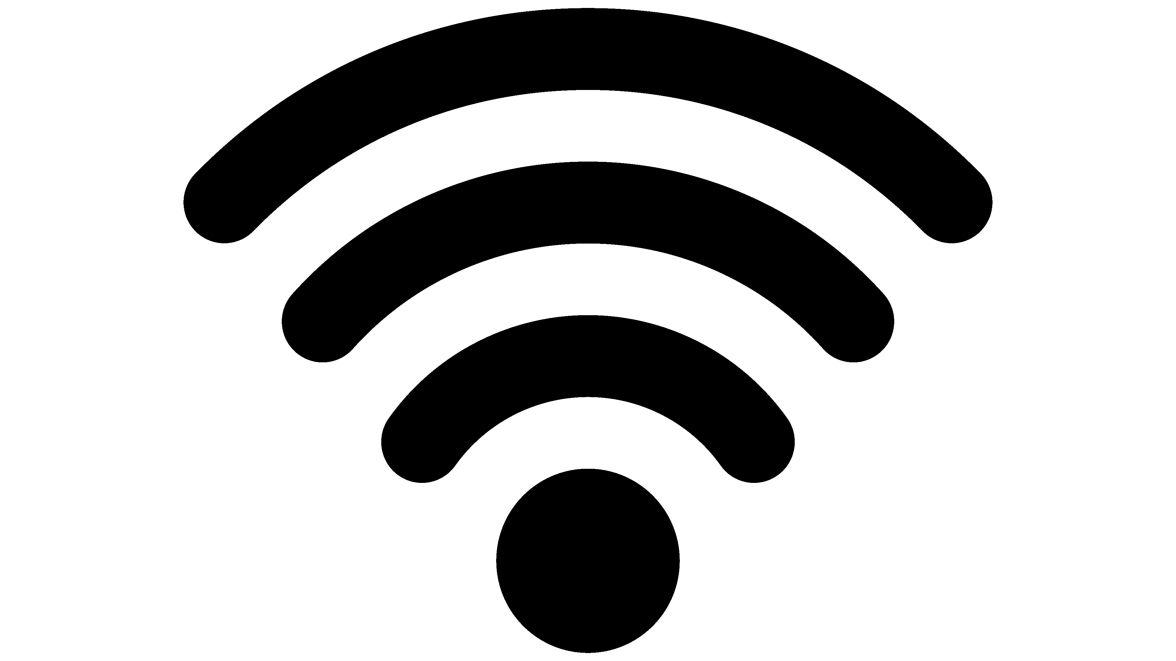
The visual sign reflects the idea of communication, the possibility of communication between two subscribers for data transmission. The Wi-Fi logo shows the point from which the signal propagates to nearby devices. The elements read simplicity and reliability.
Meaning and History
![]()
Wi-Fi appeared in late 1997, developed at the Commonwealth Scientific and Industrial Research Organization (CSIRO) Radio Astronomy Center. The mass launch took place in 1998, when an Australian laboratory in Canberra finalized a new standard for air-to-air communication. The author of the protocol was engineer John O’Sullivan.
And Wi-Fi is a trademark owned by the nonprofit Wi-Fi Alliance. As of 2017, the community had more than 800 companies from all over the world. And in 2019, demand for this communications standard grew so much that shipments of Wi-Fi-enabled devices exceeded 3.05 billion units. In 2021, there were already several versions of IEEE 802 protocols, and their characteristics determine the maximum data exchange and transmission rates. There are bands divided into several channels.
Radio wave data transmission bands work best in line-of-sight areas. Various obstacles, such as poles, appliances, walls, and other obstructions, reduce propagation speed and coverage range. On average, it is about 20 m. Modern access points can achieve a range of up to 150 m outdoors.
The name of the Wi-Fi technology was coined a year after its launch. It was developed by the consulting firm Interbrand at the request of the Wi-Fi Alliance, which wanted a simpler, more memorable, and easier-to-pronounce phrase than IEEE 802.11b Direct Sequence. The branding agency offered 10 options, and Phil Belanger (the founder of the Alliance) chose the term spelled “Wi-Fi.”
Moreover, the resulting word means nothing and is in no way related to the acronym for Wireless Fidelity, but for advertising purposes, the developers exploit this similarity. There was also a reference to the English version “High Fidelity,” which hints at high fidelity and is spelled Hi-Fi. The Interbrand studio also created the Wi-Fi logo. It drew a parallel between the concept of yin-yang (the original cosmogenesis of Chinese philosophy) and the new technology of device compatibility.
The logo shows a complex two-color figure. Its complexity lies in its multi-structure, though it is not immediately apparent given the specific palette. The emblem shows a solid-filled circle with an oval in the background, composed of two halves. The left one is black, like the base; the right one is white, so it is visible against a dark background, unlike the first one.
On them, the name of the digital product is written in a contrasting font, additionally encircled by a frame. So black-on-black is not visible. But, as they say, it is there. It is probably a reflection of the principle of the radio-wave network, with communication over the air: invisible yet real. The two central parts named are reminiscent of the oriental yin-yang symbol, in which the classic dots are replaced by the words “Wi” and “Fi.”
Font and Colors
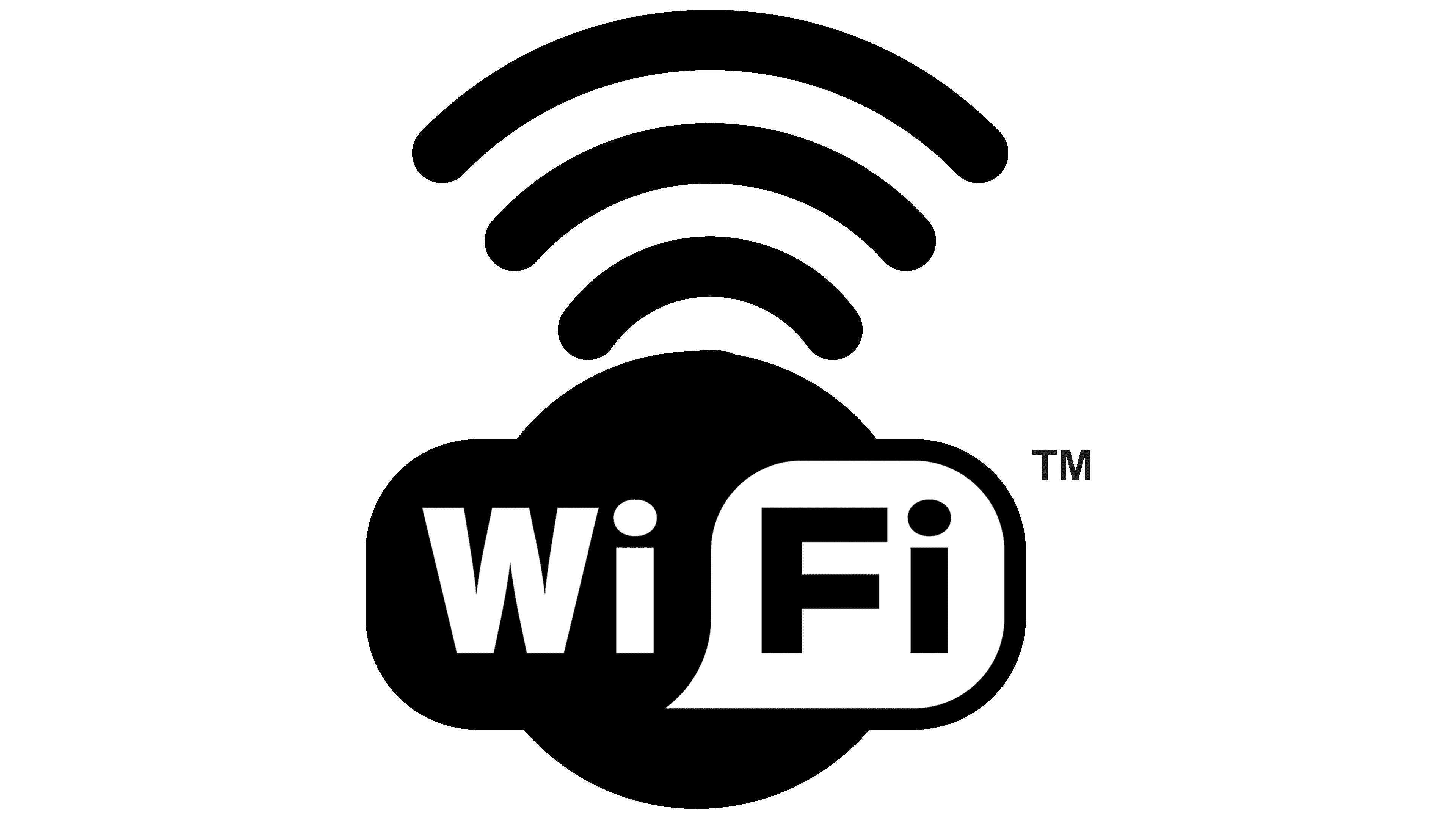
The official logo uses a sans-serif geometric typeface. It is a typographic typeface with an even cut of the upper elements, precise lines, and perfect angles: three sharp (in the letter “W”) and several right angles (in all the other symbols). The emblem’s color palette is monochrome, consisting of black and white.