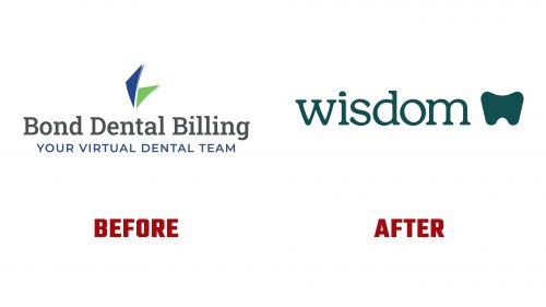
Wisdom, formerly Bond Dental Billing, has rebranded to highlight its innovative dental billing services. Established in 2019, Wisdom offers comprehensive billing solutions for dental practices, using AI technology, proprietary data, and trained professionals to improve the claims process and practice efficiency.
The new logo, designed by A LINE, significantly departs from the old, unremarkable design. It features a clever combination of a tooth icon and the letter “W.” This dual-purpose design symbolizes the dental industry and visually embodies the brand’s name. The tooth icon, stylized to resemble an open mouth, reinforces the connection to dental care.
The wordmark uses the Henrietta typeface, which is playful and warm without being overly whimsical. This choice reflects the brand’s approachable yet professional nature. The letters’ rounded, organic forms complement the overall visual identity, creating a cohesive and inviting look.
Wisdom’s new color palette features soothing shades of teal and mint, chosen for their calming and fresh qualities. These colors stand out in the dental billing industry, providing a sense of tranquility and trust. The palette is designed to appeal to dental professionals and patients, making the brand feel accessible and reliable.
The typography includes ITC Clearface and ABC Marfa to support the wordmark. ITC Clearface’s inviting curves mirror the organic forms in the logo, imparting a sense of practicality and approachability. ABC Marfa adds a touch of sturdiness and charm, balancing the overall design. These typefaces reinforce the brand’s grounded and charming personality traits.
The new identity visually represents the fusion of dentistry and data. This concept is shown through dynamic infographics and charts, all based on rounded, mouth-like shapes. These shapes create expressive visualizations of data, such as charts and graphs, which communicate complex information in an easy-to-understand manner. The use of these graphics highlights the company’s expertise in both dental care and data management.
The logo’s supporting visuals include spot illustrations that complement the infographics. These illustrations can stand alone as iconography when needed, providing flexibility in the brand’s visual communications. The consistent use of rounded forms throughout the design system creates a unified and cohesive visual language.
Wisdom’s new brand identity extends to its digital and physical applications. The updated logo and graphics are prominently displayed across the company’s website, marketing materials, and customer interfaces. The cohesive design ensures the brand is instantly recognizable and conveys its message clearly at every touchpoint.
The soothing color palette and inviting typography in digital applications create a user-friendly experience. The dynamic infographics and charts present data visually engagingly, making it easier for users to understand complex billing information. This approach enhances the aesthetic appeal and improves the functionality of the company’s digital platforms.


