Wish Logo PNG
The Wish logo helps users and manufacturers. The emblem alludes to online interaction enabled by Internet technologies. You no longer need to leave your home to shop. The sign exudes ease and convenience.
Wish is an American online platform for making remote purchases from merchants worldwide. It connects buyers with manufacturers’ representatives, enabling consumers to buy products at factory prices. The service was launched in the summer of 2010 and is managed by ContextLogic Inc. Its founders are Piotr Szulczewski (CEO) and Danny Zhang (former head of the technical department).
Wish originated as a digital app for iOS and Android. Over time, it has become a full-fledged service that lets you personalize purchases without using search. This eCommerce platform aims to connect products directly with consumers and close deals. This lets buyers purchase goods without commissions, bypassing distributors. As a result, more than one million sellers now post their offers on the service.
A former Google employee founded the service, which began as a software company. In its first year of operation, ContextLogic (the name it bore) received more than $ 1.5 million in investment and attracted Yelp’s head, Jeremy Stoppelman, to join. In the spring of 2011, Piotr Szulczewski asked Danny Zhang, a college friend, for help. As a result, the site relaunched under its current name, Wish, which became the basis for the logo.
In the early days, software-enabled consumers created wishlists for the products they needed and only then checked them against offers. But in 2013, sellers were asked to post their options directly in the app, with the service retaining a commission on each completed sale. This is how a full-scale web resource with its own features emerged.
In 2017, the service became the most popular in e-commerce, and its simple logo gained widespread recognition worldwide. Moreover, the emblem appeared alongside the program and fully reflected its essence: the simplicity of concluding purchase and sale transactions at a low price. Most purchases are concentrated in the foreign small-goods segment, weighing up to two kilograms.
Meaning and History
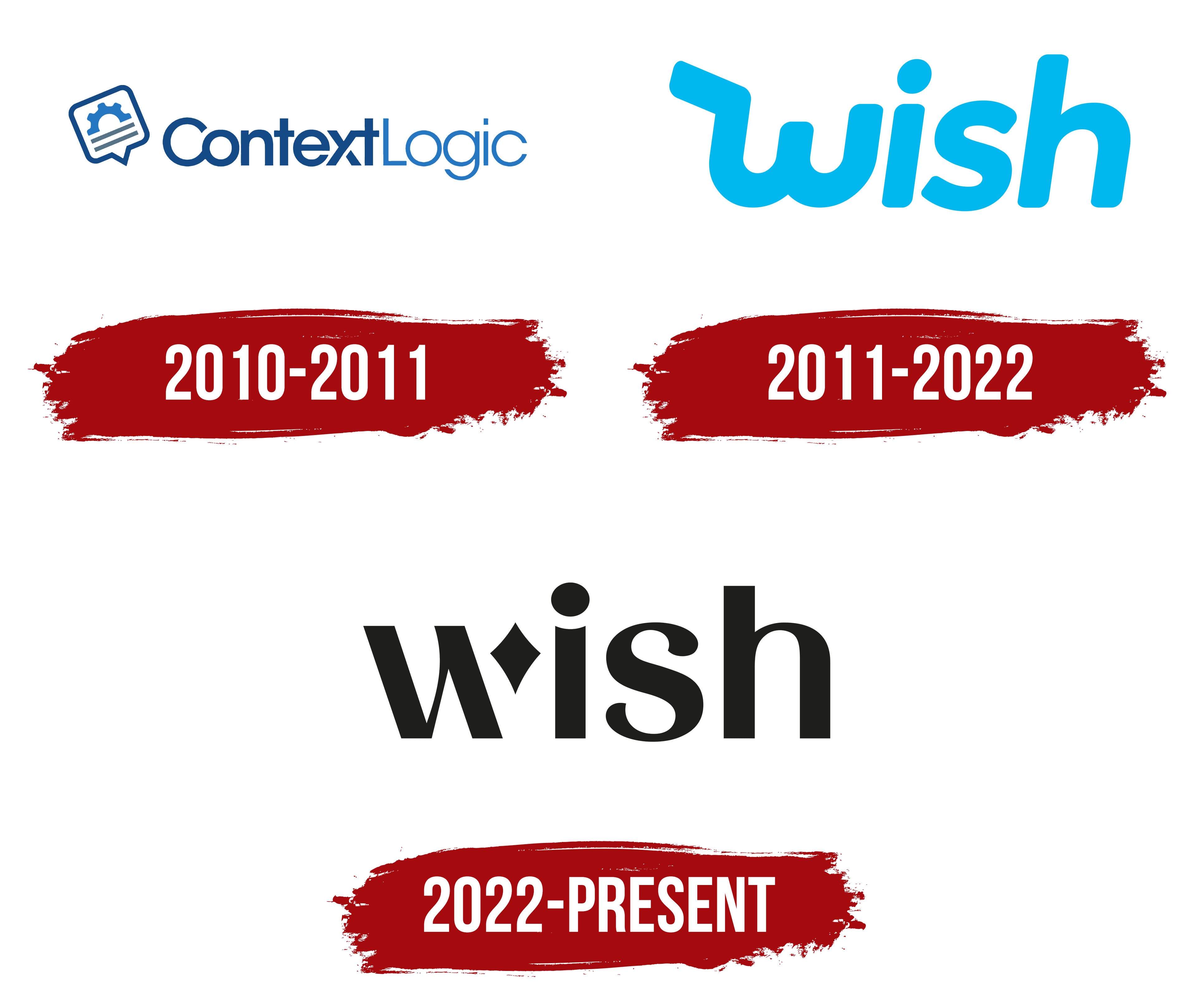
Tracing the history of Wish’s logo changes reveals the platform’s development path. At first, ContextLogic developed various programs. It rendered its name in a stylish navy-blue wordmark. Then the owners wanted to restart the brand and gave it a new name. Thus, the next emblem appeared with a bright blue inscription. Almost ten years later, the marketplace decided to highlight its progress with an improved identity. As a result, the word “wish” was repainted in black. But even with a dark color scheme, the logo looks attractive because the designers used an unusual font and complemented the letters with a stylized diamond-shaped star.
What is Wish?
Wish is an American online platform that lets sellers list products and buyers find and purchase what they need. At the same time, the platform does not store products in warehouses; it only acts as an intermediary between the two parties in e-commerce. The company was founded in 2010 and, as of 2022, is owned by ContextLogic Inc.
2010 – 2011
ContextLogic initially replaced Wish. A former Google engineer founded it in 2010, and it focused on creating software. In this regard, its logo featured a half-gear over two gray stripes, symbolizing lines of text typed on a computer. These elements were inside a white callout tilted to the left. Its outline and gear fragment were blue but in different hues.
To the right of the emblem was the brand name. Designers visually divided it into two parts using different colors and fonts. For the first half (“Context”), they used dark blue, bold sans-serif; for the second (“Logic”), thin, light blue sans-serif letters. Some glyphs looked non-standard. For example, “x,” which, due to the through hole, looked like a “y” with a stripe drawn in the corner. The developers connected the “x” to the next “t” and the “C” to the “o.”
2011 – 2022
In 2011, ContextLogic was relaunched as Wish. The name conveyed a new marketplace that let customers create wishlists to compare the same product from different sellers. The logo contained a blue “Wish” written in bold italics. The designers used a bubble font that hints at lightness and friendliness.
The Internet service identity is presented in two formats:
- A full-fledged logo
- Consisting of text
- A truncated icon formed from the name of the company
The official emblem contains the single word “wish.” It is made in a semi-handwritten style: the first letter is handwritten, and the rest of the characters are printed. In this case, all characters are lowercase. The letterforms combine an individual typeface with a classic sans serif.
The brand name includes an initial handwritten “w” with a distinctive stroke on the left side. The lines are smooth, streamlined, and free of breaks, corners, and sharp transitions.
For the logo of the commercial and sales service “wish,” the designers chose a typeface that, in parts, resembles the Neutro Heavy Italic by Durotype and Axiforma Black Italic by Kastelov.
The logo’s predominant color is blue (# 2ab8ec). In the main version, it colors the wordmark and the icon background. An additional color is neutral white, with light blue lettering visible.
2022 – today
In August 2022, Wish launched the first stage of its rebranding. This process started with a new logo, completely different from the previous one. Of course, it still contains the name of the online platform, but now there is no trace of the usual pale blue color and rounded letters. The developers made the inscription black because minimalism is fashionable and added more angles to the font. If you believe in the original idea, these radical changes should have reflected Wish’s progress, as the company has recently begun actively developing, improving the interface, and introducing additional functions.
As a result of the redesign, the Wish logo has become versatile and memorable – primarily due to the letter “w.” It consists of two diagonals connected by a thin, uneven line and a separate rhombus with concave sides. The rhombus, in this case, represents a four-pointed star – a symbol of light, good luck, victory, and career growth. The other glyphs also have an unusual design. For example, the “i” has a semi-circular cut at the top of the vertical stripe, while the “s” looks elegant and balanced despite the asymmetry.
Font and Colors
The inscription in the new Wish logo has many distinctive details because it was not set in a standard font but in individual glyphs. The designers experimented with the letterforms, combining smooth curves, sharp points, and right angles. At the same time, it turned the “w” into a two-piece design that could be adapted for future promotions. As for the color scheme, nothing stands out. The bright blue hue has been replaced by a deep black, reflecting the trend toward minimalism.