WIX Logo

WIX LogoWIX Logo PNG

The platform contains a seed that allows you to grow a real website. Convenient and well-thought-out templates combine to form a harmonious web page space, similar to how smooth letter elements come together in the Wix logo.

WIX: Brand overview

The cloud platform Wix allows you to create HTML5 web pages without any coding experience. It offers universal free templates aimed at entrepreneurs and ordinary users. Paid features go beyond the basic service: connecting the site to your domain or increasing storage is only possible for a fee.

Wix was founded in 2006 in Tel Aviv, Israel, by Giora Kaplan, Nadav Abrahami, and Avishai Abrahami. The idea for the company came when the founders encountered difficulties while creating a website for a previous venture. This experience inspired them to build a platform that would simplify website development.

In its early days, the team focused on developing tools allowing users to create professional-looking websites without programming knowledge. The team worked on building a library of templates and creating a user-friendly interface.

A major milestone for the company came in 2008 when the platform launched a beta version of its Flash-based website builder. While this allowed users to create visually appealing websites, it presented challenges related to mobile compatibility and search engine optimization.

In 2009, the company secured its first significant investment—$3.5 million—from Bessemer Venture Partners and Mangrove Capital Partners. This funding enabled the team to expand and accelerate product development.

Between 2010 and 2011, the platform grew significantly, reaching 10 million users. This demonstrated the demand for its services. The company began localizing the platform so that different languages and countries could expand globally.

2012, a major technological shift occurred when a new platform version based on HTML5 instead of Flash was introduced. This transition improved website compatibility with mobile devices and search engines.

In 2013, the company had a historic year with a successful IPO on the NASDAQ, raising $127 million. This influx of funds supported further development and marked the company’s debut as a public entity.

The platform continued to enhance its services in 2014–2015, launching an App Market, which allowed third-party apps to be integrated into websites and introducing a dedicated platform for musicians.

In 2016, the company introduced ADI (Artificial Design Intelligence), a groundbreaking tool that uses AI to automatically create personalized websites based on user input.

In 2017, the platform launched a tool for web app development, later renamed Velo, allowing more advanced users to build complex websites using JavaScript.

The ecosystem continued to expand in 2018 and 2019 with the introduction of a payment processing system and an AI-driven logo creation tool.

Despite the global economic challenges of 2020, the company continued to grow and innovate, launching Editor X, a sophisticated web design tool aimed at professional designers and developers.

In 2021, new milestones were achieved through a partnership with Vistaprint to expand market share among small businesses. The company also introduced a comprehensive solution for large brands and organizations.

In 2022, the focus shifted to enhancing e-commerce capabilities and improving the user experience. New features for online stores were introduced, and mobile development tools were strengthened.

By 2023, the platform had millions of users and had become one of the world’s leading website-building services. The company continues investing in technological advancements, including machine learning and artificial intelligence, to streamline website creation and management.

The company has faced challenges throughout its history, including intense competition in the website-building industry, the need to constantly adapt to new technological trends, and changing consumer demands. However, thanks to its focus on innovation and user-friendliness, the company has become a leader in its field, continually expanding the possibilities for users to create and grow their online presence.

Meaning and History

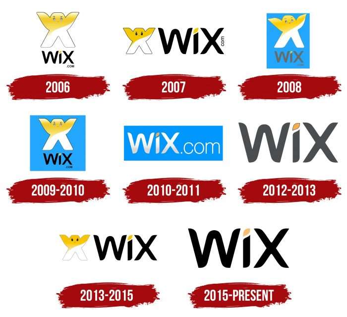
WIX Logo History

The company was founded in Israel by three entrepreneurs working on another startup. They realized how time-consuming creating web resources is and launched their website builder. Wix’s main idea is freedom of expression. Moreover, the platform provides this to others and follows this principle, as seen in its bright and diverse logos.

What is Wix?

Wix is an Israeli software company registered in the USA. It develops software for creating web resources based on cloud technologies. It was founded in 2006 by Giora Kaplan, Avishai, and Nadav Abrahami. The company’s headquarters is in Tel Aviv, with additional offices in 12 countries, including Canada, Japan, Ukraine, Germany, and others.

2006

Wix Logo 2006

In 2006, Wix introduced a recognizable symbol: a character in the shape of the letter “X.” It had raised arms, widely spaced legs, and a schematic face: eyebrows, gray eyes, mouth. Above the word “WIX” was a white-yellow creature with a black outline. Just below, aligned to the right, was the site’s “.com” domain. The dot over the “I” looked like a yellow pointed ellipse.

2007

Wix Logo 2007

A year after the service launched, designers changed the logo design. They changed the color of the man’s eyes and moved the name to the right. The domain “com” without a dot was placed vertically after the word “WIX.”

2008

Wix Logo 2008

The anthropomorphic character’s eyes are grey. One arm is slightly bent; the head is turned to the right. Below is the site’s grey name. The background is a blue rectangle.

2009 – 2010

Wix Logo 2009-2010

The X-shaped creature looks straight ahead. The inscription becomes black, and the blue rectangle becomes a blue square.

2010 – 2011

Wix Logo 2010-2011

The logo developers removed the little man and left only the white site name Wix with the domain “com” after the dot. It was, as before, placed in a blue rectangle.

2012 – 2013

Wix Logo 2012-2013

Designers removed the blue background to add a gradient reflection to the inscription at the bottom. Moreover, they removed the .com domain and repainted WIX in grey.

2013 – 2015

Wix Logo 2013-2015

The Wix logo, which emerged between 2013 and 2015, represents an updated version of the original design from 2007. At the center of the emblem is the recognizable symbol—a stylized “X” with a smiling face, making it friendly and memorable for users. The yellow color at the top of the “X” symbolizes creativity and energy, while the white at the bottom signifies purity and simplicity, directly aligning with the company’s philosophy.

Yellow is often associated with positivity and innovation, reflecting the service’s mission to make website creation accessible to everyone. The white hints at the platform’s ease of use, allowing even beginners to set up a site quickly and effortlessly.

The font of the visual mark is equally minimalist and modern. The black text next to the “X” symbol contrasts and emphasizes the brand’s seriousness while maintaining its approachable image. Uppercase and lowercase letters make the logo easy to perceive, balancing playfulness and professionalism.

2015 – 2023

WIX Logo 2015

This logo, introduced in 2015, marked the company’s shift towards minimalism and brand maturity. It symbolized a significant stage in the company’s growth as it fully transitioned to a more refined and straightforward visual style. The main change was removing the cartoon-like “X” symbol with a face, which had made the previous versions of the emblem more playful and casual. The new logo became more serious, emphasizing the company’s growth and its aim to attract a broader range of professional users.

The font remained rounded and modern, reflecting the technological nature of the platform while still being friendly and accessible. The color palette underwent some changes as well. Most of the visual mark is now presented in a formal black, but the dot above the letter “i” has been changed to a bright yellow, adding a touch of playfulness and freshness. This element symbolizes creativity, freedom, and the possibilities the company offers its users.

This version of the logo underscores the company’s readiness for new challenges, representing its evolution from a startup with a more playful image to a serious international platform for website creation.

2023 – today

WIX Logo

The Wix logo has undergone further changes, becoming even more minimalist, reflecting the company’s commitment to simplicity and professionalism. In the new logo, the dot above the letter “i” has been completely removed, making all the letters uniform in style and size. Now, the logo is presented in all uppercase, giving it a more formal and solid appearance. This shift reflects the company’s new stage of development, as it has firmly established itself as a major player among website creation platforms.

The letters “W” and “I” in this visual mark feature softer, rounded edges, which give the logo a sense of modernity and openness. Interestingly, the letter “X” has slightly less rounded corners than the first two letters, adding a touch of dynamism and emphasis at the end of the word. This subtle change creates balance and a sense of completeness.

The color scheme remains simple and formal — black emphasizes the company’s professionalism and seriousness. This signifies that Wix is now targeting professionals and businesses, offering high-quality services for website creation.

The new logo symbolizes the company’s maturity and readiness to work with many clients, including large businesses and web design and development professionals.

WIX: Interesting Facts

Wix.com Ltd. is a website that allows people to easily create their own websites and mobile sites without knowing much about computers.

  1. How It Started: Avishai, Nadav, and Giora, three Israeli guys, started Wix in 2006 because they had trouble creating a website for another project. They wanted to create something that would allow anyone to create a cool website easily.
  2. Going Public: On November 5, 2013, Wix became a public company, meaning people could buy shares on the NASDAQ stock exchange. This was a big deal for Wix because it helped them grow even more.
  3. Lots of Users: Wix became popular, starting with just a few thousand users and now having millions of users worldwide. This shows that many people want an easy way to make websites.
  4. So Many Choices: Wix has hundreds of templates, which are like starting points for your website. This means you can pick one you like and change it to make it your own.
  5. Smart Website Making: Wix has a cool tool called ADI, which stands for Artificial Design Intelligence. It asks you questions and then makes a website based on your answers, complete with pictures and text.
  6. Wix App Market: This is like a store where you can buy extra tools to add to your website, such as ways to sell things, share on social media, or book appointments.
  7. All Around the World: Wix is based in Tel Aviv, Israel, but it has offices in many countries, which allows it to help people from all over make websites.
  8. For Coders Too: Wix isn’t just for people who don’t know how to code. They have a platform called Corvid for people who know how to code so they can make even more advanced websites.
  9. Helping You Learn: Wix offers many tutorials, webinars, and forums where you can learn how to do cool things with your website.
  10. Everyone Can Use Wix: Wix works hard to ensure everyone, including people with disabilities, can create websites using its platform.

Font and Colors

Wix Emblem

The old Wix trademark had a proprietary yellow-white “humanoid” symbol. But the current version has no place for it: the emblem contains only the inscription. The “com” addition, used periodically, is now also absent. The evolution of the identity went towards a simplification: each year, extra elements were removed to focus attention on the word “WIX.”

The logo font has no analogs, as it was created from scratch for the website builder. The design is built on contrasts: the sharpness of the lines combined with smooth curves and black letters with a yellow elliptical dot over the “I.” There is also a dark grey version with “.com” and a completely black emblem without adding yellow.