


![]() Wonder Woman Logo PNG
Wonder Woman Logo PNG
The Wonder Woman logo embodies strength, speed, self-defense, and a commitment to goodness and justice. It symbolizes a woman with extraordinary abilities, equipped to inspire and ready to amaze the world.
Wonder Woman is a fictional character from DC Comics and a founding member of the Justice League. Her identity is Princess Diana of Themyscira, rooted in Greek mythology and the Amazon society. She was created in 1941 by William Moulton Marston. The debut appeared in All-Star Comics #8 in October 1941, during World War II. Marston aimed to introduce a heroine who combined strength with ideals of equality and care.
In 1942, the character received a standalone series. Early stories, drawn by H. G. Peter, addressed themes of authority and emancipation. After Marston died in 1947, Robert Kanigher revised the tone toward a more conventional storytelling style.
During the 1950s and 1960s, declining interest in superheroes affected the series. The character later regained abilities and visibility during the genre’s revival and returned to the Justice League roster. In 1972, Wonder Woman appeared on the cover of Ms. magazine, aligning with feminist discourse. Her origin and powers were revised to match contemporary expectations.
In 1987, George Pérez relaunched the series, strengthening mythological elements. In the 1990s and 2000s, writers like Greg Rucka and Gail Simone expanded their narrative range. In 2011, The New 52 reboot presented her as the daughter of Zeus. In 2016, Gal Gadot portrayed the character in Batman v Superman, followed by a solo film in 2017 directed by Patty Jenkins. A sequel was released in 2020.
Meaning and History
![]()
Wonder Woman was created by American psychologist William Moulton Marston (alias Charles Moulton) and artist Harry G. Peter. The artistic image was based on Marston’s wife, Elizabeth Holloway Marston, and their friend, feminist Mary Olive Byrne. The character’s drawing style has constantly changed, as has the emblem.
What is Wonder Woman?
She is the superhero alias of Diana Prince – a girl with superhuman agility, combat skills, invulnerability, super strength, and the ability to fly. This character first appeared in the 8th issue of All-Star Comics in 1941.
1941 – 1942
![]()
1942 – 1949
![]()
1949 – 1959
![]()
1959 – 1969
![]()
1968 – 1972
![]()
1972 – 1981
![]()
1981 – today
![]()
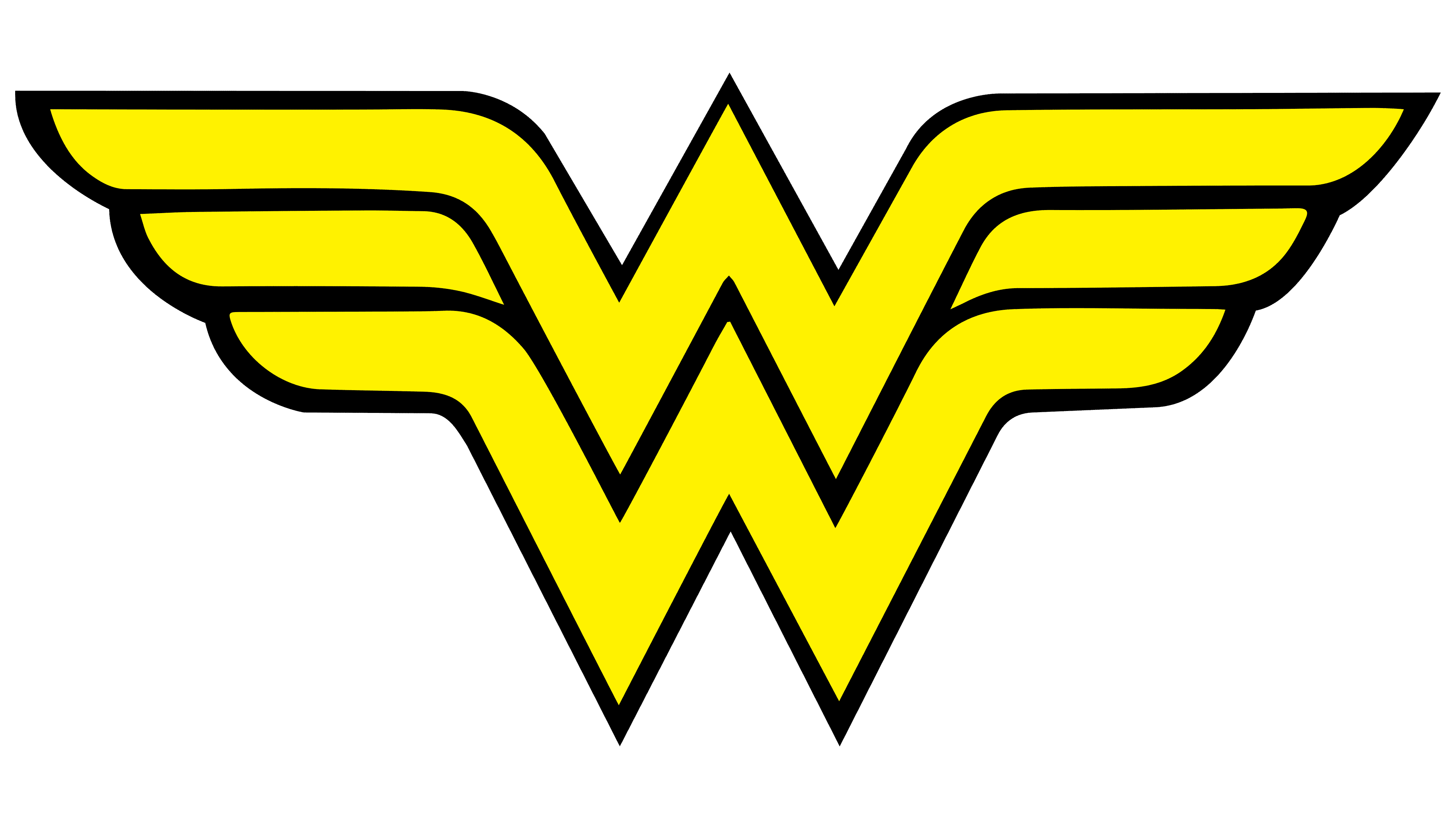
The logo, created by artist George Pérez in 1981, marked a new era for the heroine, reflecting changes in her image and symbolism. Designed forty years after Wonder Woman’s first appearance, Pérez took the original “WW” abbreviation and gave it sharp, geometric contours. Departing from the classic feminine monogram, he crafted a winged symbol from the intertwined letters.
This emblem stands out for its sharp lines and modern design, embodying the heroine’s strength and dynamism. The wings symbolize freedom and the pursuit of higher ideals. The logo is presented in several color variations: light versions feature dark separating lines, while dark versions have the opposite, creating a striking visual contrast.
Interestingly, during the “Infinite Crisis” event from 2005-2006, the heroine also adopted a glowing belt that echoed the shape of this logo. This symbol became integral to her image for many years and remains relevant today.
The strength, determination, and independence expressed in this design have become key traits that make Wonder Woman and her symbolism so significant in the superhero world.
1994
![]()
1995 – 1998
![]()
1998 – 2006
![]()
2006 – 2011
![]()
2011 – 2016
![]()
2016 – today
![]()
The logo created for Batman v Superman: Dawn of Justice and Justice League has become an iconic symbol in modern cinema. It features two stylized “W” letters overlaid, symbolizing the heroine’s power and duality as both Diana, the Amazonian princess, and Wonder Woman, the warrior fighting for justice.
The logo is designed in a clean and minimalist style, devoid of unnecessary decorative elements. The broad lines and rectangular shapes lend a sense of seriousness and strength, reflecting the protagonist’s combative nature. The gold color emphasizes grandeur and nobility, aligning with Diana’s image as someone from an ancient, powerful Amazonian civilization. The metallic sheen of the emblem evokes associations with durability and resilience, qualities intrinsic to the warrior’s character.
Font and Colors
According to the artist who created the Wonder Woman emblem, it represents an original combination of the abbreviations. This technique proved creative and lasted for many years: all subsequent logos were built around the “W” and the eagle.
The words are arranged on two levels and written in a strict geometric font in uppercase. The letters are wide, with large serifs and red shadows to create a 3D effect. The “A” and “E” crossbars look like miniature triangles.
The logo’s palette has always included bright yellow and several shades of white, black, and gold.
FAQ
What is the Wonder Woman Logo?
The Wonder Woman logo is called Stacked W. It looks like two “W” letters stacked together. Their side parts are stylized as bird wings, and the upper pointed part has a protrusion resembling an eagle’s beak.
What is Wonder Woman’s Battle Cry?
Wonder Woman’s battle cry takes various forms, including the most famous exclamations, such as “Spear of Athena!” “Trident of Neptune!” “Shadows of Pluto!” “Thunderbolts of Jupiter!” “Great, Hera!” “Suffering Sappho!”
Why is Wonder Woman an Icon of Feminism?
Historian Tim Hanley first expressed this idea. In his opinion, Wonder Woman’s new role symbolizes equality and sisterhood, and her image no longer embodies female superiority.
How Old is the Wonder Woman Logo?
The first Wonder Woman logo appeared with her in the early 1940s. However, the symbol only acquired its letter form in 1980. As for the modern version, it has been in use since 2006.