


![]()
Workday, known for its enterprise cloud applications for finance and human resources, has introduced a new logo and refreshed brand identity crafted by the London-based creative agency Koto. This update reflects how Workday has grown and focuses on creating a more dynamic, people-centered experience—both in its services and visual identity. While the new look keeps some familiar elements, it brings bold changes that align with the company’s growth and future goals.
The biggest change is the redesigned arch, a key feature that’s been part of the brand’s look for years. In the original logo, the arch was a thin, simple orange curve meant to represent a rising sun—a nod to optimism and new beginnings, much like starting a productive workday. While friendly, the design felt a bit understated.
![]()
In the new version, the arch is bolder and thicker, filled with a vibrant gradient of orange tones that bring a sense of energy and forward motion. The gradient shifts from deep orange to a lighter hue, suggesting warmth, progress, and a spirit of innovation. This time, the arch isn’t floating independently—it flows seamlessly from the right side of the lowercase “w” in the company name. This connection adds a sense of movement and growth, reflecting the organization’s focus on adaptability and transformation.
The old logo used a light, rounded sans-serif font that felt approachable and friendly. While simple, it didn’t carry the visual weight of a brand leading in the global enterprise space. The new font is bold, geometric, and more structured, with thick, balanced strokes that give it a confident presence. The clean, modern letterforms still have softened edges, balancing professionalism and warmth.
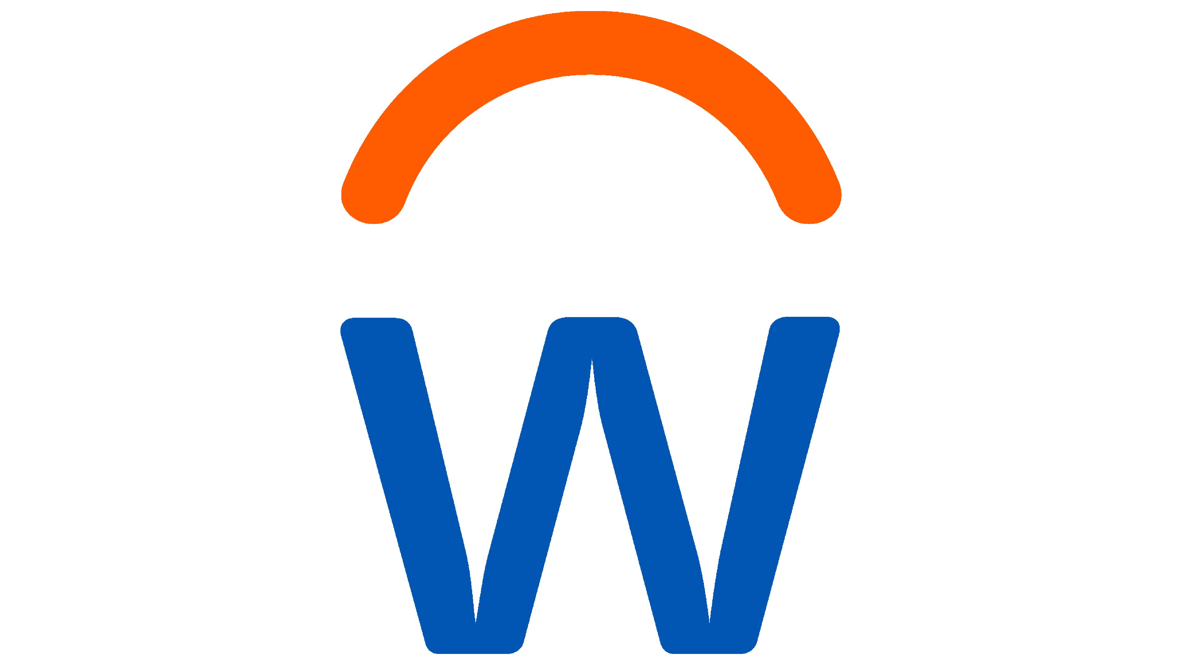
The wordmark’s blue is brighter and more vivid, making it stand out and complementing the arch’s energetic orange. This vibrant blue-orange combo reflects the company’s progressive mindset while evoking trust, reliability, and positivity—important qualities in the world of business software.
Beyond the logo, the new visual system includes gradients, soft geometric shapes, and an updated color approach. The palette is inspired by the natural flow of a typical workday, with cool tones suggesting calm focus and warm hues representing energy and collaboration. This range of colors moves away from the standard corporate blues often seen in enterprise software, creating a friendlier, more inclusive feel.
![]()
Subtle animations and transitions reflect the rhythm of modern workplaces. The arch isn’t just a static graphic anymore—it can stretch, shift, and interact with other visual elements in digital spaces, highlighting the platform’s flexible and tech-savvy approach.
The refreshed logo and visual style represent Workday’s commitment to helping people thrive at work and showcase its role in shaping the future of work through technology, data, and human-centered solutions.