


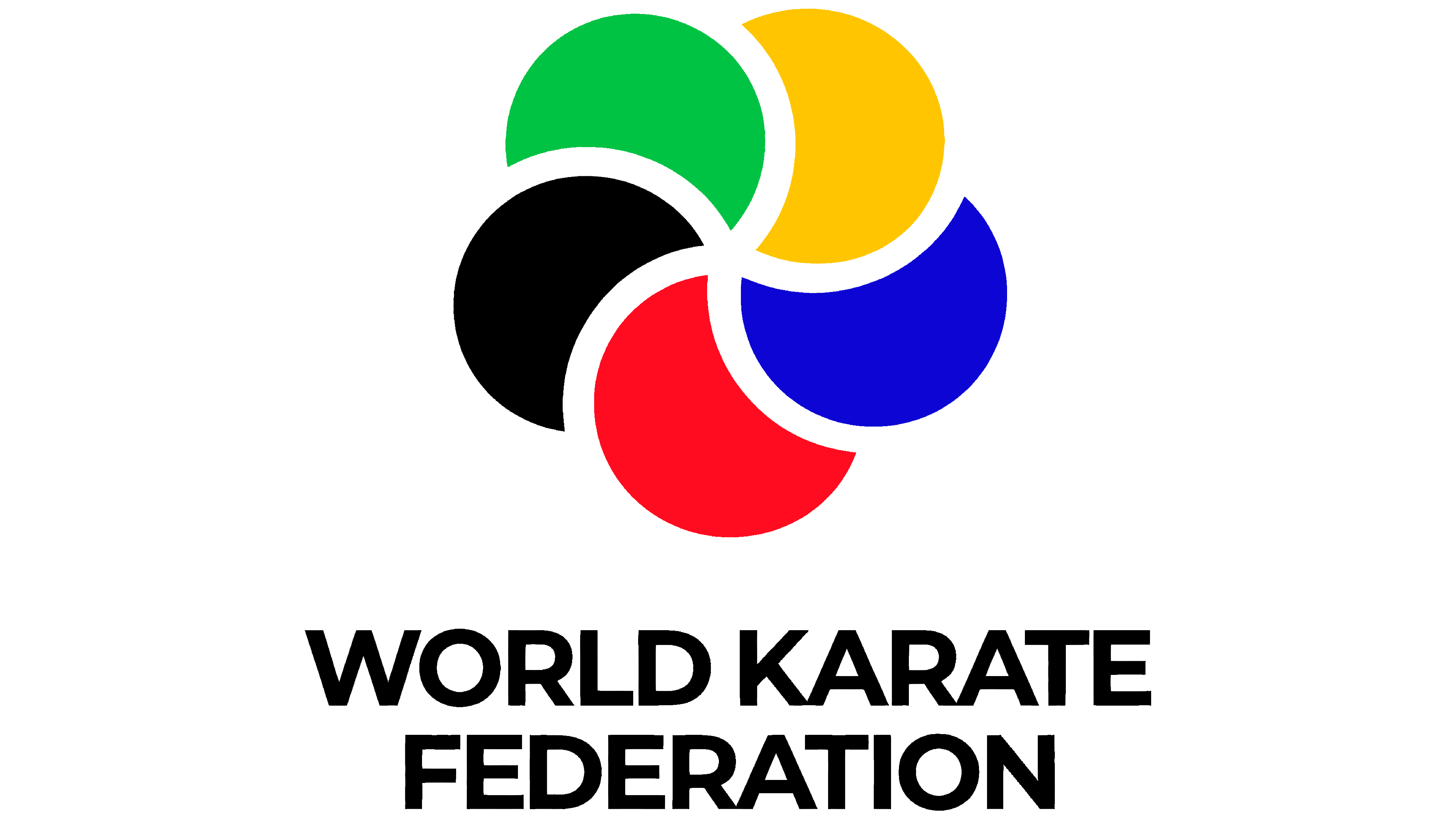
The World Karate Federation (WKF) unveiled an updated style created by Ogilvy Spain. The rebranding aims to strengthen the organization’s international image and adapt it to the digital environment.
The new WKF logo is composed of five circular segments, each divided by a white line. Previously, the circles intersected and merged into a single shape, but now they have gained independence. The red, green, blue, yellow, and black colors remain unchanged and symbolize the equality of the federation’s member countries. The circular form was chosen for its universality and for the balance and control it conveys in martial arts.
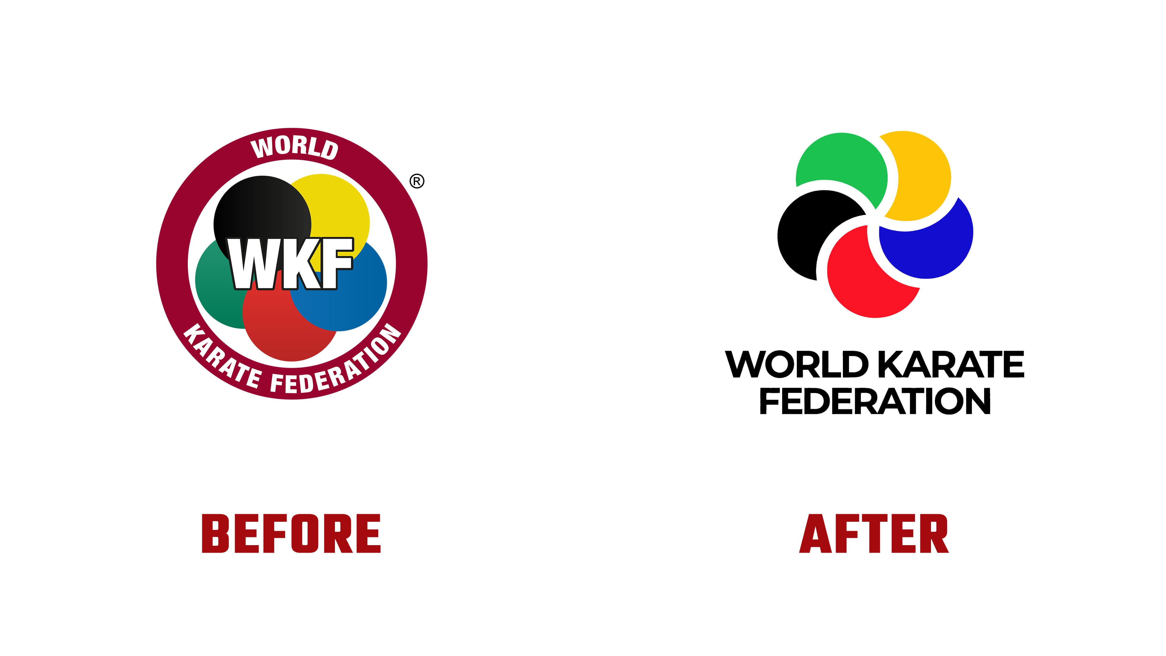
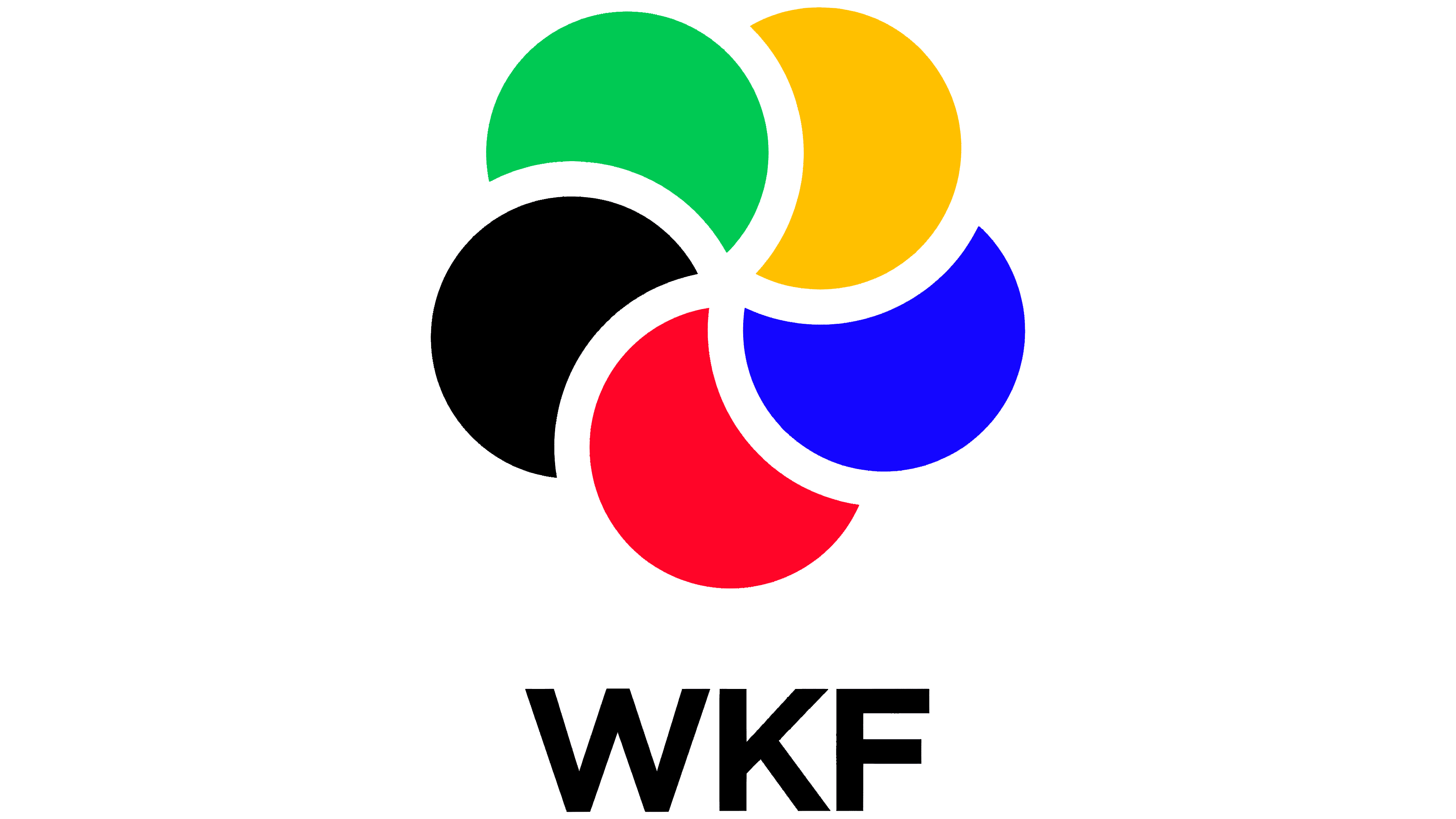
The WKF abbreviation was placed beneath the main symbol in a simple, functional typeface. This improved the logo’s legibility at small sizes and on digital screens during competitions.
The identity update is the result of an analysis of the brand’s current position and an examination of opportunities for its development. The main criterion during the work was the need to combine modernizing the federation’s image with respect for traditional karate values, such as discipline and the pursuit of mastery.
The new identity has already begun to be implemented across platforms and is being used in event branding and audience communications. The federation expects that the updated image will increase its appeal among a new generation of athletes and spectators and strengthen karate’s position on the international sports stage.
