


![]() World of Warcraft Logo PNG
World of Warcraft Logo PNG
There is magic in the World of Warcraft logo. The task of the sign is to evoke a sense of mystery, unknown worlds, and fantastic characters in the players. The emblem looks like a sign at the entrance to the ancient city. Take a step and find yourself in an amazing, magical place.
The history of World of Warcraft began with earlier titles from Blizzard Entertainment. In 1994, Warcraft: Orcs & Humans launched the Azeroth setting, followed by Warcraft II and Warcraft III. By the early 2000s, the franchise had an established audience and detailed lore.
On September 2, 2001, Blizzard announced World of Warcraft at ECTS. The project aimed to expand the MMORPG genre beyond niche titles like Ultima Online and EverQuest. Development lasted about four to five years using a modified Warcraft III engine.
The game was released on November 23, 2004, in North America, Australia, and New Zealand. In the early weeks, server instability and login queues occurred due to demand. Europe followed on February 11, 2005. Competing with EverQuest II, WoW quickly pulled ahead in terms of audience size. At its peak in 2010 during Wrath of the Lich King, subscriptions exceeded 12 million. Expansions such as The Burning Crusade in 2007 and Wrath of the Lich King in 2008 added new regions, systems, and classes, with strong launch sales.
After 2010, the subscriber base declined. Cataclysm reduced the numbers to about 10 million. Mists of Pandaria in 2012 and Warlords of Draenor in 2014 faced a weaker reception, with subscriptions dropping to 5.5 million by 2015. Blizzard stopped publishing figures. On August 26, 2019, WoW Classic launched, recreating the 2004 version and drawing large queues. In December 2007, Blizzard was acquired by Activision Blizzard. In October 2023, Microsoft completed its acquisition of the publisher.
By 2024, Blizzard had released eleven major expansions, including The War Within, with Midnight announced for 2026.
Meaning and History
![]()
Since its activation, many versions of the extension have been released. Each of them is bright and memorable, thanks to the original emblem. She opens the entrance to the wonderful world of fantastic adventures with an eternal confrontation between the forces of good and evil. Currently, fans of this game know nine logos that emphasize the next online version’s features. They are like a pass to the fantasy universe, a magic gateway to a fabulous space with its own rules of life. All options directly reflect the game’s content.
What is World of Warcraft?
World of Warcraft is an online game, also known as WoW. It attracts millions of fans worldwide. It is an MMORPG where players can create characters, interact with others, gain experience through battles, complete quests, and explore virtual worlds. WoW was developed by Blizzard Entertainment and was released in 2004. It later had several expansions.
2004 – today
![]()
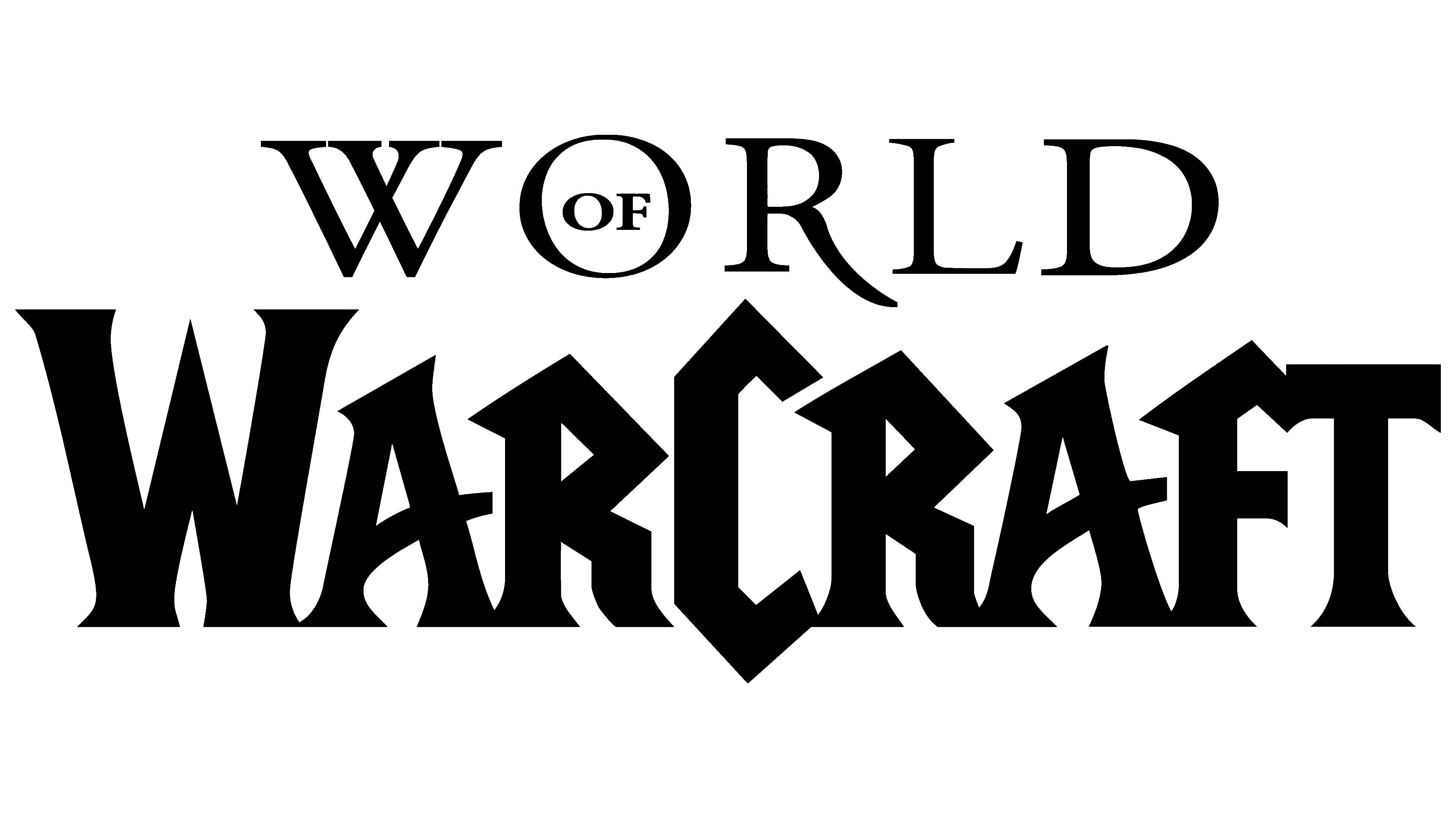
The debut mark of World of Warcraft is still relevant today. It was he who laid the foundation for the creation of many of his kind. The emblem’s design is intriguing: a golden-hued, curly frame decorated with small, spike-like details you want to peer into. In the upper and narrowest part, there is the first fragment of the name of the game – “World” with the preposition “of” in the center of the letter “o.” At the bottom is the compound word “Warcraft.” It is much larger than the top one and is similar in design to the surrounding frame. Moreover, the developers made it the accent, highlighting the stripes’ width and enhancing the color.
2007 – 2008
![]()
The first Burning Crusade expansion belongs to this period. To emphasize its peculiarity, the designers slightly changed the main logo. They placed the version name below the base text, which remained in the same framework. The words are written in small print but are set against the main decorative canvas, with angular, sharp protrusions. The blue background has been changed to green, making the yellow characters look faded.
2008 – 2010
![]()
With the introduction of the second expansion, Wrath of the Lich King, the logo’s edges were covered with frost and snow. This was the designers’ idea: to bring it as close as possible to the theme. The name of the unit is written in the lower zone in white “frosty” letters. The substrate color has been changed to a cool blue, reminiscent of ice.
2010 – 2012
![]()
The third expansion (Cataclysm) required an extreme-themed emblem. It is conveyed through cracks, chips, and fire, all of which were incorporated into the design. The logo’s edges along the frame are darkened, and flames light the center.
2012 – 2014
![]()
As it says at the bottom of the updated emblem, the Mists of Pandaria content has been integrated into the game. The red colors disappeared, and instead, the emerald shades of the deep sea appeared. The edges of the circle are sharpened. To the right and the left of the name, there are snakes wrapped around a frame.
2014 – 2015
![]()
This period was marked by the release of the Warlords of Draenor part. To emphasize the game’s direction, the developers used elements from the logo, such as wooden planks (background), iron brackets (sides), and deep chips (impromptu defects). They darkened the globe to a smoky black, making it terrifying.
2016 – 2017
![]()
The glow in the middle, the green camouflage color, and the minimalism are the main characteristics of the Legion emblem. The pointed letters of the name are arranged in one line on a black background. Sunrise or sunset rays appear through the gaps of the word “World of WarCraft.”
2018 – 2020
![]()
The emblem for the seventh part was unveiled in 2017 and used only a year later. It reflects the name “Battle for Azeroth,” which appears at the bottom of the logo. The letters are from bright gold steel to ash silver. The designers also changed the background to a dark gray, almost earthy tone. But they highlighted the globe at the top in deep blue. The skeletons and spine fragments appeared on the frames.
2020 – 2022
![]()
The eighth expansion, presented at BlizzCon in 2019, is called Shadowlands and has a spiky design. Sharp spikes stick out to the right and left, and the background is made milky and hazy. The upper and lower zones are mirrored: at the top, dark letters on a light substrate, and at the bottom, vice versa.
2022 – today
![]()
The logo uses motifs that originated in this game’s release. These include sharp elements sticking out in all directions, reminiscent of the blades of iconic edged weapons. They have notches with an ornament. The letters also began to look sharper and more voluminous due to the central lines and correctly distributed shadows. A dark one replaced the light background, so the glyphs are painted metallic gray for contrast. The bottom line is placed outside the main emblem and is located in white space.
Font and Colors
Solid logo: each option directly conveys the part’s content. It is enclosed in a curly frame whose decor changes with the theme. Moreover, each location features a different design, emphasizing the balance between the external and internal worlds. A patinated gold or silver texture with vignettes and spikes gives the emblem a heraldic touch. And the color transitions with subtle gradients make it voluminous.
The game’s verbal designation is on two levels and is set in different typefaces. For the world, the designers used an elegant, thin, graceful typeface with serifs and shadows. Inside the “o,” they placed the preposition “of.” The word “WarCraft” was written in wide curly Gothic-type characters.

Each part has an individual color scheme. The most demanded are gold, silver, and copper. They painted letters and a frame. Variants of green, blue, red, and ash have been chosen as the background. Often, a gradient is used to create smooth transitions and express the basic idea.