


![]() Wrigley’s Spearmint Logo PNG
Wrigley’s Spearmint Logo PNG
The recognizable Wrigley’s Spearmint logo is associated with the minty taste of chewing gum and the manufacturer’s use of natural ingredients. The designers created a visual image of coolness, purity, and freshness to emphasize the brand concept. Moreover, the logo symbolizes the product’s wide availability.
Wrigley’s Spearmint began in 1893, after William Wrigley Jr. changed direction in Chicago. He had arrived there in 1891 to sell soap, offering baking powder as a bonus with purchases. Customers wanted the bonus more than the soap, so he moved into baking powder. When chewing gum, used as the next giveaway, drew even stronger demand, Wrigley shifted again, making gum the center of the business.
Spearmint entered a market where licorice and heavier flavors were still common. Its mint taste gave the company a fresher product to promote, while the green packaging and clear logo helped it stand out in stores. Wrigley used free samples, newspaper advertising, and billboards to turn a promotional item into a national brand. Fifteen years after its launch, Wrigley’s Spearmint was already generating $1 million in revenue.
The brand kept selling through the Great Depression and World War II. During the war, Wrigley sent millions of packs to American troops, keeping the gum in circulation and linking it with everyday military supplies. After 1945, as consumer spending recovered, Spearmint remained one of the company’s core products. It became part of routine retail buying across the United States.
By the mid-twentieth century, Wrigley’s Spearmint had expanded into Europe, Asia, and Latin America. The company adjusted the packaging, added new formats, and later introduced a sugar-free version for customers focused on dental care and lower sugar intake. In 2008, Wrigley was acquired by Mars, and Spearmint stayed one of the best-known chewing gum names in a portfolio sold in more than 180 countries.
Meaning and History
![]()
Wrigley Jr. evolved from a small soap business to a leading chewing gum manufacturer. Its founder, William Wrigley, noticed that people were reluctant to buy soap, so he started selling baking soda and gave each customer two packages of gum. The mini gifts proved much more popular than the main product, and William decided to change his specialization once again. In 1892, he registered the trademark Lotta Gum, and in 1894, Wrigley’s Spearmint appeared. The young businessman dared to do what no one else could: popularize the mint flavor. He created a logo for the new brand for wrappers and advertising.
As a born marketer, William placed the logo in magazines, newspapers, and outdoor posters. At first, the public did not want to accept Wrigley’s Spearmint, but aggressive advertising and an unchanging logo tipped the scales in its favor. Chewing gum is now incredibly popular, and its green arrow is an example of how symbols can successfully create a recognizable brand.
What is Wrigley’s Spearmint?
A mint-flavored chewing gum brand, developed in 1893 by Wrigley and originally sold in Chicago. Now the gum is distributed all over the world.
1913 – 1932
![]()
The logo was a black right-facing arrow on a yellow background, with informative inscriptions.
The main text, in large capital letters and italics, was placed on the arrow. The word Spearmint translates as “spearmint.” It can be decomposed into two words: “spear” and “mint”. The image of the arrow is most likely this spear. It represents the mint leaf and its sharp, rich taste.
The tip looks to the right, showing movement. It indicates the gum’s lingering action. The analogs of that time lost their flavor after just a few minutes, so Wrigley gum stood out advantageously. The inscriptions on the tip of the spear also confirm this idea: “the flavor lasts,” which can be translated as “long-lasting flavor.”
Underneath the spear, it says pepsin gum. Pepsin powder was added to the gum. According to the beliefs of the time, such a product was believed to improve digestion. Therefore, gum was not only a pleasure but had a therapeutic effect. The yellow background of the logo supported the theme of health benefits and a pleasant, refreshing taste.
The above-the-spear indicates that the Wrigley Company owns the gum.
1932 – 1950
![]()
In 1932, the company’s founder died, and his son, Philip, took the helm. By the 40s, he achieved the highest sales of Wrigley’s Spearmint. A competent advertising policy and attractive visual signs aided him. The logo of that time was changed and made more harmonious.
The background of the limiting image disappeared, giving the sign an airy quality reminiscent of gum bubbles. The arrow was replaced with a mint-green color instead of bulky black. The element and the lettering now pointed to the mint flavoring.
Spearmint and Wrigley’s inscriptions became larger and balanced each other. And beneath the arrow was the very smug caption “the best gum.” However, given the sales volumes, the message was close to the truth.
1950 – 2002
![]()
By ’50, the company had recovered from World War II. Production had to be significantly reduced during the war as raw material stocks ran out. Now, production has been restored.
The logo’s general appearance was preserved. The arrow and the name remained. However, their fonts “lost weight,” indicating a decline in income and the company’s difficulties. The bottom lettering has changed. Wrigley’s Spearmint was no longer positioned as the best. The caption was made simple: chewing gum.
2002 – 2012
![]()
By the 2000s, the firm was headed by the founder’s great-grandson. In 2002, Mars offered to buy the company, but the parties could not agree. The owner wanted to promote his brands independently, so he rebranded and began conquering new markets.
The visual image of this time acquired several additions. The word “Spearmint” was set against an oval background, overlaid with an arrow. Its letters, changing size, repeated the oval. This drew attention to the name and highlighted the gum’s softness and pleasant, harmonious taste. The company name, in lowercase, was placed on a short, red, double-edged background at the top.
This was the first logo that promoted the brand, not the company. Since the company produced several types of gum (Doublemint, Orbit, Eclipse), each with a minty flavor, it was important to show the customer which brand was hidden in the package.
Below the arrow, the text is very thin, and the letters are small: “5 sticks of gum.”
2012 – today
![]()
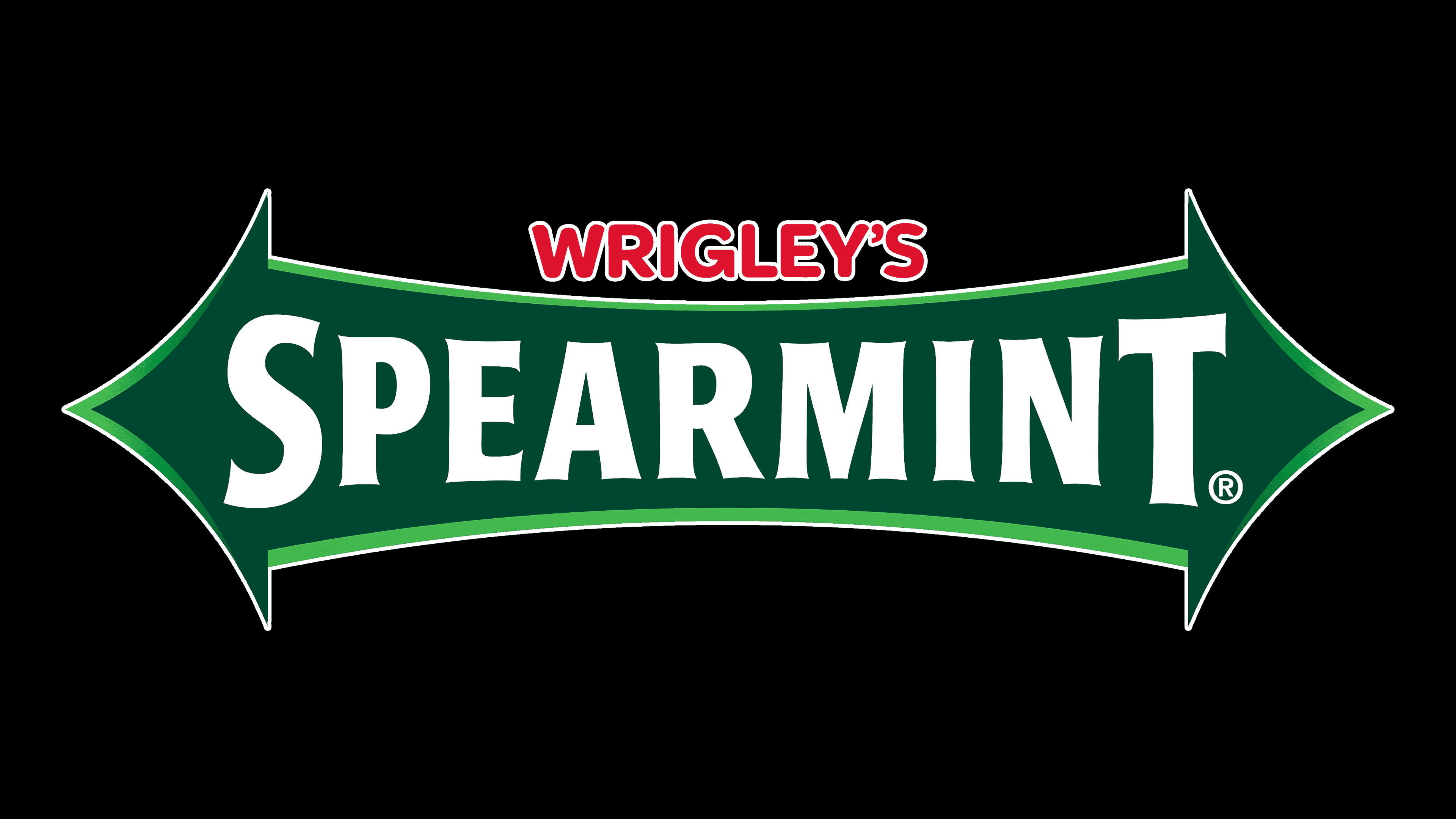
In 2008, the producing company changed ownership, leading to a rebranding. However, Mars Company retained the arrow as a distinctive feature of Wrigley’s Spearmint.
The logo is a two-pointed arrow. One tip looks to the past, the other to the future. The composition conveys that the brand has come a long way and will go far. Both the past and the future are equally important. They are what made Spearmint what it is today.
The arrow narrows toward the center, as reflected in the letters, which decrease toward the middle and increase toward the ends. The lettering indicates that the product’s flavor and formulation are perfect and complete. Everything about the product is perfect, from start to finish.
The logo is reminiscent of stretching the gum by the edges. It evokes the flexibility and malleability of Wrigley’s sticks.
Font and Colors
The green color that dominates the logo is characteristic of many food brands, as it is associated with nature, freshness, and a healthy lifestyle. In the context of Wrigley’s Spearmint, the green color reflects the main taste of mint chewing gum, which is considered fresh and cooling. It also reflects the traditional flavor of Wrigley’s chewing gum, which has been popular for decades.
The font used in the logo is custom and has no official name. It can be described as a mixture of sans-serif and script fonts. It has a classic look associated with long-standing brands. The name Wrigley’s, written in sans-serif, has a modern look. This font makes the logo more recognizable and clearer, helping draw attention to the brand’s products on store shelves.
FAQ
Why is there an arrow on the Wrigley gum?
The arrow on Wrigley gum packaging, especially on Spearmint and Doublemint packs, plays a crucial role in the brand’s identity and advertising. Known as the “Wrigley Arrow,” this symbol originated from the marketing initiatives of William Wrigley Jr., the company’s founder.
William Wrigley Jr. excelled at creating impactful and memorable advertising campaigns. He recognized the importance of a distinctive, easily recognizable symbol to attract consumers and set his gum apart. After introducing Spearmint and Doublemint, he introduced the “Spearmen” characters and the Wrigley Arrow to visually represent the brand.
The arrow symbolizes direction, movement, and progress, representing the forward-thinking and innovative spirit Wrigley wanted his chewing gum to embody. It points consumers towards what he considered a superior product in terms of quality and flavor. The arrow strengthens the brand’s image by linking the gum to a clear and appealing logo. This visual identity ensures Wrigley’s products are noticeable on store shelves and in advertisements, reinforcing the company’s market presence.
When was Wrigley’s Spearmint invented?
Wrigley’s Spearmint gum was launched in 1893, shortly after the introduction of Juicy Fruit, making it one of the earliest products in the Wrigley range. Due to its crisp spearmint flavor and refreshing quality, it quickly became a favorite.
From the beginning, Wrigley’s Spearmint has been popular for its refreshing taste, enjoyed by generations. It has remained a top choice for over a century, becoming a symbol of chewing gum itself. The gum’s lasting presence in the market highlights its appeal and Wrigley’s strong brand identity. For over 100 years, its spearmint flavor has continued to refresh consumers, securing its place as a mainstay in the chewing gum industry and a beloved choice.
What happened to Wrigley’s Spearmint?
In late 2022, Mars, the current producer of Wrigley’s Spearmint since buying the Wrigley brand in 2008, chose to halt its production in Germany. This decision was made because of declining sales in the area, suggesting that demand for this gum was decreasing. Faced with declining sales, Mars had to decide whether to continue producing the gum for the German market and eventually decided to stop.
This move is part of a broader trend in which even well-established products can struggle due to changing tastes, economic shifts, or increased competition. Wrigley’s Spearmint has been a favorite for many years and is a key product in the chewing gum world, but this situation shows that companies need to be flexible and adjust to what the market wants.
Wrigley’s Spearmint is no longer made in Germany, but it’s still sold in other parts of the world where people enjoy it. This highlights how companies like Mars must navigate complex choices when handling well-known brands across different regions.