The WTO logo is a universal symbol that inspires trust in buyers and sellers. It stands out for its friendliness, the most important quality in the field of trade, and serves as a marketing tool to attract participants to the organization. The emblem demonstrates a readiness to provide services globally and a commitment to fair regulation of international trade and economic processes.
WTO: Brand overview
The World Trade Organization (WTO) has a long history dating to its formation in 1995. Its origins are in the post-World War II era when nations tried to revive and expand international trade.
The forerunner, the General Agreement on Tariffs and Trade (GATT), was signed in 1947. This agreement was a temporary pact to lower tariffs and other trade obstacles among member nations. Its founding members were 23 nations.
The initial agreement was the main instrument to control international trade during the ensuing decades. Several rounds of negotiations were held under this agreement to further liberalize trade.
The Uruguay Round of discussions, which started in 1986 and ended in 1994, was a significant turning point. This round, which covered tariff reductions and industries, including intellectual property, services, and agriculture, was the most comprehensive and ambitious in the agreement’s history.
The new organization agreement was signed in Marrakesh, Morocco, on April 15, 1994. This agreement ended the Uruguay Round and signaled a new chapter in the history of international trade regulation.
Officially, the group opened for business on January 1, 1995. It took on the responsibilities of the prior agreement but with a far more expansive mission and a more intricate organizational structure. In contrast to its predecessor, the new organization established itself as a long-term entity with a secretariat and a dispute settlement process.
Membership expanded quickly in its early years. Many developing nations and transition economies have applied to integrate into the global economy.
A Ministerial Conference was planned for Seattle, USA, 1999 to start a fresh round of trade talks. However, the meeting was a complete disaster because of widespread demonstrations and disputes between industrialized and poor nations.
In 2001, in Doha, Qatar, a new round of negotiations was initiated under the name Doha Development Round despite this defeat. The goal of this round was to give developing nations better trading opportunities.
The organization persisted in liberalizing trade and settling trade disputes between its member nations throughout the 2000s. It was essential to controlling international trade during the 2008–2009 global financial crisis.
The Trade Facilitation Agreement, the first multilateral deal signed since its founding, marked a major milestone for the organization in 2013 during the Bali Ministerial Conference.
The decision to remove agricultural export subsidies was made in 2015 during the Nairobi Ministerial Conference, a major step toward restructuring this industry.
The group encountered several obstacles in the 2010s, including the emergence of protectionist tendencies in certain nations and trouble in achieving agreement on important trade policy matters.
The Appellate Body, a vital component of the dispute resolution process, was in crisis in 2020 because fresh judge appointments were blocked.
Notwithstanding these obstacles, the organization still oversees global commerce and accommodates evolving political and economic circumstances. To better address the difficulties of the twenty-first century, the organization is restructuring its procedures and structure.
Meaning and History
What is WTO?
This is a global arbiter that oversees international trade rules. Governments use this organization, based in Geneva, to negotiate trade agreements, resolve trade disputes, and administer the rules system. It addresses various issues such as services, environmental goods, intellectual property, and agriculture. The organization acts as an international trade court through its dispute settlement system, ensuring compliance with agreements between member countries. Despite its technocratic focus, it plays a key role in shaping the global economy. This organization often becomes a point of contention related to globalization, economic sovereignty, and fair trade issues.
1995 – today
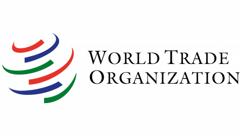
The WTO logo has two key components: graphic and textual, which are structurally separated but ideologically united. They represent the main trading entity that regulates buying and selling processes and monitors rule compliance. Its principles are conveyed simply and vividly.
The symbol comes first, formed by six curved lines arranged diagonally. Each line has a wide and a narrow side. The stripes are colored in repeating colors: red, blue, and green. These can symbolize the diversity of participants in global trade and its worldwide reach. The number of arcs indicates the organization’s fundamental principles:
- Equal opportunities
- Stability
- Transparency (openness)
- Global cooperation
- Free trade
- Fairness
Additionally, the six arcs can signify the multilateral interaction between regions and the variety of trade and economic relationships. The double occurrence of each color emphasizes the cyclical nature of international commerce, its consistency, and close interconnection. The lines are arranged to form a three-dimensional sphere, hinting at the planet’s outline.
Red, green, and blue effectively convey global trade participants’ cultural and economic diversity, symbolize different parts of the globe, and represent interaction between countries with varying economic models. They also denote strategic alliances formed by nations. All the colors are deep rather than bright, adding richness to the palette. This vibrancy enhances the dynamism reflected in the graphic arcs, supporting an atmosphere of optimism and unity among the member countries.
Another significant element of the WTO logo is the name. It is positioned to the right of the colorful symbol and is written out fully: World Trade Organization. The text spans two levels and is presented in thin capital letters. Almost every letter has small serifs—thin, elegant, and pointed. The graceful serif font adds lightness to the emblem, emphasizing the ease of interaction within a unified project. The visual identity reflects the mission of promoting international trade among countries, regions, and economies.
