


![]() World Wrestling Entertainment (WWE) Logo PNG
World Wrestling Entertainment (WWE) Logo PNG
The WWE logo nods to poignant plots that keep viewers on their toes and boost the channel’s ratings. According to the emblem, programs are chosen for their spectacle and the intensity of the emotions they evoke.
WWE traces its roots to 1952, when Jess McMahon founded Capitol Wrestling Corporation. In 1963, after Vincent J. McMahon left the National Wrestling Alliance, the promotion became the World Wide Wrestling Federation. By the early 1970s, WWWF had become a leading wrestling company in the northeastern United States. In 1979, the name was shortened to World Wrestling Federation.
The major shift came in 1982, when Vince McMahon Jr. bought the company from his father and began turning it into a national business. He signed major talent from rival territories and used cable television to reach a wider audience. The 1980s Golden Era was built around Hulk Hogan, Andre the Giant, and “Macho Man” Randy Savage, with the first WrestleMania in 1985 becoming a landmark event.
The early 1990s brought pressure from a steroid scandal. Still, the New Generation era kept the company visible through Bret Hart and Shawn Michaels. From 1997 to 2001, the Attitude Era reshaped wrestling through the Monday Night Wars against World Championship Wrestling (WCW). “Stone Cold” Steve Austin, The Rock, and D-Generation X became central figures, and WWE ended the rivalry by buying WCW in 2001.
In 2002, after a legal dispute over the WWF name, the company changed its name to World Wrestling Entertainment. The 2000s introduced John Cena, Batista, and Randy Orton, while WWE moved into films and broader entertainment. From 2010 to 2020, it launched a streaming service, expanded NXT, grew its women’s division, and held major events abroad. In 2022, Vince McMahon stepped down, and in 2023, WWE merged with Endeavor to form TKO Group Holdings.
Meaning and History
![]()
Capitol Wrestling Corporation was founded in 1953 by Toots Mondt, Jess McMahon, and Vincent J. McMahon. It is the largest wrestling show organization, conducting live wrestling tournaments and hosting more than 500 programs a year.
A little later, the Titan Sports, Inc. association was formed and registered in 1980. It opened in South Yarmouth, Massachusetts. Its founders are Linda McMahon and Vince McMahon. Two years later (in 1982), this firm bought the holding company Capitol Wrestling Corporation Ltd. Later, the CWC joined the NWA (National Wrestling Alliance).
In 1998, Titan took on a new name, becoming the World Wrestling Federation. It was renamed World Wrestling Federation Entertainment in 1999 and World Wrestling Entertainment in 2002. But since 2011, the shortened version has been most often used by WWE. This abbreviation is much better known than the company’s full name, although it has not changed legally.
Given the long histories of the two organizations, it is understandable that they have had many emblems over the years. In general, there are more than ten modifications.
What is WWE?
WWE (World Wrestling Entertainment) is a sports and entertainment TV company based in the United States, engaged in activities such as games, competitions, music, films, and more. She is known in 145 countries for her wrestling, her top priority. The association consists of two specialized firms, Titan Sports, Inc., and Capitol Wrestling Corporation Ltd., both founded by members of the McMahon family. The headquarters is in Stamford, Connecticut, and has many offices worldwide, including Tokyo, Munich, Dubai, Singapore, Shanghai, Mumbai, Mexico City, London, Los Angeles, and New York.
1952 – 1963
![]()
The earliest logo is based on an abbreviated version of the Capitol Wrestling Corporation name. It contains the abbreviation CWC, played out as steep horns. This style was very suitable for the company since the two side letters “C” themselves begged such an interpretation. To enhance the “tough” effect, the developers flipped the right “C” to mirror the left letter. The middle part is occupied by “W,” played like an evil squint on the “muzzle” of a bull, which is very consonant with the wrestling team’s style.
1963 – 1971
![]()
A new emblem was automatically created after changing the name to the World Wide Wrestling Federation (WWWF). It is theme-centered rather than symbolic or elegant, unlike the old one. It depicts two wrestlers: one standing and holding the other over his head, ready to throw him into the ring to win. On the right side of the figures are two versions of the company name (full and abbreviated), a large inscription “CHAMPIONSHIP,” and the phrase “Villie Gilzenberg, the president,” located in two lines. The only thing that has survived from the old logo is the black-and-white color scheme.
1971 – 1979
![]()
In 1971, a radically different emblem was introduced – a graphic one. The name “World Wide Wrestling Federation” appears as an arch at the top. It is made in small print and is located above the globe, lined with a grid of parallels and meridians. Not in the foreground is an abbreviation combined of three “W” s with serifs. The letters are white and outlined with a thin black stripe. Below them, the word “Federation” is written in a different font.
1979 – 1982
![]()
The designers removed the abbreviation that obscured the globe and detailed it. In addition to the geographic grid, they mapped all the continents, slightly expanding both hemispheres. Above, a large inscription “W. W. F.” was placed, as the TV company changed its name to World Wrestling Federation (see the logo below).
1982 – 1985
![]()
In 1982, the developers proposed a radically different version, a simple one. All unnecessary elements have disappeared from it – only the stylized abbreviation “WWF” remains. It is drawn on a white background with wide black lines connected into a single whole.
1985 – 1995
![]()
World Wrestling Federation Logo
The World Wrestling Federation (WWF) logo, used from the mid-1980s to the late 1990s, became a symbol of the era when wrestling transformed from a regional attraction into a global phenomenon. This emblem represented a time of spectacle, vibrant characters, and grand shows, where every detail conveyed a sense of greatness.
The logo features bold “WWF” letters in a volumetric style with gradients and mirrored effects. The golden edges of the letters and their three-dimensional design added a sense of grandeur and luxury. The inner sections of the letters transition from a rich blue to white, creating an impression of brilliance and openness.
The logo’s three-dimensional nature highlighted its modernity for the time. The letters appear to “break out” of their boundaries, symbolizing the brand’s expansion and ambition to lead the entertainment industry. The reflective effect at the bottom of the letters reinforces this idea, adding depth and sophistication.
Gold, blue, and white are primary colors that carry significant meaning. Gold symbolizes success, wealth, and prestige, while blue conveys stability and reliability. White enhances the contrast and emphasizes the clean, bold image. These colors communicate power and confidence, central to WWF’s identity during this period.
The logo’s symmetrical, sharp-edged lettering creates a clean and impactful visual impression. The precise angles and polished surfaces lend the design a harmonious and professional appearance. Every detail was meticulously crafted to ensure it looked striking across all media, from posters to television screens.
WWF expanded into new markets and established itself as an international brand. The logo reflected the organization’s evolution and readiness to become a leader in sports and entertainment. In an era when wrestling became a part of mainstream culture, this emblem symbolized success and spectacle.
The use of gold and the three-dimensional effects emphasized the grandeur of events like WrestleMania, which drew millions of viewers. This logo marked the transition of wrestling into a new era, an era of show business, where every event became a must-see spectacle.
1995 – 1998
![]()
For a while, two emblems were in use. Since 1995, color has been used alongside the black-and-white versions. It consists of a neon yellow center, a cobalt outline, and letters. The small background cube is painted in the same color. The abbreviation is turned sideways and placed vertically, with a slight leftward slant.
1997 – 2002
![]()
This logo became one of the most iconic visual symbols in wrestling history. Emerging during the height of the “Attitude Era,” it reflected the transformation within the organization and the spirit of the times. It conveyed aggression, chaos, and energy, the hallmarks of the World Wrestling Federation (WWF) during that period.
The emblem features bold “WWF” letters crafted with sharp, uneven strokes. Each line resembles a brush or marker stroke, applied quickly and with emotion, creating a sense of dynamism and raw power. The lines are deliberately rough and chaotic, underscoring the brand’s bold and rebellious character of the time.
Beneath the letters is a red streak, also drawn with swift motion. Its shape adds a sense of completion to the composition and is an accent element for the logo. The red color symbolizes passion, energy, and strength, aligning with the essence of wrestling.
The letters appear rough and vary in stroke thickness, giving the design an atmosphere of chaos and aggression that perfectly mirrors the wrestling shows filled with conflicts, drama, and spectacle.
The logo debuted in 1997 at the Survivor Series event, marking a turning point for the WWF. It replaced the previous version and gradually took over in the months that followed. The “Attitude Era,” during which this new visual identity emerged, brought the WWF a new wave of popularity thanks to daring storylines, charismatic wrestlers, and a shift in the approach to entertainment. The logo perfectly encapsulated these changes.
After the company rebranded as World Wrestling Entertainment (WWE), the logo underwent slight modifications but remained a significant part of wrestling history and a symbol of that era.
This emblem represents a time when WWF redefined its values and image. The dynamic, uneven lines symbolize a departure from tradition and a shift toward a more brutal, modern style. Its design represents rebellion and the late ’90s style, when wrestling was at the peak of its popularity.
2002 – 2014
![]()
In May 2002, the company removed the word “Federation” from its name for good. She started using “Entertainment” instead (following a lawsuit by the World Wildlife Fund). In 2011, the wrestling organization finally approved the WWE symbol, formed from World Wrestling Entertainment. There is only one “W” on the logo, also outlined with uneven strokes. The only thing that has survived is the red line at the bottom, which emphasizes the letter diagonally.
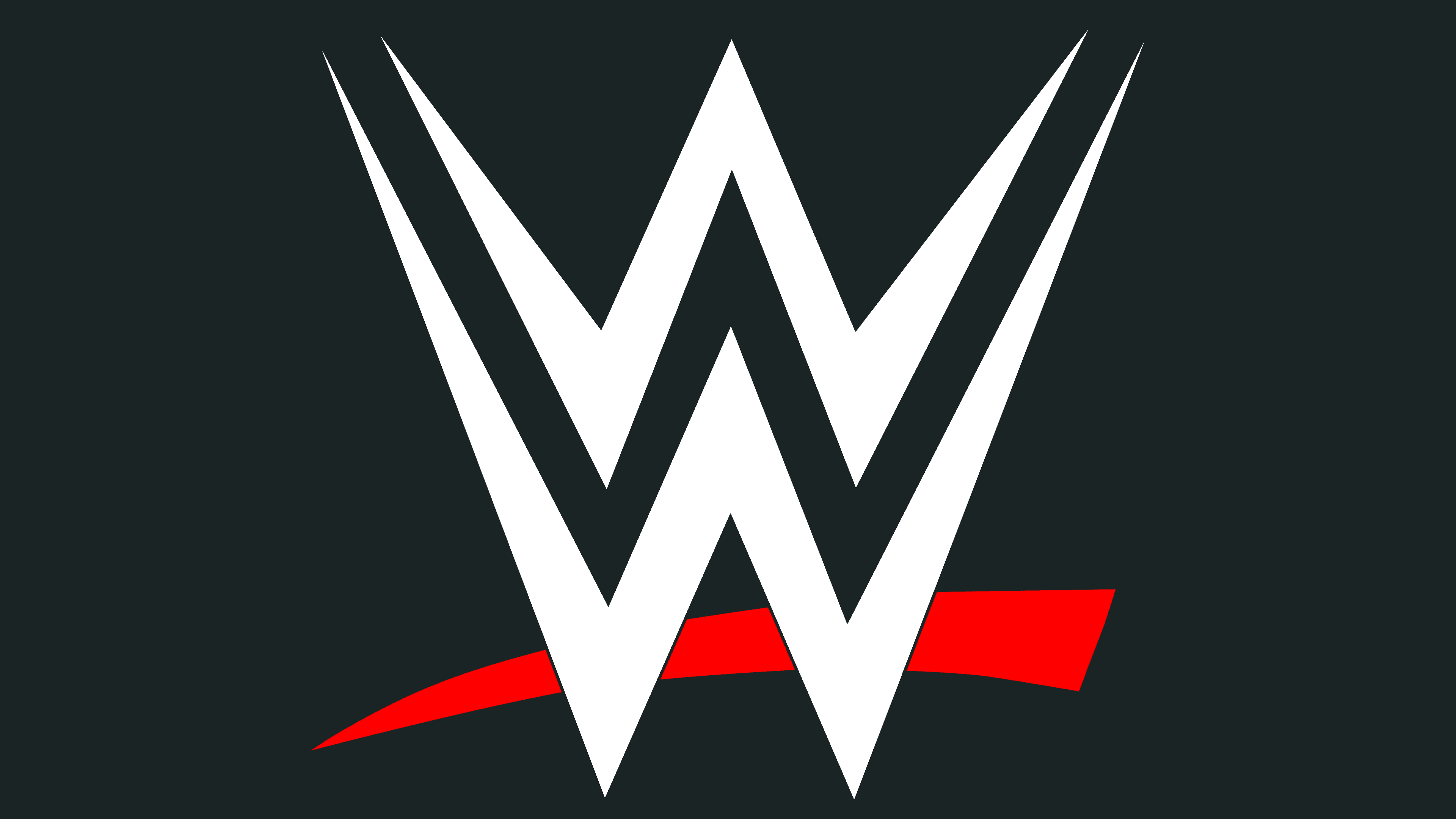
2014 – today
![]()
The current emblem also comes in two versions: light and dark. Designer John Lefteratos created them. He used smooth and unbreakable lines to make the symbolism more confident and solid. Two “W” are formed in lightning: one at the top and the second at the bottom. Between them is another similar letter in the negative space, visible in contrast to the black version. The chaotic bottom underline has widened into a band with a tapered left end.
Font and Colors
The evolution of the logo occurs simultaneously with changes in company names; therefore, it is a constant refinement of the abbreviation. If the sign was triple at the beginning, now it is single: CWC, WWF, and W. In addition, accompanying details, such as a globe and expanded inscriptions, have gradually disappeared from the logo.
The WWE logo uses the Smack Laideth Down font from Checkered Ink. An early version used a typeface reminiscent of the Ikarus Regular with sharp serifs.

The corporate colors are classic and restrained: black, white, and red. The exception was the 1995-1998 logo, which featured bright shades of yellow and blue.