


![]() Xbox Live Logo PNG
Xbox Live Logo PNG
The Xbox Live logo grants users access to a repository of useful and indispensable game data. Inside the service, a whole world captivates players and transports them into a revitalizing virtual reality.
Xbox Live launched in November 2002 alongside several games for the first-generation Xbox. Microsoft built it around broadband internet, while dial-up modems were not supported. That gave the service a more stable base than many console online systems of the period, including PlayStation 2, where multiplayer often depended on individual publishers.
By 2004, Xbox Live had about one million subscribers. Halo 2, released in November 2004, became a turning point, as its multiplayer mode brought record online activity and pushed many players to register for the service. With the Xbox 360 in 2005, Microsoft redesigned Xbox Live and added Achievements, Gamerscore, Gamertags, avatars, the Xbox Live Marketplace, and Xbox Live Arcade, where games such as Geometry Wars and Braid gained cult status.
The service used two tiers. Xbox Live Silver gave access to the store and downloads, while Xbox Live Gold unlocked online play. Gold became a key revenue source for Microsoft. After the Xbox One arrived in 2013, Xbox Live served tens of millions of users, while competition with Sony’s PlayStation Network and PlayStation Plus pushed Microsoft to add Games with Gold.
In 2017, Microsoft launched Xbox Game Pass, followed by Xbox Game Pass Ultimate in 2019, combining Game Pass and Gold. In 2021, Microsoft dropped the paid requirement for free-to-play online games. In 2022, it announced the $68.7 billion Activision Blizzard deal, completed in 2023, bringing franchises such as Call of Duty, Diablo, and Overwatch into the Game Pass ecosystem.
Meaning and History
![]()
Throughout the service’s operation, users could observe the development of visual brand elements, including the logo. A total of four variants were presented. The main element among them was the platform’s verbal name. Like a breath of fresh air, each update made the Xbox Live logo more modern and focused on the average user.
What is Xbox Live?
First and foremost, it is an opportunity to access popular games and stay up to date with the latest news from the world-famous company.
2002 – 2010
![]()
The first version of the logo was introduced immediately after the service’s launch in 2002. Unlike the other variations, the logo features a dark background, which adds to its mystique and gloom. Despite this, the elements relevant to the brand were still present. First, it is necessary to discuss the four-pointed green star, which serves as an emblem.
For the verbal inscription, a stylish and unique font was used. The word “Xbox” was done in uppercase green letters using a bold sans-serif font. The letter “B” stands out in particular because of the extended middle bar. On the other hand, the word “Live” is much larger and under “Xbox.” The orange gradient adds volume to the lettering and evokes associations with fire, as the light on the “i” also confirms. Bold capital letters without serifs are also used here.
2005 – 2013
![]()
The first redesign made the logo look more relaxed and client-oriented. This result was achieved by removing the gloomy background, which could subconsciously scare away potential customers. The first word, “XBOX,” is written in the same green capital letters, but the hue is brighter and friendlier. All the letters in this part of the brand name are narrower than in the previous version. The letter “B” retains the already canonical extended end for the company. However, it is not as striking at this stage because the letter is no longer flat. The word “Live” is also rendered with a yellow gradient. At the same time, the “fire” effect is less noticeable than in the original version.
2012 – 2013
![]()
A significant redesign resulted in all the word lettering being placed on one line, in white. A classic, bold sans-serif font was used. The main emphasis was on the word “Live,” which is noticeable because this part is slightly larger than “Xbox.” The lettering’s calm color and bold font evoked a friendly and positive feeling. In addition, the brand name was placed inside a green rectangle.
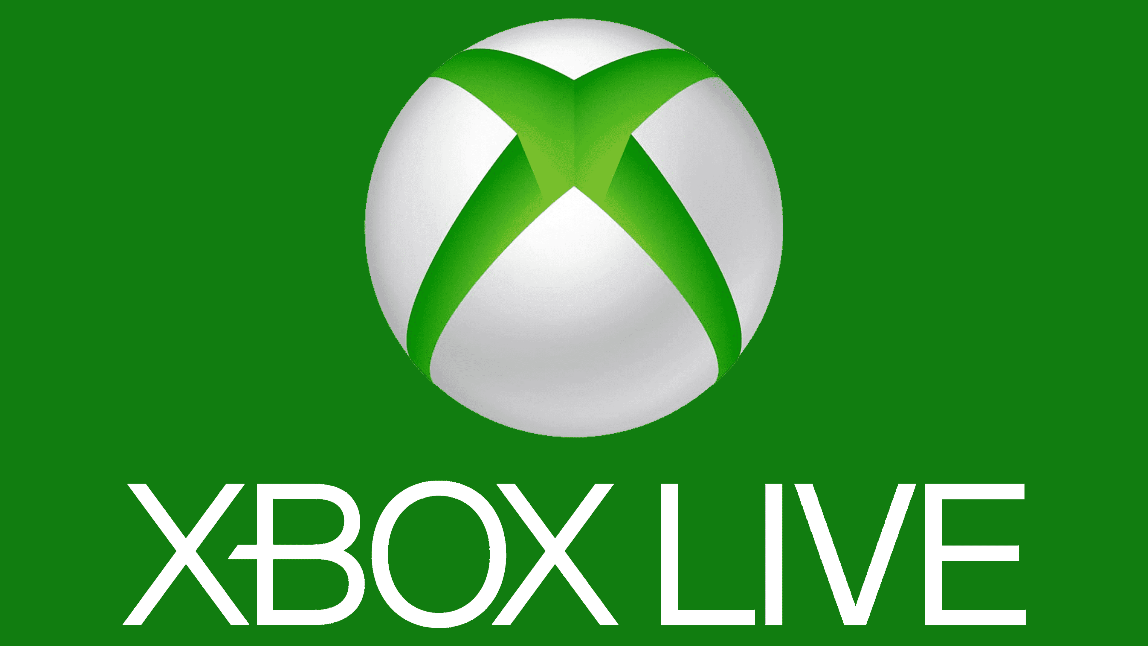
2013 – today
![]()
Today, the service logo is almost completely identical to the main brand’s visual identity, namely “Xbox.” Naturally, the main difference lies in the verbal name, as the prefix “Live” is also added here, pointing directly to the service. In this logo variation, the iconic emblem is to the left of the verbal inscription. It is a four-pointed star placed inside a white circle. With the help of the gradient, the feeling of its volume is created, and therefore, the emblem “Xbox Live” looks even more effective. Thanks to it, the brand is recognized by hundreds of millions of users worldwide.
The main inscription is in capital letters, with “Xbox” in green and “Live” in gray. For the inscription, a classic font with the already classic company elongated letter “B.” is used. Unlike in previous variants, the user does not feel that one part is highlighted more than the other. Even though they contrast with each other thanks to the color palette, they look quite effective and attractive.
Font and Colors
The unique lettering style of the first versions of the logo has been replaced with a classic style. Thanks to the bright colors, the capital letters don’t create the feeling of aggressive marketing on the company’s part. The “highlight” of the brand is the unusual style of writing the letter “B.”
The aggressive color palette used in the first versions of the “Xbox Live” logo has been replaced with a more down-to-earth, vibrant one. The company abandoned the gradient yellow, creating associations with fire. The current palette symbolizes the service, characterized by innovation, modernity, and development. Green, for many, is a symbol of vitality and rapid growth. Gray represents reliability and stability in the company’s work, and white is associated with loyalty and unity.