


![]() Xilam Animation Logo PNG
Xilam Animation Logo PNG
The Xilam Animation logo symbolizes the desire to paint the world with bright colors. After all, this is exactly what the animation studio does: it fills the world with colorful cartoons, making it more interesting, kinder, and happier so that children grow up in a positive atmosphere.
Xilam Animation was founded in Paris in 1999 by French director and producer Marc du Pontavice. Before launching the studio, he had worked in animation on projects such as Space Goofs and The Adventures of Tintin. The name Xilam was built as a palindrome of “Mailx,” reflecting the studio’s interest in unusual creative formats.
The company first focused on animated television. Oggy and the Cockroaches, launched in 1998 before Xilam’s formal creation, became its early breakout project and later reached audiences worldwide. In 2002, the studio released Kaena: The Prophecy, described in the source as the first French full-length computer-animated feature. In 2005, development began on Zig & Sharko, another series that found international viewers.
Xilam continued to expand through both original work and known properties. In 2006, it released Go West: A Lucky Luke Adventure, followed by The Daltons in 2010, a Lucky Luke spin-off. The company listed its shares on Euronext Paris in 2011, gaining new funding for production. It later released Floopaloo, Where Are You? in 2013, Paprika in 2016, and a new Mr. Magoo series in 2017.
In 2018, Xilam strengthened its 3D production base by acquiring Cube Creative. Moka followed in 2019, while in 2020 the studio expanded online distribution through partnerships with major streaming platforms. In 2021, it launched Oggy Oggy, a preschool spin-off of Oggy and the Cockroaches. Its catalog came to include shows such as Space Goofs, Shuriken School, and Zig & Sharko, as well as animated films for children and adults.
Meaning and History
![]()
Few know that Xilam was named after its founder, Marc du Pontavice, and Alix’s wife. The person who named it reversed the word “Alix” to “Xila” and added an “M” at the end. Notably, film producer Marc is now the animation studio’s main shareholder, owning more than 36% of the shares. The remaining assets are divided among several large organizations.
The history of Xilam Animation is closely connected with Gaumont’s activities. As far as is known, the world’s oldest film group created the division Gaumont Multimedia in the mid-1990s and appointed Marc du Pontavice as its general manager. Inspired by the creative atmosphere, Marc started his own business and founded a separate studio to produce animated films in 1999.
This is how the Xilam company appeared; in fact, it is the successor to Gaumont Multimedia’s traditions. The designers played with its name in the logo, depicting a free-standing letter “X” in careless brush strokes. Subsequently, they changed the design a little: they made the lines neater and introduced a large red “X” into the gray word that used to be located at the bottom.
What is Xilam Animation?
It is a company that produces feature-length cartoons and animated series. It appeared in Paris in 1999. Its main goal is to create and distribute entertainment content in English and French.
1999
![]()
The Xilam logo, at first glance, appears simple, but it contains a wealth of symbolism and the spirit of its time. The bright red “X,” as if painted with a single confident brushstroke, conveys energy and movement, reflecting the dynamism and originality of the company’s animation projects. This letter looks as if it were drawn quickly, yet with clear confidence in every stroke, as if the creator knew exactly what they were doing. This feeling of spontaneity and creativity was characteristic of Xilam during its early days when the company was just beginning to carve out its niche in the animation industry.
The font “ilam” appears calmer and contrasts with the bold “X.” This combination highlights the company’s drive for experimentation while producing polished, well-thought-out works. During those times, Xilam boldly took risks and experimented with formats and styles, a daring approach reflected in their productions. The silver font color symbolizes reliability and professionalism, qualities crucial for a company aiming to stand out from competitors.
This logo is more than just a set of letters; it’s a visual representation of the company’s philosophy: a blend of innovative approaches with respect for animation traditions. Every detail of the emblem speaks to the company’s fearlessness: it’s bold, stands out, challenges conventional standards, and creates something new and memorable.
1999 – 2000
![]()
The red cross in the shape of the letter “X” became the hallmark of Xilam Animation immediately after the company’s inception in 1999. Its first version was uneven: the diagonals on the left side were connected by a jagged, upward-curving line that simulated a random brush stroke. The first word of the brand name was right under the cross. The artists made it gray and depicted each glyph in the style of hand-drawn Chinese characters.
2000 – today
![]()
In the modern logo, the red “X” is located to the left of the gray “i,” “l,” “a,” and “m.” Notably, the designers slightly improved its shape by removing the connection between the two diagonals. They also adapted the “X” to the rest of the glyphs, for which they reduced it and thickened it a bit. At the same time, the colors became a little lighter.
As far as we know, in the animated version of the logo, the letter “X” was drawn by a small white man. He used an artist’s brush and a can of red paint, and an empty, colorless surface served as his “canvas”. Based on this, the Xilam Animation graphic symbolizes the company’s main goal of painting the world in bright colors, which it achieves through animated series, feature-length cartoons, and other entertainment content.
2013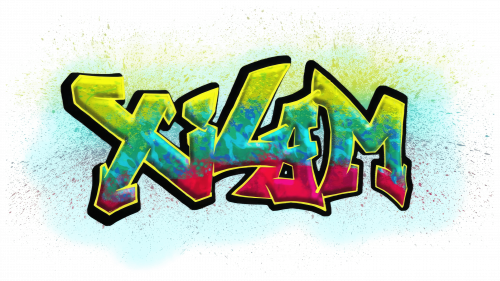
This logo exudes boldness and vibrancy, as a talented graffiti artist spray-painted it on a wall in an urban neighborhood. The visual mark practically screams creativity and unconventional thinking, which peaked when the company released some of its most iconic projects.
The standout feature of the emblem is the massive “Xilam” lettering, styled in graffiti fashion. Each letter is outlined in black, emphasizing the brand’s importance. Inside the letters, there’s a blend of bright colors reminiscent of paint splashes on a wall. These vibrant transitions from green to blue to red create a sense of movement and energy as if the logo is ready to leap off the wall and charge forward. This perfectly captures the era when Xilam was in a state of constant growth and experimentation, striving to capture the attention of viewers worldwide.
The font is intentionally designed to be slightly messy and chaotic, symbolizing creative freedom and a rejection of rigid boundaries. Each letter “lives” its own life, yet together they form a harmonious, memorable image that accurately reflects the company’s spirit.
The saturated colors, even with their neon-like, acid tones, are strongly associated with pop culture and significantly influenced animation and art at the time. These colors convey that the company isn’t afraid to stand out and be bold, attracting a young, energetic audience.
Font and Colors

The logo creators created all the glyphs from scratch because they could not be attributed to existing fonts. Moreover, typographers’ work resembles Japanese calligraphy. The unique shape of the letters is comparable to hieroglyphs, where each line has a well-defined length and thickness.
The palette was also chosen with great care. Given the light gray color, the designers focused on the red tint to highlight its brightness and optimism.