The user can only exclaim in surprise – the search engine knows and knows so much. Finding an answer to any request is not a problem. The Yahoo logo represents the service as playful, young, and out of the ordinary, able to captivate and interest.
Yahoo: Brand overview
| Founded: | January 1994 |
| Founder: | Jerry Yang, David Filo |
| Headquarters: | Sunnyvale, California, United States |
| Website: | yahoo.com |
Meaning and History
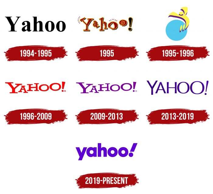
The company frequently updates its identity to keep up with the latest trends on the World Wide Web. But the rethinking of the design does not concern the content of the logo: since 1996, it consists only of the words “Yahoo!”. This word cannot be considered an interjection because it is formed by the first letters from the phrase “Yet Another Hierarchical Officious Oracle.” According to another version, the service is named after the book’s unpleasant humanoid creatures Gulliver’s Travels.
What is Yahoo?
It is an American Internet company headquartered in Sunnyvale, a search, email, and portal that brings together other services of the same name. Yahoo has been around since 1994.
1994 – 1995
When Jerry Yang and David Robert Filo created a website directory platform, they didn’t care about brand identity. Therefore, the first Yahoo logo looked like standard black lettering in the popular Times New Roman font.
1995
In 1995, the company added an exclamation mark to the end of the name to make it somewhat different from Yahoo’s sauce maker. The wordmark received a new design: the letters became red-yellow, uneven, and jumpy. Shadows have been added around the edges, and a “!” This version has been in use for five months.
1995 – 1996
In the second half of 1995, a logo appeared known as Jumping Y Guy. It was invented by David Shen, the seventeenth employee of Yahoo. The curved yellow “Y” symbolized the little man jumping for joy because Yahoo helped him find what he needed. The blue circle in the background represented our planet.
That same year, the company turned to an organic advertising agency to revise the logo. The idea was to make the image not vertical but horizontal. For this purpose, the inscription “Yahoo!” has been added to the circle’s bottom. Chief designer Kevin Farnham chose the Able font and lifted the last letters. The word going up was supposed to be the embodiment of energy.
1996 – 2009
In the second half of the 1990s, a redesigned logo was introduced. The designers removed Jumping Y Guy and left only the inscription. The wordmark turned red, with a faint light gray shadow.
2009 – 2013
The Yahoo platform has once again repainted its name in an epic campaign. The palette was based on purple. Otherwise, this is the same version of the 1995 emblem, but without the shadows and outlines.
2013 – 2019
In 2013, the CEO of Marissa Mayer wanted to change the logo herself without going to professional studios. She had a little background in Adobe Illustrator, a team of in-house designers at Yahoo, and a couple of days off Saturday and Sunday.
This is a case of a redesign for redesign’s sake because essentially nothing has changed. The developers kept the purple color scheme by choosing the shade of Pantone Violet C. The subtle gradient made the letters three-dimensional. Also, the emblem creators used a sans serif font and kept the inclination of the exclamation mark at 9 degrees.
Marissa Mayer strictly controlled every little thing, and it reached the point of absurdity. When the team was picking a new color for Yahoo Mail, an obsessive CEO left the manager (he left for Disney) and the lead designer (he found a place at Google) because of the obsessive CEO. And when Mayer worked at Google, several people in senior positions fled from her. Therefore, we can confidently say that she came up with the new logo from start to finish.
2019 – today
In late 2019, the company turned to design agency Pentagram to simplify branding. The specialists insisted on bold lowercase letters and chose a modified Centra No. 2. The exclamation point at the end expresses the idea of amplification.
Yahoo: Interesting Facts
Yahoo! is an important company that helped shape the internet.
- How It Started: Jerry Yang and David Filo, two Stanford University students, created Yahoo! in 1994. The funny name “Yahoo!” stands for “Yet Another Hierarchical Officious Oracle” because it was originally a website directory.
- Growing Big: Yahoo! was a simple directory that helped people navigate the early Internet. It quickly grew into a big website where you could search for things, check email, read news, and learn about finance.
- Yahoo! Mail: In 1997, Yahoo! started Yahoo! Mail, a popular email service. It began after Yahoo! bought a company with one of the first free email services on the Internet.
- Buying Other Companies: Yahoo! got bigger by buying many other companies, like Geocities for creating websites and Tumblr for sharing short blog posts.
- Yahoo! Answers: Yahoo! had a place called Yahoo! Answers where you could ask questions and get answers from others. It started in 2005 and was popular until it closed in 2021.
- Up and Down Money: Yahoo was worth over $100 billion at its most successful time. However, it also had tough times, especially when companies like Google and Facebook became more popular.
- Smart Move with Alibaba: In 2005, Yahoo! invested in a small Chinese internet company. That investment proved to be smart because Alibaba grew into a huge business.
- Verizon Buys Yahoo!: After having a hard time keeping up with changes on the internet, Verizon bought Yahoo! in 2017 for $4.48 billion. This ended Yahoo! ‘s time as its own company.
- Changing Culture: Yahoo! has made a big difference in how we use the Internet, starting the idea of a web portal and becoming a well-known brand online.
- Yahoo! in Japan: Yahoo! Japan is a separate company and is still very popular and important in Japan. It shows how Yahoo! has left a lasting mark in some places.
These points show Yahoo! ‘s journey from a simple directory to a huge internet company, its influence on internet culture, and how it eventually was sold. Yahoo! ‘s story is a big part of tech history.
Font and Colors
The current emblem is reminiscent of the old Looney Toons style of 1996. But it is more versatile because the designers have tried to make it suitable for both the Internet and physical media. In some cases, the full text is abbreviated to “y!” To denote the Yahoo sub-brands.
The logo designers took the Centra No. 2 Extrabold and slightly changed the shape of the symbols. The exclamation point got a slope of 22.5 degrees. The letters look more compact and more geometric than the original.
Since 2003, the brand name has been spelled in different shades of purple. According to legend, David Robert Filo bought much lavender paint for Yahoo’s offices, so the company was forced to make this color corporate.
FAQ
What ticker symbol is Yahoo?
The company’s ticker symbol was YHOO. This symbol represented Yahoo! Inc. when it was a publicly traded company. The brand, known for its email, news, and search engine services, used this symbol in financial markets.
Jerry Yang and David Filo founded Yahoo! Inc. It quickly became one of the most popular web portals and search engines, and its success made its stock a significant part of the NASDAQ stock exchange.
In 2017, Verizon Communications acquired Yahoo’s core internet business. The remaining parts of the company were rebranded as Altaba Inc. After this acquisition, the ticker symbol YHOO was retired, marking the end of an era for the brand as an independent company.
What is the Yahoo font?
The Yahoo font is Centra No. 2. It is part of the brand’s visual identity and has a clean, modern look.
Centra No. 2 is a sans-serif typeface. This means it does not have small projecting features at the ends of its strokes, giving it a sleek and contemporary appearance. The font enhances readability and clarity, making it suitable for digital and print media.
Using Centra No. 2 helps create a cohesive and recognizable brand identity. It is used across Yahoo’s platforms, from the website to marketing materials. The font’s simplicity reflects the brand’s commitment to clear and accessible information.
This font is key in maintaining Yahoo’s professional and user-friendly image.
What is the meaning of the Yahoo logo?
The logo features an exclamation mark, symbolizing energy, intensity, and significance. This mark shows the brand’s dynamic presence and early entry into the internet world, highlighting its ongoing effort to stay relevant.
The exclamation mark reflects the excitement and enthusiasm the brand aims to inspire in users. It captures the spirit of innovation and vitality that has driven the brand since its beginning.
This symbol signifies the brand’s ambition to stand out digitally. The exclamation mark represents the brand’s journey from its early days to its status as a major player in the internet industry.
Did Yahoo change its logo?
The brand changed its logo to give it a modern and serious look. The new design is simple and confident, reflecting the brand’s evolution. The updated logo features clean lines and a refined font to show professionalism and reliability.
This redesign was part of the brand’s efforts to stay relevant in the digital world. The changes show the brand’s growth and adaptation to modern aesthetics.
The decision to change the logo reflects a trend in branding where simplicity and clarity are valued. By adopting a streamlined design, the brand aims to appeal to a wide audience, including new and long-time users. This update helps the brand stay fresh and relevant in the competitive digital world.
What is the logo for Yahoo?
The new logo features the brand’s name in deep purple and a tilted exclamation mark. The letters are wide and bold, giving it a modern and strong look.
The deep purple color represents creativity, luxury, and ambition. The bold, wide letters enhance readability, making the logo easily recognizable. This design reflects the brand’s commitment to clear and accessible services. The combination of these elements creates a cohesive and striking visual identity. The new logo represents a fresh, contemporary look.
Is Yahoo still here?
Yes, the brand has been around. It remains among the most popular internet sites, ranking 12th in demand according to SimilarWeb and Alexa Internet.
The brand offers various services, including email, news, finance, and sports. It continues to attract millions of users daily. Despite changes in ownership and competition, the brand maintains a strong presence in the digital world.
Who made the Yahoo logo?
The modern logo was created by the design agency Pentagram. This redesign was the first major brand identity change in several years.
Pentagram gave the logo a fresh, modern look while keeping recognizable elements. The new design features bold, wide letters in deep purple with a tilted exclamation mark. This update reflects the brand’s evolution and its goal to stay relevant.
The new logo conveys professionalism and clarity, helping the brand maintain its presence and appeal in the digital world.
