The oldest service, YesVideo, which has been the pleasing photo and video users for two decades, has served a total of more than 10 million families. The company became famous for its rapid start when the film industry was only developing to its current scale, quality films were a rarity, and the brand offered a good new service, which delighted both the younger and older generations.
In 1999, an ordinary American family happily gathered around the big screen and enjoyed blockbusters with Jean-Claude van Damme, Jackie Chan, dramas by Tom Cruise, and Nicole Kidman. Television has acquired such interest, and universal love, probably as the Internet and social networks have now. It was available, but not everyone could find quality.
But even more, Americans wanted to see themselves in video and photos. There is a huge demand for film cameras, cameras. People began to appreciate the moments of meetings, various events, the magic of random videos and pictures. The hobby of shooting and watching memorable moments became a mass fever.
So, at one time, YesVideo established cooperation with retailers Costco, Sam’s Club, Walmart, CVS, Bartell Drugs. Then followed the era of digitalization, and with the release of the Internet for public view were introduced online services YesVideo.com and LegacyRepublic.com. The resource base is located in Norcross, Georgia, and the main office is located in Santa Clara.
It was decided to merge the two brands – YesVideo and Capture, and now most of the work falls on the shoulders of Capture.
The design was developed this time by Kilter’s creative agents from Los Angeles. They decided to emphasize the consumer interest in the Capture brand, coverage, and comprehensive entertainment. It’s like a technical service that allows you to share pleasant memories with loved ones and save data. The emotional impact that a favorite photo or video plays on people needs to be conveyed by the new logo.
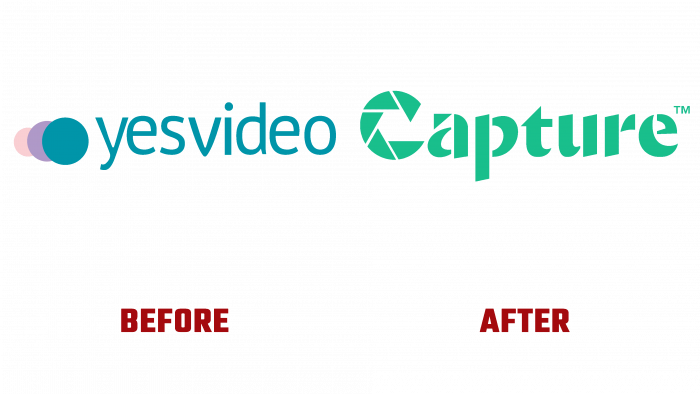
Yes, the video was previously depicted in three circles of different sizes: the largest – a green shade of a sea wave, a purple smaller circle, and a very small beige. And the inscription was made without capital letters with an island-like and attractive font, rounded in some places. And all this is the same greenish hue as the inner circle.
Nowadays, the Capture logo is brighter – a bright, fresh grass color, a font like broken shards of glass, and at the beginning of the name, a large C, like a zoom lens. Technological, bright, and interesting. Such a logo is fully associated with the nature of the brand, which will help keep the brand still logo for a while.2
