A Canadian TV channel with a laconic name uses the same “laconic” emblem. But for all its simplicity, the Z logo boasts an original design because its creators did some successful experiments with asymmetry and reflection of colors.
Z: Brand overview
| Founded: | January 31, 2000 |
| Founder: | Bell Media |
| Headquarters: | Montreal, Quebec, Canada |
| Website: | ztele.com |
Meaning and History
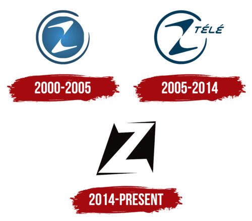
In 1999, Radiomutuel received permission to launch a television service devoted to scientific facts, science fiction, space exploration, mysteries of planet Earth, technology, paranormal phenomena, and the digital world. But just before the television service launched, the founding company was bought by the media conglomerate Astral Media and liquidated. He then opened the planned TV service, named it Canal Z, and fitted it with an appropriate logo. In 2005 he renamed it Ztele and introduced a new logo. The owner added HD format a year later, which he also reflected in the identity.
In 2013, Bell Media absorbed Astral Media and turned its sci-fi TV service into an offshoot of Space. In 2014, the channel was renamed: it officially received an abbreviated name that appeared among viewers. This move also launched the process of redesigning the visual identity. There are a total of three logos.
What is Z?
Z is a television channel from Canada that shows sci-fi, fantasy, drama, and fantasy films. It has been around since 2000, having been invented by Radiomutuel and launched by Astral Media. Bell Media now owns this TV service. It is headquartered in Montreal, Quebec Province.
2000 – 2005
The debut Z logo was circular. The central part was painted blue with a gradient and served as a background for two curved elements that resembled waves. It was the encrypted name of the television channel. It was taken outside in an unclosed ring, tapering toward the end.
2005 – 2014
After the rebranding, the channel had a new logo. It consisted of a central letter “Z” of the same shape as before (wave-shaped). The designers kept the ring, too. They only added to the space between the beginning and the end of the line a fragment from the name of the television service – “télé.” The word was made in capital letters without serifs. In doing so, the developers changed the color scheme, coloring the glyph blue and the background white.
2014 – today
After shortening the name, the channel got a rectangular logo. The “Z” symbol was also transformed. The glyph became geometrically flat, with straight lines and sharp corners. In addition, it got a hidden concept reflected in the negative space. The fact is that on the right and left, in the gaps in the white lettering, and you can see two black arrows. One of them points upwards, the other one – downwards.
The Z logo has evolved from a curved, wavy shape to a strict geometric sign. This was done to embody the concept: of different directions in themes and genres, from drama to technology and from fantasy to science. This idea is conveyed by two arrows looking in different directions.
Font and Colors
Although the emblem of Z channel conveys its name, it is not a text but a graphic one. For this purpose, the designers presented the letter in different forms, but always in drawings. That is, it has an individual design. For the logo palette, white and blue were chosen first. Then black appeared.
Z color codes
| Black | Hex color: | #000000 |
|---|---|---|
| RGB: | 0 0 0 | |
| CMYK: | 0 0 0 100 | |
| Pantone: | PMS Process Black C |

