The ZDF logo shows an organization that broadcasts within its own country and abroad. In its programs, the company goes beyond the well-known news, seeking to provide viewers with an exclusive.
ZDF: Brand overview
| Founded: | 1 April 1963 |
| Headquarters: | Mainz, Germany |
| Website: | zdf.de |
Meaning and History
The TV network broadcasts using several channels: terrestrial, cable, and satellite. It has two independent branches – information and youth, which became separate after gaining popularity. Also, she adheres to the principle reflected in the slogan, which translates as “With the second, you see better.” Its content is because the company is the second-largest broadcasting structure.
For almost 60 years of its existence, the channel has changed its logo several times, adjusting it to the changing technical standards. There are four logos in total, based on the abbreviated form of the phrase “Zweites Deutsches Fernsehen” (this is complete decoding of the abbreviation ZDF).
What is ZDF?
ZDF is a German broadcasting company, the name of which stands for Zweites Deutsches Fernsehen. It owns a large national television channel that broadcasts various programs: entertainment shows, documentary and feature films, series, sports programs, and news. The television network was founded in 1963 and is partially funded by the state budget.
1961 – 1963
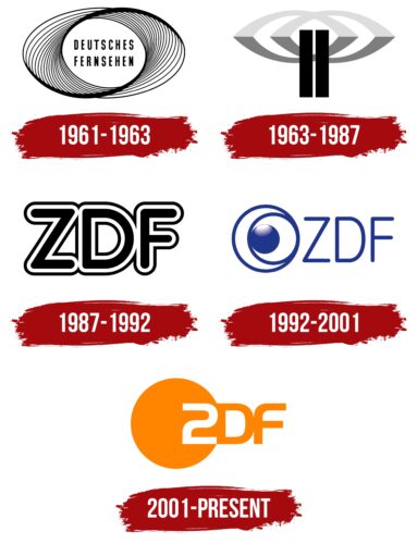
In 1961, ZDF was better known as Zweites Deutsches Fernsehen. The last two words of her name occupied the central part of the logo and consisted of bold black letters in upper case. The font was roughly shaped like Okuda Bold by Pixel Sagas or Trump Gothic Pro Bold by Canada Type. The inscription was inside many black and white stripes, similar simultaneously to the Moebius Strip and the DNA chain.
1963 – 1987
The debut logo was launched on April 1st, 1963. Initially, the company chose an option in the form of two vertical rectangles and two ellipses. The former symbolizes the towers, the latter – the signal emanating from them. Both of them are two because, in this way, the institution has beaten its name – “second television.” When there are two copies of all the elements, it is guaranteed to be seen better, and the station works twice as reliably. Medium wide black stripes are located exactly in the middle, and above them are ovals, which are half superimposed on each other. They came from the preversion that existed from 1961 to 1963.
1987 – 1992
In 1987, the administration decided to introduce a radically new logo to move away from standard images and introduce individuality. That is why the preference was given to the abbreviated form of the name – “ZDF.” Large letters on a light background are made with double edging – thin lines of black and white.
1992 – 2001
The essence of the logo has been preserved, but the design has been completely changed. Now the letters have no stroke and are written in a thin sans serif typeface. To the left of the abbreviation is the broadcasting sign: two concentric rings with a slight offset that surround a dark blue ball. The graphic elements are grouped so that the image looks not only like an eye but also like a crescent moon, sun, and globe. This symbol’s concept is simple: the broadcast is conducted around the clock with extensive coverage of the territory.
2001 – today
Originality is what sets this logo apart from everyone else. The name is uniquely played in it. First, the letter “Z” is replaced by the number “2”, which repeats it in almost identical form. Secondly, the manual reflected the complete transcript of the abbreviation from the phrase “Zweites Deutsches Fernsehen.” That is, the particle “zwei” means “second television.” To emphasize this idea, the designers placed the deuce separately – in an orange circle, highlighting it in contrasting white.
ZDF: Interesting Facts
ZDF (Zweites Deutsches Fernsehen) is a major public broadcaster in Germany, offering various programs, from news to entertainment.
- Start and Goal: ZDF started in 1963 to complement the ARD network, aiming to broaden the range of TV content in Germany.
- Funding: It’s mainly funded by broadcasting fees from German households, which helps it stay independent and focused on quality programming.
- Location: Unlike other German media hubs, ZDF is based in Mainz and chosen to spread cultural and informational activities across the country.
- Creative Shows: ZDF has introduced innovative shows to German TV, including the political talk show “Maybrit Illner.”
- Global Collaboration: It also works on international documentaries and series, bringing global stories to German viewers.
- Digital Library: ZDFmediathek, its online media library, lets people stream live or catch up on shows, making its content easily accessible.
- For Kids: With ARD, ZDF runs KiKA, a channel focused on children’s educational and entertaining programs.
- Sports Broadcasting: ZDF and ARD share the rights to broadcast major sports events like the Olympics and the FIFA World Cup, which are free for viewers.
- Culture and Education: ZDF is committed to cultural and educational content, promoting knowledge and critical thinking among viewers.
ZDF showcases the importance of public broadcasting in offering diverse, high-quality, and accessible content, aiming to inform and engage the public.
Font and Colors
The evolution of the visual identity of a broadcast station has moved from standard to original. Therefore, at the beginning of his career, a hackneyed image of towers and signals emanating from them was used, and at the end – a personal sign reflecting several meanings at once. The new logo developers are two agencies: the German Das Werk from Frankfurt and the American Razorfish from New York. They created it in close collaboration.
Each emblem has its typeface so that you won’t find two identical ones. It was bold with a contour; then it was threadlike; now it is wide, streamlined, with roundings. The modern version also plays up the similarity between “2” and “Z.” The color palette consists of orange (closer to carrot) and gray (two types – metallic and light silver). Also, white is used.
ZDF color codes
| Orange | Hex color: | #ff8400 |
|---|---|---|
| RGB: | 255 132 0 | |
| CMYK: | 0 48 100 0 | |
| Pantone: | PMS 151 C |
