


![]() ZEE5 Logo PNG
ZEE5 Logo PNG
The ZEE5 logo is a symbol of diversity and multilingualism. The emblem indicates that the channel covers a wide range of topics. It is freely available, and every viewer can learn the necessary knowledge.
ZEE5 traces its origins to Zee TV, launched by Subhash Chandra on October 2, 1992, with the Essel Group behind the project. It was India’s first private Hindi satellite channel and entered a market long dominated by Doordarshan. Zee Entertainment expanded in 1995 with the launch of Zee Cinema, a 24-hour Hindi film channel, and later added Zee News and regional channels in Marathi, Kannada, Bengali, Telugu, Tamil, and other languages.
The digital phase began before ZEE5. In 2012, Zee launched DittoTV, an early Indian subscription-based live TV streaming service. In February 2016, it introduced Ozee, a free ad-supported catch-up platform for Zee shows. By 2017, Zee needed a service that combined paid streaming, free viewing, television, films, and originals.
ZEE5 launched on February 14, 2018, absorbing DittoTV and Ozee. At launch, it offered 100,000 hours of video in 12 languages, including Hindi, English, Tamil, Telugu, Malayalam, Kannada, Marathi, Bengali, Gujarati, Punjabi, Odia, and Bhojpuri. Its first originals included Nanna Koochi, America Mappillai, Dhatt Tere Ki, and the biopic Karenjit Kaur: The Untold Story.
In October 2018, ZEE5 expanded to more than 190 countries. In 2019, it added ALTBalaji content to its service. Zee later held merger talks with Sony Pictures India, but the deal collapsed in January 2024. ZEE5 entered the sports space through the DP World ILT20 rights in 2022. By 2023, it had passed 100 million registered users. In June 2025, it refreshed its identity with the slogan “Apni Bhasha, Apni Kahaniyan.”
Meaning and History
![]()
ZEE5 is the successor to the video streaming service OZEE, which merged with the similar service DittoTV in 2018. They have expanded their capabilities to compete successfully against market leaders such as Hotstar, Amazon Prime Video, and Netflix. The platforms operated separately, although the Indian media conglomerate Zee Entertainment Enterprises owned both. The company itself is part of the Essel Group holding.
The predecessors of ZEE5 had their distinctive marks before the integration. Their designs had nothing in common, from different color palettes to text decoration. After the merger, the identity has changed. It is worth noting that the developers took the OZEE logo as a basis. They retained their shape (rectangle), color (black base), and font (grotesque).
2012 – 2016
![]()
The DittoTV web portal was launched in 2012, offering a subscription-based streaming video service. Its first logo resembled a horizontally elongated blue geometric shape with white lettering inside. The platform’s name had an unusual design: the word “ditto” occupied almost all the space, with “TV” positioned above the letter “o.” Most notable were the round typeface and the elongated vertical “d” line that touched the emblem’s outer edge.
2016 – 2018
![]()
Two years before the merger with OZEE, the DittoTV service underwent a small redesign. The blue geometric shape has been removed from the logo. Once on a blank white background, the lettering turned purple, and the font became rounded at the ends. A black italicized phrase “powered by Z5” appeared at the bottom.
2016 – 2018
![]()
In the first week of March 2016, Zee Network, which owns DittoTV, launched another online video streaming platform, OZEE. The concept of the new project reflected the motto “Entertainment Now,” which became integral to the logo. The designers used a handwritten white font. Above was the name of the service, written in bold grotesque, and the emblem, an orange ring with a multicolored triangle inside. The last symbol was the button to start the video. A black rectangle served as a background for all elements.
2018 – today
![]()
The ZEE5 media service was launched in 2018 and built on DittoTV and OZEE. She inherited some design aspects from OZEE. The base of the logo, as before, is a black quadrangle, but subtle patterns of eyes, fingers, ears, tongues, mobile phones, and monitors have appeared on it. There is a white circle with the black word “ZEE” written in the middle. And the white number “5” is out of the circle. Five arcs of different colors add color to the design: purple, red, yellow, green, and blue.
Font and Colors
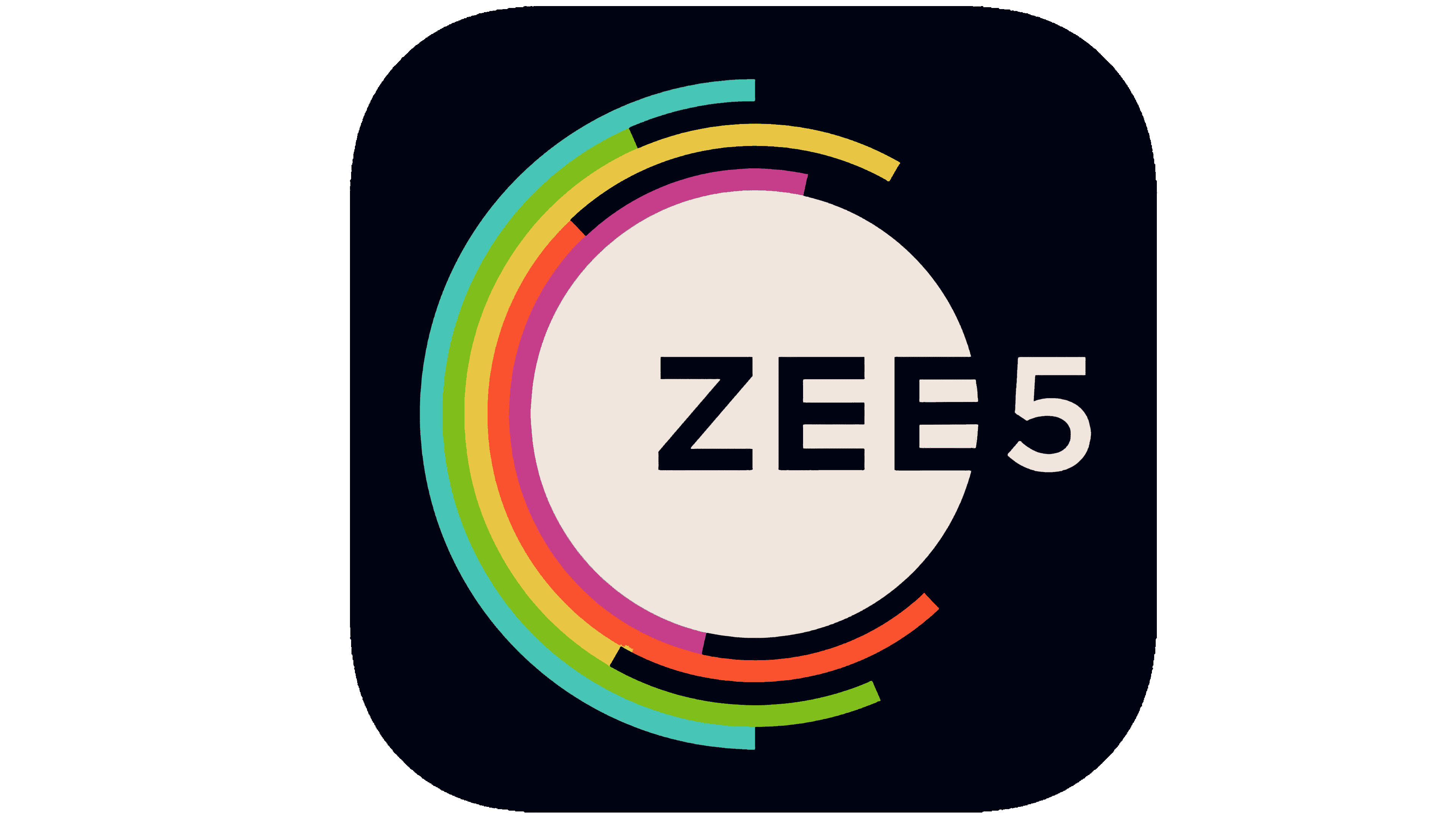
The black rectangle symbolizes the screen, as the platform’s main content consists of various films, shows, music videos, and other videos. Multi-colored curved lines embody vivid emotions and impressions of what you see. And the white circle in the middle is associated with the start button.
The name of the Indian media service is written in a standard sans-serif font. All letters are bold and capitalized. But the color palette looks much more interesting. It is dominated by the classic combination of black and white, which form the basis for five vibrant colors: blue, green, yellow, red, and purple.