


![]()
ZigZag, a vodka brand known for its vibrant and lively character, has unveiled a refreshed logo and packaging to reflect its energetic spirit. The new design focuses on creating a bold identity in the competitive beverage market while fulfilling its mission of delivering fun and memorable experiences.
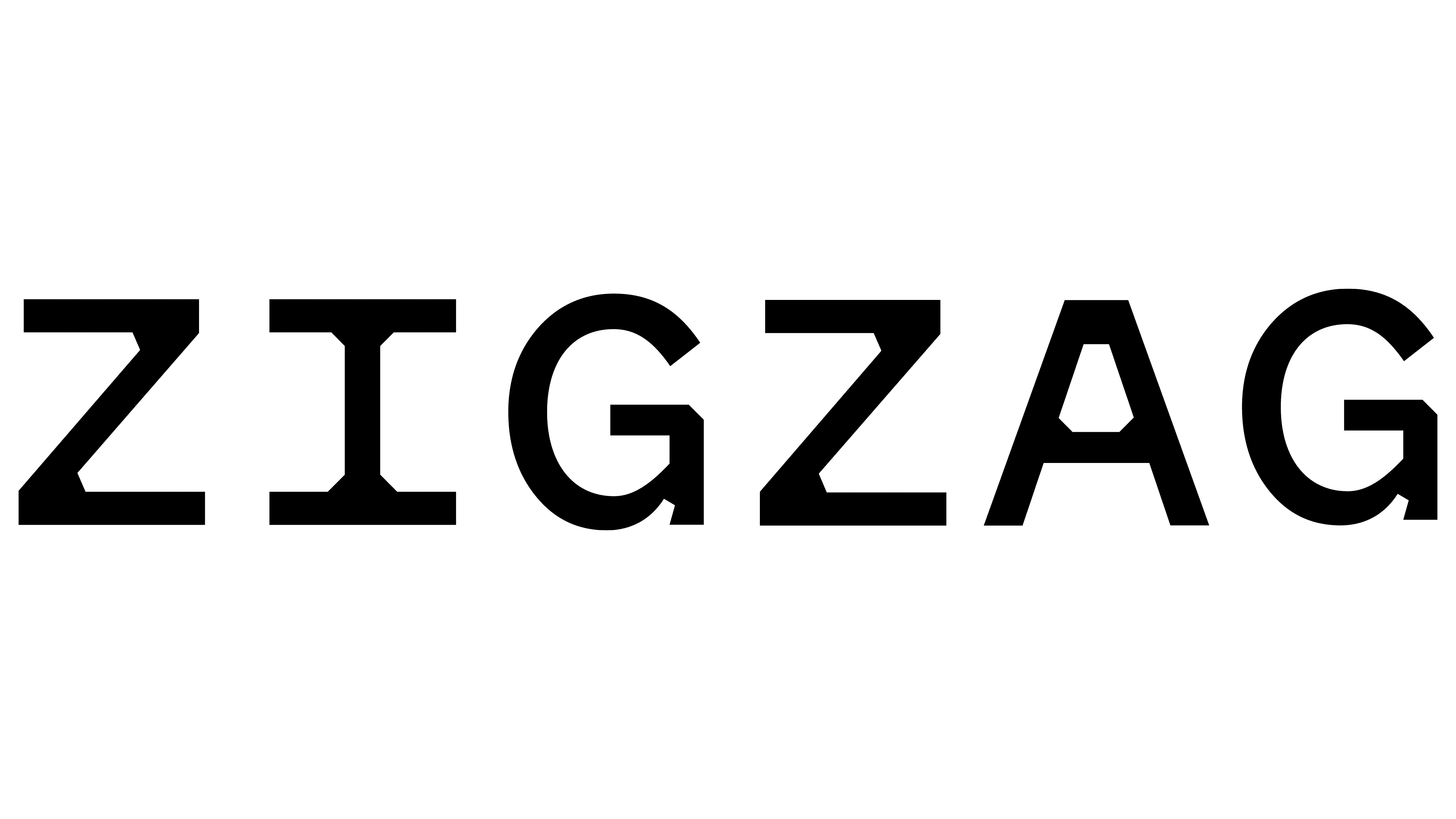
At the heart of the logo is a striking “Z” shape, designed to zigzag in a way that directly reflects the brand’s name. The clever integration of the name “ZigZag” within this bold design element gives it a cohesive and visually engaging look. Using the Pitch Sans typeface, the lettering includes angular details that complement the zigzag motif, adding a sense of motion and dynamism.

The logo’s black-and-white color scheme keeps the design clean and focused, focusing on the intricate zigzag shape. Vibrant accent colors distinguish each flavor across product variations, creating a balance between consistency and individuality in the branding.
The packaging design features bold patterns that wrap around the bottle. These patterns emphasize the logo while creating depth and intrigue. An elongated starburst graphic at the base of the bottle hints at the unique flavors of each vodka, while the neck label features a playful sawtooth-blade design that ties back to the zigzag theme.
The packaging’s typography complements the overall look by balancing playful energy with a polished, modern feel. The “VODKA” label is sleek and clean against bold patterns and sharp angles. This blend of elements underscores the product’s unique identity and ensures it makes a strong impression.
The brand leans into its lively persona online with bold visuals and dynamic compositions. TT Backwards Script adds a whimsical touch, contrasting with the structured design elements. On social media, vibrant colors and eye-catching layouts highlight the brand’s fun and irreverent character.
The redesign celebrates energy, movement, and the unexpected, presenting a fresh and memorable identity. This updated look strengthens its position in the spirits market and reinforces its commitment to bringing excitement and joy to its customers. This modern approach ensures the brand resonates with a wide audience looking for engaging and vibrant experiences.