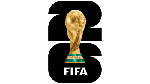
Last week, the world of football witnessed a momentous occasion as FIFA President Gianni Infantino, accompanied by dignitaries and celebrities, unveiled the official logo for the 2026 World Cup. This highly anticipated event will span three nations – Canada, the United States, and Mexico – and is already being hailed as the most epic football tournament in history. The emblem itself, a stunning representation of the World Cup trophy, symbolizes the unity and celebration that the event brings to people across the globe.
The 2026 FIFA World Cup is set to capture the hearts and minds of football enthusiasts like never before. With an unprecedented 48 national teams vying for glory, a total of 104 matches will be played across 16 magnificent stadiums. From the bustling cities of the United States to the pristine landscapes of Canada and the vibrant spirit of Mexico, this tournament promises to be an unforgettable experience that transcends borders and unites fans from every corner of the world. As CONCACAF President Victor Montagliani declared, this World Cup will be the “greatest, most inclusive, and most diverse” ever witnessed.
The unveiling of the official logo is a pivotal moment that signifies the start of a new era for the tournament. FIFA’s aim is to evoke the spirit of football and diversity through a timeless design that will leave a lasting impression. The emblem cleverly combines an image of the iconic World Cup trophy with a pattern that pays homage to the hosting year. This innovative visual concept is destined to be etched in the memories of football enthusiasts for years to come.
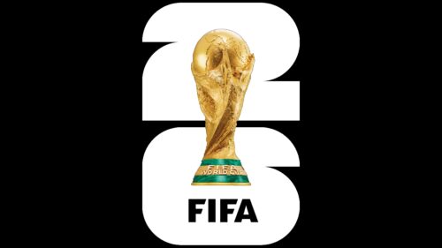
The FIFA logo for the 2026 World Cup brings the tournament to life with a striking black-and-white rendition. Featuring a realistic image of the trophy, it showcases the pinnacle of football excellence. The number 26 is ingeniously constructed using 48 squares and circles, representing the teams competing in this grand event. The circular and rectangular shapes within the logo capture the essence of the game, reflecting both the roundness of the ball and the rectangular edges of the pitch.
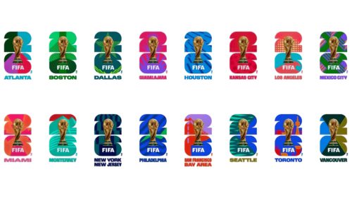
In addition to the main emblem, FIFA has also unveiled 16 Host City Logos, each derived from the World Cup emblem. These vibrant logos, designed in different colors, further amplify the excitement and diversity of the tournament. The iconic number 26 takes center stage in these visuals, serving as a powerful symbol that unifies the host cities.
Moreover, the number 26 not only appears prominently as a typographic wordmark in smaller visuals but also serves as inspiration for the tournament’s official typeface. Noto Sans, a visually appealing font, has been chosen to complement and visually support the symbol. This thoughtful selection of fonts enhances the overall aesthetic of the World Cup branding.
As the world eagerly awaits the kickoff of the 2026 FIFA World Cup, anticipation is reaching unprecedented levels. This monumental tournament will transcend boundaries and captivate billions of fans worldwide. The official logo, with its timeless design and powerful symbolism, is a reminder of the unifying power of football. It represents the spirit of competition, diversity, and global celebration that define the World Cup. Don’t miss out on this once-in-a-lifetime opportunity to witness the world’s best football teams in action, as they compete for glory in the grandest stage of all.


