The 30 Seconds To Mars logo resembles an electronic display on a spaceship screen. The unusual “Martian” symbols and color scheme set a tone of uniqueness and the significance of the message the band wants to convey to their listeners.
30 Seconds To Mars: Brand Overview
For over two decades, the band 30 Seconds to Mars, which originated in the pulsating heart of Los Angeles, California, has been a seismic force in rock music. Led by Jared Leto with his distinctive vocals and guitar, accompanied by Shannon Leto’s powerful drums and Tomo Milicevic’s virtuoso guitar, this trio inspires fans around the world with their extraordinary sound.
In the twilight of the 1990s, the Leto brothers, Jared and Shannon, cherished the dream of forming a band. Despite Jared’s successful acting career in Hollywood, his enduring love for music drove him to new endeavors. They soon recruited bassist Matt Wachter and guitarist Kevin Drake, christening the band 30 Seconds to Mars, thus paving their way into the music world.
The band burst onto the music scene with their debut album in 2002. It may not have ranked high on the commercial charts, but critics quickly recognized its potential, which helped build the band’s devoted fanbase. The breakthrough came three years later with the release of their second album, A Beautiful Lie. The album reached No. 36 on the Billboard 200 chart and included the hit single “The Kill,” which resonated with fans.
Releasing their third album, This Is War, in 2009, the band reached stardom. The album reached No. 18 on the Billboard 200 chart, and the acclaimed single “Kings and Queens” won several MTV awards and critical acclaim.
With the artistic vision of frontman Jared Leto, the Grammy-nominated musicians captivated audiences with their cinematic music videos. The band’s experimental approach to video creation, reflected in songs such as “The Kill,” “From Yesterday,” and “This Is War,” revolutionized the art form.
2013 saw the release of their fourth album, Love, Lust, Faith, and Dreams, which was another triumph. Debuting at No. 6 on the Billboard 200 chart, it included the popular singles “Up in the Air” and “City of Angels.” In 2018, the band expanded their musical horizons by releasing their fifth album, America, which includes collaborations with Halsey and Zedd.
For over 20 years, the band 30 Seconds to Mars has remained an unstoppable force in rock music. Their powerful combination of heartfelt lyrics, electrifying live performances, and groundbreaking music videos has won the hearts of an ever-increasing number of fans. As they continue to evolve and create music that transcends the boundaries, the horizons of this dynamic trio seem incredibly bright.
Meaning and History
What is 30 Seconds To Mars?
They are an American rock band from Los Angeles, California. Formed in 1998, the band gained popularity for their unique style and sound. The band has released several studio albums and has done numerous world tours, entertaining audiences with their distinctive rock music. Known for their energetic performances and experimental soundscapes, they have amassed a loyal fan base around the world.
2002 – today
The bright red 30 Seconds To Mars logo captures the energy and intensity of rock music. The logo features several symbols with undisclosed meanings, sparking fan theories about their significance. Fans believe the symbols encode the band’s name. The first symbol appears to be two “3’s,” forming a “0”. A circle with protrusions resembles a clock face. The third element has two white lines, interpreted as “to.” The final symbol represents Mars, depicted as a planet with two moons. These interpretations remain speculative.
Next to these symbols, the band’s full name is written in Bank Gothic font and divided into four lines. The cryptic nature of the symbols makes the logo feel like a secret code, intriguing fans and drawing them closer to the band. The bold red color sets an energetic and aggressive tone, mirroring the band’s music. The clean, modern font complements the enigmatic symbols, creating a balanced and visually engaging design.
The bright red in the logo immediately catches attention and conveys a sense of urgency and passion. The mysterious symbols add depth and intrigue, encouraging fans to explore and interpret their meanings. The structured Bank Gothic font contrasts with the symbols, adding a touch of modernity and clarity to the logo.
2003
The emblem for the debut album “Welcome to the Universe” features concentric circles symbolizing planets and portals. The musicians call This design Mithra, with a phoenix at the center, representing eternal rebirth from the ashes. The phoenix was initially the primary symbol of the band, embodying its spirit and drive for renewal.
Around the phoenix are four symbols encoding the band’s name. The first symbol, two intertwined threes, represents the number 30. The second symbol, a watch face, conveys the word “seconds.” The third symbol, two white stripes, represents the particle “to.” The fourth symbol, an image of Mars with two moons, symbolizes the final destination. These symbols give the impression of a signal from another world as if the text were sent in an alien language.
The band’s name is written around the central ring of the emblem. “30 Seconds to Mars” originates from a renowned professor’s speech about humanity’s rapid advancement. The idea behind the name is that soon, people will be able to reach Mars faster than the speed of light. This futuristic concept inspired the musicians, and the phrase became the band’s name.
The band’s Latin motto, which translates to a call to move upward, grow, and reach for the stars, is at the bottom of the emblem. This motto underscores the band’s commitment to self-improvement and exploring new horizons, reflecting their philosophy and mission in their music.
2005
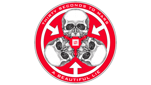
The logo for the album “A Beautiful Lie” is circular, echoing the theme of the planet Mars. The red color complements the idea and hints at danger, highlighting an important issue the musicians want to discuss with their listeners.
The logo features three arrows, three skulls, and the band’s emblem with the number three in the center. These elements resemble a clock, measuring humanity’s time, emphasizing the inevitability and urgency of current problems. The images draw attention to self-destruction, environmental pollution, oceanic waste, and global warming.
At the top of the logo, the band’s name is displayed in thin white letters, appearing as if formed from melting ice, reinforcing the theme of ecological issues. At the bottom, the album’s title is written in a similar style. This composition is called the Trinity Seal.
2009
The album “This Is War” logo reflects the dark and heavy theme of the record. The black square background with large bold letters creates an oppressive impression, emphasizing the seriousness and harshness of the war theme. The world turns dark when war comes, and battles take all attention.
The band’s name is at the bottom of the logo, on a red strip resembling a news ticker. This element highlights the relevance and urgency of the discussed issues. The emblem’s atmosphere conveys the artists’ struggle, mirroring their conflict with the recording studio. The disputes lasted over a year, receiving extensive media and tabloid press coverage.
2013
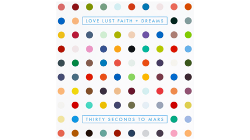
The emblem for the album “Love Lust Faith + Dreams” is unusual and vibrant. The logo consists of many colorful dots, each representing different shades of feelings and emotions. This approach resembles the technique of pointillism, where paint is applied to the canvas in separate spots, which then come together to form a cohesive picture. The image symbolizes how the background of life is created from a blend of diverse emotional tones, forming a rich and multilayered composition.
Renowned artist Damien Hirst inspired the logo design. The theme, “Isonicotinic Acid Ethyl Ester,” refers to a chemical compound used to synthesize many substances. This name highlights Hirst’s scientific and experimental approach to art, aligning with the album’s themes.
2018
The emblem served as a symbol for the Monolith tour. An image of an arrow extended and crossed by separate lines relates to the Provehito in Altum motto and represents the band’s fans, known as The Echelon. Some fans see the emblem as depicting the Tiwaz rune, symbolizing a flying spear and associated with the god of lightning.
The symbol resembles a cross with a sacred triangle at its center, representing the Trinity. This triangle, called the Triad, has been a symbol of the band since the “This Is War” album. The image can be seen as a crucifixion of the band, similar to the crucifixion of Christ on the cross.
Both interpretations present the image as symbolizing suffering for humanity’s sins, redemption, and rebirth. The logo matches the tour name and indicates that Jesus is the center of the world, the basis of everything.
The upcoming album’s songs connect to America and the American dream, presenting the USA as a monolith. The music advocates for unity and fighting for beliefs. This tour and its symbolism highlight the band’s philosophy, emphasizing the importance of spiritual and social aspects in their work.
FAQ
What does the 30 Seconds to Mars symbol mean?
The band 30 Seconds to Mars unveiled a triangular emblem known as the Triad during the launch of their album. This Is War. The emblem symbolizes triple or triple unity. In the song “The Kill,” room number 6277 is coded to represent the name “Mars” using a telephone keypad.
What is the motto of the band Thirty Seconds to Mars?
The band’s logo features a phoenix, which they have named “Mitra.” Attached to this figure is the Latin motto “Provehito in Altum,” which translates to “Rise to the depths.”
Why did Tomo Milicevic leave?
In 2018, the band released their fifth studio album, America. During the subsequent Monolith Tour, it was reported that Milicevic was stepping away from touring for undisclosed personal reasons. His departure from the band was officially confirmed in June of the same year.
Why did Tom leave the band for 30 seconds for Mars?
The band originally consisted of brothers Shannon and Jared Leto, with Tomo Milicevic joining in 2003. During the Monolith tour, it was publicly announced that Tomo would temporarily leave the band to deal with personal issues. This later culminated in his official departure from the band.
Does the band 30 Seconds to Mars still exist?
Indeed, the band 30 Seconds to Mars has returned with new songs inspired by the global pandemic. These songs are collected in an album with the apt but paradoxical title It’s the End of the World, But It’s a Beautiful Day, reflecting a sense of hope in the face of uncertainty.

