The 5sos logo conveys the unity of the group. The growth and maturation that the members of the foursome have experienced together, ready to move into the future as a united group. The emblem hints at the importance of friendship, love, and family in a dangerous and dark world.
5sos: Brand overview
5sos is an Australian quartet that performs rock and pop music. The band’s permanent lineup includes Luke Hemmings, Michael Clifford, Calum Hood, and Ashton Irwin. In 10 years, the musicians have sold 10 million copies of their five studio albums, introduced two solo albums by the members, and their singles have been listened to over 7 billion times online.
Meaning and History
The band’s logo has changed with new albums and contracts. Each rendition attempts to find the perfect representation and capture the essence of the album. To date, there have been three rebrandings. One of them is related to the plagiarism issue. The group had to abandon one of the main elements of the lines because of its similarity to the emblem of another brand. The claims required finding a completely new approach to its own identity. The result can’t be called a bull’s-eye, but the logo has definitely gained individual features.
What is 5sos?
A musical group formed in high school. Popularity came to the band after posting songs on YouTube. The group further developed through a contract with Sony/ATV Music Publishing and collaborative songs with popular bands. A world tour with One Direction cemented their success. After the tour, the band’s debut album sold 259,000 copies in one week. The band’s studio and solo albums have been popular ever since.
2012 – 2014
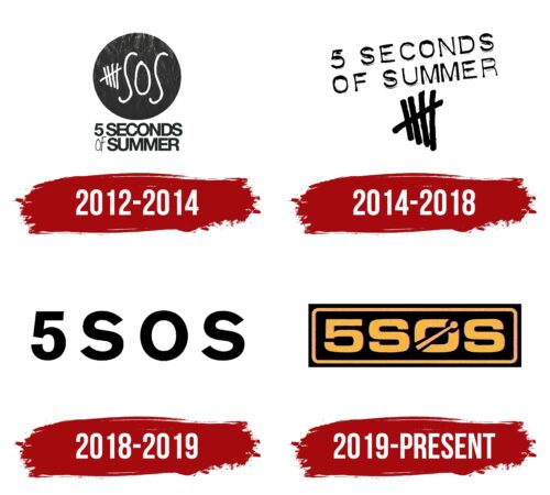
The first emblem of the band consists of an image and an explanatory caption below it. The background for the image is a black circle, symbolizing records and music CDs. Since the band’s songs are recorded on CDs, the logo also overlays information on top of the disk.
In the center of the drawing are five white lines: four vertical lines and a fifth horizontal line crossing the others. The lines symbolize the number 5 in the title and allude to the four participants united by a common idea.
Next comes the acronym SOS, written in capital letters.
Below the disk, the full name of the band is listed on two levels. Here, the preposition OF is made in thin, barely visible lines. The name of the band was suggested by guitarist Michael Clifford. Since the guys started playing as students, their interest in music was like a breath of fresh air in the midst of classes. A way to immerse themselves in the atmosphere of summer vacations. Interestingly, 3 out of 4 band members ended up dropping out of school for a music career, permanently staying “on vacation.”
In some versions of the logo, the full name is on a white stripe around the black core of the disk, making the symbol look even more like a record.
2014 – 2018
The band signed a contract with Capitol Records. Growing popularity draws attention to the visual symbol of the previously little-known band, and the disc symbol seems unoriginal, as it is present on the logos of many companies, including record companies.
Therefore, in 2014, they changed the emblem. A light and free logo without a restrictive background was chosen, as the band was on a world tour, and there were no boundaries for the musicians any more.
The mark emphasizes a composition of lines, which is sized to match the letters of the inscription and made in bold glyphs. This technique indicates that the quartet depicted on the sign is becoming known.
Above the image, the name of the group is slightly tilted. The turn shows growth and aspiration for the future: Blossoming and popularity.
2018 – 2019
Since 2018, the band’s emblem has undergone a significant change. The new mark is characterized by minimalism.
The team replaced the visual representation of the lines with the number 5 to avoid legal proceedings with the Undefeated store. This clothing brand uses an almost identical symbolism of crossed sticks.
The band name 5 Seconds of Summer has been shortened to the acronym SOS. In 2018, Youngblood’s third album was released, and the tour promoting it was called 5SOS III, which echoed the new logo.
The sign turned out to be concise and simple. However, it was more like a temporary replacement “on the fly” while the band searched for a better option. The new symbol was developed just a year later.
2019 – today
The band is preparing for the release of their fourth album by introducing two singles to the public. An original sign was designed for the new collection. The band’s logo was encased in a rectangular black base. The choice turned out to be quite appropriate for the title of the new album – C A L M, formed from the first letters of the artists’ names. The musicians, who started out in high school, have been inseparable for more than a decade.
The orange border inside the rectangle reinforces the impression of isolation. The line shows that the inner world of the band is based on mutual support and unity.
The inscription 5SOS is made in a large orange font. The letter O is crossed by a drumstick, which makes the symbol look like drums. This technique hints at the band’s musical direction.
Font and Colors
The contrast of black and white is a major technique in the band’s emblems. The appearance of color in the last sign indicates a change in the views of the members and the expansion of horizons. With age, musicians stop dividing the world into white and black, feeling its benevolence. They find strength and inspiration in friendship and unity. This is indicated by the warm, sunny hue of the title.
A square geometric font with rounded corners highlights the lettering. The rectangle shape hints at the four members of the quartet. The transformation of the letter O makes the title unique and emphasizes the rhythmic nature of the music.
5sos Logo Color Codes:
- Black: Hex: #000000; RGB: 0, 0, 0; CMYK: 0, 0, 0, 100; Pantone: PMS Process Black C
- White: Hex: #FFFFFF; RGB: 255, 255, 255
- School Bus Yellow: Hex: #F5A602; RGB: 245, 166, 2; CMYK: 0, 32, 99, 4; Pantone: PMS 137 C
FAQ
Why did the 5SOS group lose its logo?
The band 5SOS has decided to abandon their original “tally mark” logo due to legal difficulties, as revealed in a deleted tweet by band member Calum Hood. Responding to a fan’s question about the disappearance of the tally marks, Calum cited copyright issues as the reason.
Who made 5SOS famous?
The band 5SOS first gained attention as a YouTube personality before achieving international fame as One Direction’s opening act during their “Take Me Home” tour.
Why is 5SOS being sued for their logo?
According to unconfirmed reports, clothing brand Undefeated has initiated a lawsuit against 5SOS for using their tally mark logo. Tom Gordon, the famous designer, stated on his website that the emblem has been the source of legal difficulties.
