The A Day to Remember emblem is majestic and monumental. The emblem demonstrates the band’s commitment to leaving a mark in history and being remembered by fans for years to come. The mark epitomizes the band with style, mission, and path.
A Day to Remember: Brand overview
A Day to Remember is a Florida quintet formed in 2003 in Ocala. Founding members Tom Denny and Bobby Scruggs were the only ones to leave the band afterward, and the current members are McKinnon, Westfall, Woodard, Shellnutt, and Skaff. The band released seven studio albums on the Victory Records label under the name ADTR.
Meaning and History
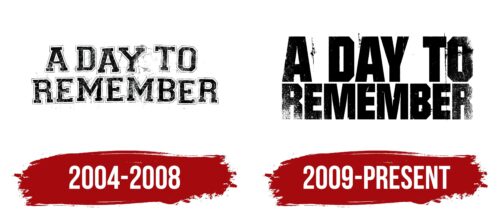
The band’s logos focus on the essence of the name. The marks are indicative of wear and tear and the passage of time. The band has been playing for a long time, and the audience now observes old, peeling posters. This technique demonstrates the transience of the world, bringing to mind eternity and the meaning of life. The band came up with their first logo a year after their formation, timed to coincide with the release of their independent EP: Halos for Heroes, Dirt for the Dead. The second logo is related to their third album, Homesick. It was recorded and produced by Victory, who probably designed the new logo.
What is A Day to Remember?
American band combining hardcore and pop-punk in their music. They are distinguished by their unusual melodies. The band released their first EP independently and sold it at concerts. After that, seven studio albums were released in cooperation with four labels. The latest contract is with Fueled by Ramen. The band regularly tours Europe, the United States, and Australia.
2004 – 2008
The band’s emblem consists of a sticker-like inscription due to the wide white border around each symbol. The name is arranged in two levels. The ends of the words on the right side are slightly slanted, indicating the long time that has passed since the sticker was applied. The cracked, ruled background gives an aged effect. The whole appearance of the logo echoes the theme of remembrance.
The logos do not reflect the band’s first name, End of an Era. It was changed in the first year of the band’s existence. The current name was suggested by the girlfriend of the band’s founder, drummer Bobby Scruggs, during one of the rehearsals. The band members liked the name and decided to keep it. Scruggs was dropped from the band after two shows because his playing was not up to par.
2009 – today
In 2009, a new logo was created for the band’s third studio album to reflect the significant events of the year: the band renewed their lineup and embarked on their first headlining tour.
Large capital letters with truncated corners signified a new stage in the life of A Day to Remember, their growing popularity and fame. The image resembles a massive monument to a great man, slightly touched by time. Hence the wear and tear on the edges of the inscription.
The logo demonstrated that the band has left a significant mark on music history that won’t be disappearing anytime soon.
Font and Colors
The black color goes well with the theme of remembrance and the hardcore style the musicians play. Dark shades evoke feelings of sadness and melancholy. They are associated with loud, powerful sounds characteristic of metal.
The font of the inscription is Mako Black. Each symbol resembles a hewn boulder, a rock. The inscription conveys calmness and confidence, indicating the strength and unity of the band.
A Day to Remember Logo Color Codes:
- Black: Hex code: #000000; RGB: 0, 0, 0; CMYK: 0, 0, 0, 100; Pantone: PMS Process Black C
- White: Hex code: #FFFFFF; RGB: 255, 255, 255; CMYK: 0, 0, 0, 0; Pantone: N/A
- Gold: Hex code: #FFD700; RGB: 255, 215, 0; CMYK: 0, 16, 100, 0; Pantone: 871 C
FAQ
Where did the name A Day to Remember come from?
The name “A Day to Remember” came from a random moment during a training session in Ocala, Florida, around 2003. Bobby, the original drummer of the band, had a girlfriend who spontaneously mentioned the phrase that became the band’s name.
How popular is the band A Day to Remember?
Since the release of their first album, “And Their Name Was Treason,” in 2005, A Day to Remember has made significant strides in today’s hardcore music scene. The band has released eight albums in 15 years, building a massive streaming audience with billions of streams on Spotify.
Is A Day to Remember an emo band?
The band is a unique fusion of different genres, combining elements of emo, hardcore, and metal in what Eduardo Rivadavia of AllMusic called “pop mosh.” When asked about the band’s genre in an interview with AbsolutePunk, Jeremy McKinnon recognized the uniqueness of their sound.
