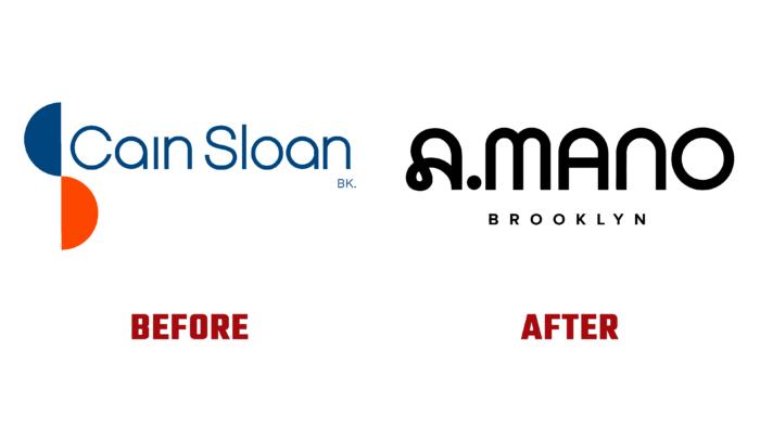
Cain Sloan, a Brooklyn home decor store, has changed its name to A.MANO Brooklyn with a dramatic rebranding. Its assortment consists of work by local artists, including vintage pieces and exclusive recycled furniture. A variety of fun and clever gifts are always available, including original stationery and a wide variety of garden products. Its founder, who opened the business in 2020 as Cain Sloan as an e-commerce store, paid tribute to his ancestor, who opened a department store in Nashville, TN, with a similar name in 1903. After conducting an expansion of the store, adding handmade offerings, and moving to new premises, there was a need for a rebranding, a complete name change that would reflect the change.
This task was handled by Sergio Mannino Studio of Brooklyn, NY, who was able to reflect all of the store’s unique features and perspectives in a modern and original new brand style. The rendering created successfully combines the Italian aesthetic of the eighties with the minimalism of the modern industrial design. At the same time, the inspiration was taken by the designers in the works of Donald Judd and the Milanese Memphis group, the most famous representatives of modern art. The construction of the whole interior was formed in three different spaces, the atmosphere of which was unique and highly individual. The main goal was achieved – to create conditions for the formation of a constant progressive flow and suggestions for each of the clients, based on the presence of a variety of experiences in this area.
The corporate style created by the designers was a natural continuation of the general design of the store itself. The basis of the logo was the capital letter A, presented in two completely different designs. The first one is from Lyno font and is distinguished by boldness and playfulness, typical for the brand’s visualization. The second one was created as a unifying element between the main and the rest of the typeface. The main lettering is perfectly reoriented into the logo itself, easily used both independently and with the word Brooklyn. At the same time, it looked very effective in any frame or solid background.
The color scheme created by corporate identity consists of three colors – the contrasting black and white and the original smoky-blue, which looks very advantageous against the first two. An unexpected but very bold and advantageous solution was to create a reflective effect of these colors in the materials of the floor and glazed bricks in the images. Thus ensuring their bold presence and demonstrating the strong character of the renewed brand.


