The emblem of the band ABBA is simple yet original. The emblem demonstrates the uniqueness of the band and shows its pairing. The symbol also speaks to the equality of the performers, who each had solo parts.
ABBA: Brand overview
ABBA was a legendary Swedish quartet consisting of two married couples, each singing, founded in Stockholm in 1972. They performed in the rock and roll style and were inducted into the Hall of Fame in that category in 2010. The band – winners of the 1974 Eurovision Song Contest – recorded eight albums and over 60 singles. The band broke up in 1982 but reunited in 2016 and performed several songs in honor of the 50th anniversary of the meeting of Björn Ulvaeus and Benny Andersson.
Meaning and History
Despite forming the band and creating a common logo in 1972, the band members began performing separately in their youth and together in 1970. Björn and Benny knew each other and had been working together since 1966. The band had a permanent four-letter logo with an ambigram and several variations of emblems for each single and album. Depending on the content of the song, the letters changed color and shape, conveying the emotion of the song.
What is ABBA?
One of the most successful musical groups in the world. More than 355 million ABBA records have been sold. Although the band ceased to exist in 1982, their CDs are still sold, and their songs are still played on the radio. Their compositions topped the charts in all English-speaking countries, and their compilations topped the charts even after 2000.
1972 – 1974
The first logo shows the alliance between the band members. On the right side of the logo are the male names (Björn and Benny), followed by a large ampersand, and then the female names (Agneta and Frida).
This design choice suggests that the band began as a collaboration between Björn and Benny. These men formed a band and even recorded an album together. Agneta and Frida played the role of backing singers. That is why their names are in the background.
The ampersand also indicates the union of the first and second halves: Bjorn and Agneta got married, while Benny and Anni-Frid lived together.
1974
In 1974, they shortened the name to an acronym, taking the first letters of the members’ names for easier pronunciation. Instead of the name Frida, Lyngstad’s full name, Anni-Frid, was used for symmetry. In this case, the male names started with two B’s and the female names with two A’s. The idea first came to Benny Andersson.
A Swedish seafood company was using the same name, and the quartet formally approached the company for permission to use the acronym. The company agreed, but on the condition that they would not dishonor the name.
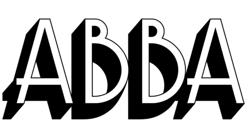
The new name first appeared on the cover of the Waterloo single. The symbols on the logo are three-dimensional and written in capital letters. The viewer seems to be looking at them from the bottom up. This approach testified to the growing fame of the band – with the song of the same name in 1974, the band won first place at the Eurovision Song Contest.
1974
A new logo is designed for the single Honey, Honey. It is soft, tender, and bright, like a girl’s feelings. The song is about falling in love, dreams, and fantasies. Therefore, the emblem was chosen in a romantic style with an emphasis on clouds, sun, and sky. The shape resembles the sun rising above the horizon and swirls of clouds. On the edges of the background, there are bright lights. At the same time, the lettering is stylized as if the letters “A” were living letters that spread their glyphs like legs in different directions. This design choice looked very feminine and appropriate for the single, considering that the lead singer of the band was hiding under the letters “A” and the lyrics were about love.
1974
Another single song from the Waterloo album, Hasta Mañana, deserved its own logo. This song was prepared as a backup for Eurovision. The black shadows of ABBA’s letters formed the basis of the logo. They represent the shadow of the departed love, which is the subject of the song. The symbols indicate the sadness and memories that remain after the passing of a loved one.
1974 – 1976
The emblem was used for two ABBA album singles. The first of these, So Long, was released in 1974. It first featured stylish red lettering with swirls and shining stars. The song was about how money can’t buy love. The rich design of the emblem symbolized treasure, and the red color indicated that only love was valuable. The second single, Rock Me, was recorded in 1974 and was included as a single in 1975. The band performed this song on all of their world tours. The composition talked about the desire to give in to feelings. The emblem for the song also emphasized the value of love and demonstrated putting a loved one on a pedestal.
1975
A seemingly ordinary logo of simple black letters with rounded glyphs and a large distance between the symbols symbolized the flight of the boomerang. The logo was designed for the song Bang-A-Boomerang, which tells us that the love we give always comes back. The band ABBA recorded the song twice, in 1974 and 1975, and provided it to Svenna and Lotte for the Eurovision Song Contest. The emblem was designed for the 1975 version used in the singles. The basic idea of the emblem is that even if you feel lonely, like these scattered letters, give love, and it will come back to you. That’s why, in some versions, the emblem is in a sensual red color.
1975
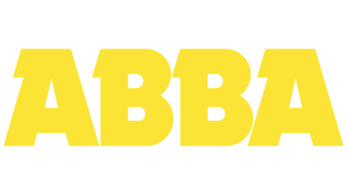
A bright yellow inscription of solid capital letters with a notch to the right of each symbol was used for only one single SOS. The song is about trying to save a dying love. The placement of the serifs on one side speaks to the efforts of one person in the couple and the indifference of the other. The yellow color speaks of the search for understanding and the desire to establish and restore communication.
1975
The single Mamma Mia from an album called ABBA also received its own logo. The composition was performed by the lead singers of ABBA. The composition topped the charts in Australia, the UK, Switzerland and Germany. In the logo, the red letters A have a different slope in opposite directions. A similar technique was used in the creation of the single Honey, Honey. The bright color of the sign and the emphasis on the female half of the band emphasized the song about a love-sick woman who was betrayed but still loved.
1976 – today
The letters B seem to turn toward their partners and look in different directions. The ambigram was first used when the soloists were being filmed for a youth magazine. They were holding the first letters of their names, and Benny accidentally flipped the symbol. They liked the idea. The new emblem was finalized by Rune Söderqvist and first placed on the Golden Double Album in 1976. It showed family relationships and the presence of two couples in the band.
Font and Colors
During the band’s existence, white, red, yellow, and black colors were used in the emblems. This color palette conveyed the youth, popularity, and exciting melodic songs of the musicians. The final symbol was the color black. This color suggests that the band will forever be remembered by fans. The group left a serious mark in the world of music. They have virtually no competitors. The black color shows ABBA’s confident position on the world stage.
Thin elongated letters symbolize refinement and the impeccable musical style of the band. The font of the inscription is simple, reminiscent of Helvetica.
ABBA Logo Color Codes:
- Black: (#000000); RGB (0,0,0); CMYK (0,0,0,100)
FAQ
What is the ABBA emblem?
ABBA’s emblem is an inverted letter B next to the two standard As and B, symbolizing the duality of the two pairs in the band. Created using the News Graphic Bold font, the design also echoes the balance inherent in the ABBA name itself.
Who created the ABBA logo?
ABBA’s unique logo, depicting a backward B, was designed by Rune Söderqvist, who was responsible for most of ABBA’s album covers. The abigram debuted on the French compilation Golden Double Album in May 1976 and has been a permanent mark of the band ever since.
Is ABBA a Swedish icon?
There is no doubt that ABBA is one of Sweden’s most iconic pop groups. The country, a major music exporter, recognizes ABBA as its crowning glory in the world of popular music.
Is the ABBA logo subject to copyright?
The name ABBA and its unique inverted B logo are legally protected trademarks. They are owned by Polar Music International AB and Universal Music Group, and additional licenses for ABBAWORLD have been granted to Touring Exhibitions Sweden AB.
What is the meaning of the name Abba?
The name Abba comes from Semitic languages and translates as “father.” Although it is a nominative name, it has also been used as an honorific title for religious figures.


