The association for growth and development is contained in the emblem. The elements that make up the Ace Hardware logo show the strength and power that the joint work of companies gives the brand. The sign is filled with energy and continuous work for the sake of the future.
Ace Hardware: Brand overview
| Founded: | 1924 |
| Founder: | Richard Hesse, E. Gunnard Lindquist, Frank Burke, Oscar Fisher, William Stauber |
| Headquarters: | Oak Brook, Illinois, U.S. |
| Website: | acehardware.com |
Meaning and History
Ace Hardware Co-op was once a small business of four enthusiasts who decided to band together because it was easier for them to make deals. It was shortly before the financial crisis, but the economic problems in the country only helped the entrepreneurs develop their common business. At that time, many people began buying construction tools and materials to do their repairs rather than spending money on handypersons.
In 1927, the partners chose the name Ace Stores for their joint company in honor of the pilots who had participated in World War I. In this case, the word “ace” should be understood as “master of air combat.” The title was awarded to pilots who shot down five or more enemy planes. They marked each victory by painting one ace on the plane. Thus the term for the English card suit gradually passed into the vocabulary of combat aviators.
In 1928, the company finally opened its first warehouse and three years later changed its name to the current one: Ace Hardware Corporation. Two more years later, the chain had grown to 38 stores. They were independent, but they worked together: in particular, they bought goods together and evaluated their quality. In 1976, the dealers took over, and the organization itself was transformed into a cooperative and moved to the city where it is now headquartered.
Ace Hardware now owns dozens of its brands, each with its own identity. The company pays just as much attention to its own visual identity. The group of companies makes sure that each store conforms to a single concept, subject to a common branding. That is why logos are very important in its history.
1929 – 1930
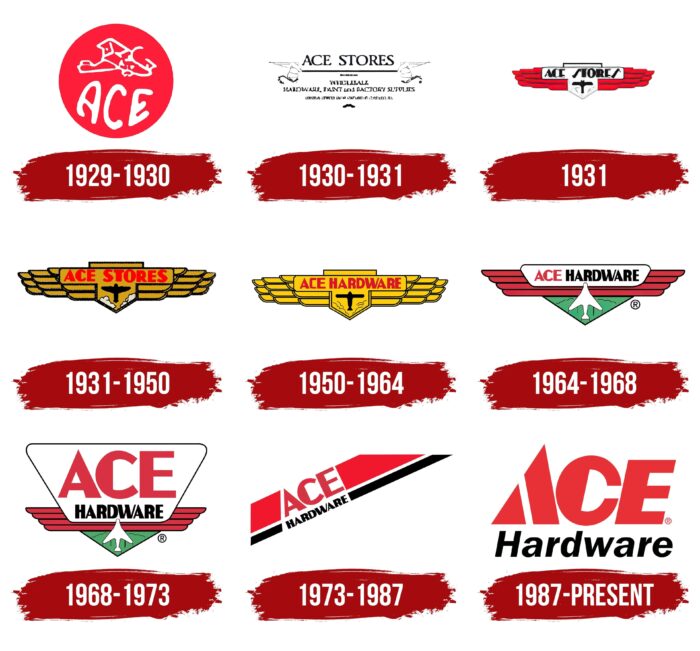
In the early days of Ace Stores, the designers developed an emblem in the form of a red circle with “ACE” written on it. The word consisted of jagged white letters and occupied the whole lower half of the graphic sign. Above it was a picture of a biplane, the main aircraft of World War I. It was schematic: thin white lines outlined only the silhouette.
1930 – 1931
The logo, which appeared in the early 1930s, was black and white and contained a lot of text. At the top was the company name. It was separated from the rest of the lettering by a thick horizontal bar with decorative ornaments along the edges. The drawings looked like two stylized wings.
1931
The new symbol was shaped like an aviator’s chevron, like the one on a pilot’s jacket. The central white plaque bore the inscription “ACE STORES” in the high-contrast script, and the shield beside it showed a small airplane. Artists painted red wings composed of feathers like a bird to the right and left.
1931 – 1950
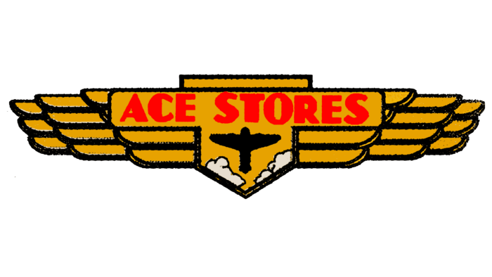
After the redesign, the lettering became red, and the entire base was repainted yellow. This allowed the white clouds next to the plane’s tail to stand out. The font also changed: the designers left it in high contrast but made it flat and symmetrical.
1950 – 1964
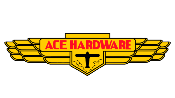
The old company name was changed to Ace Hardware. It took the same place in the center. The light red tone shifted to a burgundy tint. In addition, the designers gave the plane a more compact shape, increased the expressiveness of the contours, and replaced the white clouds with yellow.
1964 – 1968
The yellow multi-structure wings were removed. In their place, the artists depicted four red stripes of varying sizes. They were arranged in ascending order, with the shortest line at the bottom and the longest at the top. A white plate covered the middle in the shape of an inverted trapezium. In it was a two-color inscription: red word “ACE” and black “HARDWARE.” Underneath is a green triangle was a white silhouette of a fighter plane.
1968 – 1973
In 1968 the proportions of the elements changed. The largest part of the logo was a white trapezoidal figure. This allowed placing the name of the cooperative in two lines. And the font of the word “ACE” was also modified. The designers made a straight vertical line on the inside of the “C” to remove the rounding. At the same time, they widened the right stroke on the “A” and the left stroke on the “E.” All colors except black and white were muted.
1973 – 1987
In 1973, a graphic symbol appeared that did not look like a pilot’s chevron. It looked conceptual because it consisted of two diagonal lines: a wide red line and a narrow black line. They ran parallel and were cut horizontally at the top. Inside the first line was the red word “ACE,” and in the second was the black “HARDWARE.”
1987 – today
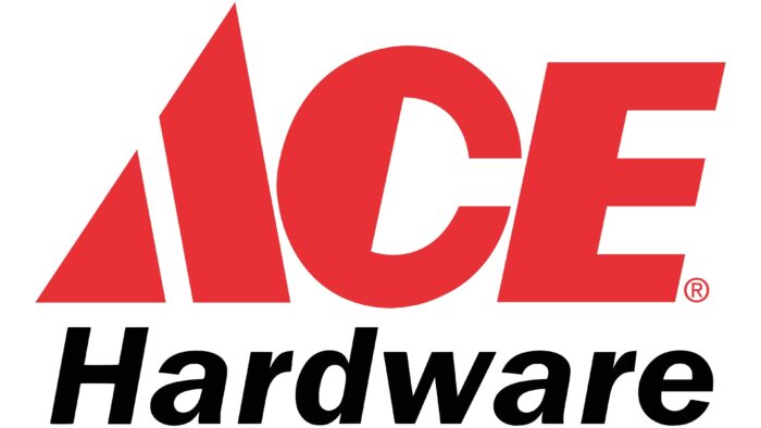
The current co-op logo was created in 1987. The designers integrated geometric shapes directly into the lettering, turning the first “A” into a combination of a triangle and a standing trapezoid on its side. The “C” inside the lettering is now shaped like a semi-circle because it’s half painted over. The black word “Hardware” is under the red “ACE” as before. It is written in italic, sans serif font, and all the characters except the “H” are lowercase.
Ace Hardware: Interesting Facts
Ace Hardware has become a key player in the home improvement industry, and it is known for its cooperative business model and emphasis on customer service.
- Cooperative Model: Ace operates as a retailer-owned cooperative, where local entrepreneurs independently own each store. This structure lets profits go back to the store owners.
- Customer Service Focus: Known as “The Helpful Place,” Ace Hardware prioritizes customer service, offering knowledgeable staff and personalized service.
- Worldwide Expansion: Ace has over 5,000 stores in about 60 countries from Chicago, making it a leading hardware retail cooperative globally.
- Founding: Established in 1924 in Chicago by Richard Hesse, E. Gunnard Lindquist, Frank Burke, and Oscar Fisher, “Ace” was chosen to represent top-quality household hardware products.
- Retail Innovation: Ace was an early adopter of computer technology for inventory and sales, highlighting its innovative retail approach.
- Franchise Recognition: Ace Hardware is highly rated for franchisee satisfaction and has won awards for its business model and community involvement.
- Paint Studio Launch: In 2014, Ace introduced the Paint Studio, offering a boutique shopping experience to compete with specialized paint stores.
- Commitment to Community: The Ace Hardware Foundation supports causes like the Children’s Miracle Network Hospitals, showing Ace’s dedication to community service.
- International Growth: The company has grown globally with Ace International, tailoring products to various markets while keeping its core values.
- Diverse Offerings: Ace stores provide various products and services, from gardening supplies to home décor and services like key cutting and paint matching.
Ace Hardware’s journey from a small Chicago-based group to a global cooperative highlights its adaptability, commitment to service, and community-focused business approach.
Font and Colors
The most recognizable part of the logo is the word “ACE.” Its letters are very symbolic, considering that the “A” consists of elements similar to a Speedline. It conveys the energy of motion, which has a connection with airplanes. So allegorically, the designers tried to connect the emblem with the company’s name without depicting combat fighters. After all, the activities of Ace Hardware have nothing to do with aviation – the chain of stores sells building tools and materials. By the way, if you look closely at the letter “C,” you can see a nail head inside it. Its silhouette is formed by negative space.
Corporate symbols allow all businesses to work as a unified system. It increases their popularity and contributes to profit growth because customers trust the familiar brand more.
Since the logo contains only lettering, the designers paid full attention to the font. For the word “Hardware,” they chose the Franklin Gothic equivalent of a sans serif geometric italic typeface. As for some of the letters in “ACE,” their style is similar to Old Miami Beach Nights JNL – high-contrast grotesque with a pronounced asymmetry of strokes. Still, it’s a custom typeface designed specifically for the co-op.
Red was originally present in the brand identity. The modern version uses its bright shade, almost scarlet. It is traditionally combined with white and black.
Ace Hardware Logo Color Codes:
- Imperial Red: Hex color:#e73137; RGB:231 49 55; CMYK:0 79 76 9; Pantone:PMS Warm Red C
- Black: Hex color:#010202; RGB:1 2 2; CMYK:50 0 0 99; Pantone:PMS Black 6 C

