


![]() ACE Logo PNG
ACE Logo PNG
The trio that the ACE logo points to is unusual. Its participants are multifaceted personalities who form a single tandem, complementing each other. The elements of the emblem are permeated with movement. The group goes forward and leads the youth.
A.C.E took shape before its official debut, through five trainees who had spent years moving between agencies and survival shows. Jun trained for seven years at Jellyfish Entertainment and CJ E&M. Donghun appeared on Superstar K5 and I Can See Your Voice. Wow, trained at YG Entertainment with future WINNER members, while Byeongkwan came through K-Pop Star, and Chan trained at JYP Entertainment and in break-dance crews.
In 2016, before any formal launch, the group performed on the streets of Hongdae in Seoul. Their cover stages spread online, giving them an early fan base. On May 23, 2017, A.C.E debuted under Beat Interactive with “Cactus,” a hardstyle EDM single that stood apart from the polished sound of larger agencies such as SM Entertainment and HYBE.
The second single, “Callin’,” followed in October 2017. During that same period, the members split across survival shows: Jun and Chan joined The Unit, while Donghun, Byeongkwan, and Wow entered Mix Nine. Chan later debuted as a member of the temporary group UNB. In 2018, A.C.E released Adventures in Wonderland with “Take Me Higher,” then moved into stronger chart results through Under Cover in 2019, The Mad Squad later that year, and HJZM: The Butterfly Phantasy in 2020.
“Goblin (Favorite Boys)” became a key moment, reaching the group’s best chart position to date. In 2021, Steve Aoki and Thutmose released the “Fav Boyz” remix, widening A.C.E’s overseas reach. Swing Entertainment joined Beat Interactive for co-management in 2021, and Siren: Dawn followed with “Higher.” From 2021 to 2022, all five members entered military service. By February 2024, the full group had returned, and their Beat Interactive contract ended on March 31, 2025.
Meaning and History
The band made its debut in mid-May 2017. But listeners learned about it much earlier because all five members of ACE had already become famous media personalities before the release of the first Cactus song. They attracted attention for their active social life. First of all, the team published arrangements of world-famous hits and new dance renditions on their YouTube channel. Videos enjoyed great popularity. What are the millions of views of the cover of “Playing With Fire” by BLACKPINK? In addition, the musicians starred in musicals and attended various shows as guests.
Though the band is owned by a small label, the budding stars made a high-profile name for themselves, paving the way for their long-awaited debut. ACE members not only sing but also move very well, as the audience can see at their many street performances. They danced on the street, drawing crowds around them. A huge fan base became the backbone of the Choice community. As the musicians admitted, it was the fans who helped them win the Choice Global Hallyu Star Award in 2020.
The K-pop artists rose to fame quickly, so their first song, “Cactus,” was met with great enthusiasm. The release date can be considered the group’s official debut. Shortly before that, a teaser of the ACE logo was unveiled. It turned out to look like a complex abstract symbol, consisting of wide stripes. At the top is a triangle. A diagonal starts at the bottom edge and connects to two lines of different lengths. In the space, the creative team’s name is written, with dots after “A” and “C.” The entire left side is aligned vertically, so it slightly skewed the image.
The logo is not as abstract as it seems. The geometric composition has a hidden meaning: each element denotes a specific letter. The upper triangle symbolizes “A,” though without the lower diagonals. Three parallel lines connected by a common basis represent “E.” On the opposite side is “C,” turned around, but still recognizable by its horseshoe shape. It is these letters that make up the band’s name.
Font and Colors
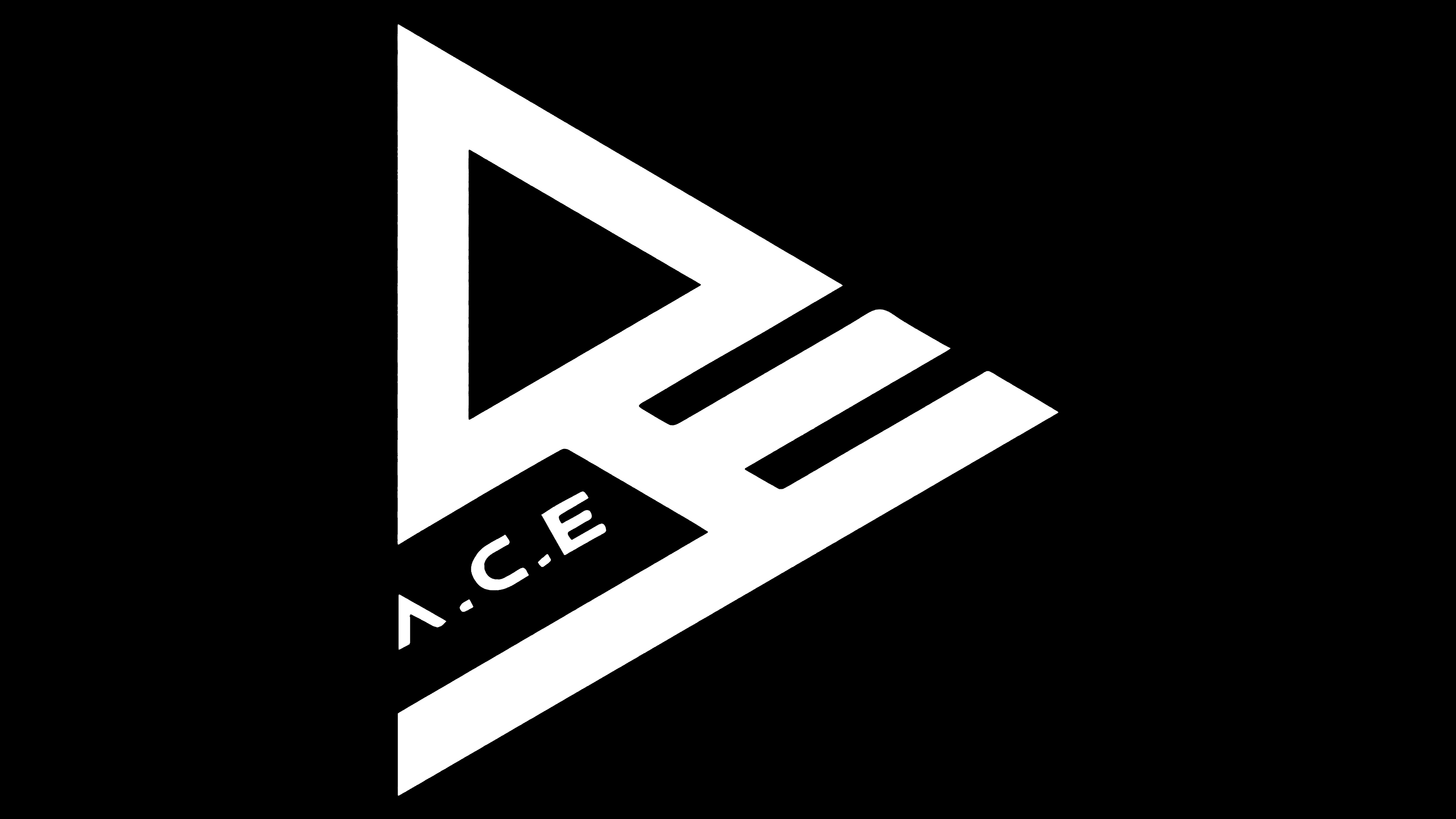
The word “A.C.E.” is written in a custom font. “A” looks like a triangle without a bottom edge, “C” resembles a fallen “U,” and “E” has a shortened middle horizontal stroke. There are no serifs; all lines are the same width. The designers tried to make the letters match the emblem’s structure, or at least be remotely associated with it.
The main colors of the logo are black and white. This combination emphasizes the band’s minimalist style, its desire for brevity, and visual balance.
ACE Logo Color Codes:
- Black: Hex color:#000000; RGB:0 0 0; CMYK:0 0 0 100; Pantone:PMS Process Black C