


![]() ADO Logo PNG
ADO Logo PNG
The ADO logo is a perfect embodiment of the personality of a company that produces home furniture. It is massive, large, and memorable, with an original design in which each element is harmoniously blended into a single symbolism. The main point is that the manufacturer showcased the product as a reliable, durable, and stylish interior element.
ADO Furniture is a Lithuanian furniture company registered in Klaipėda on July 10, 2019. Its legal name is UAB Ado Baldai, company code 305208773. Director Marius Kulberkis leads the company and is legally based at Nidos Street 54-42 in Klaipėda, Lithuania’s only seaport and one of the country’s industrial centers.
The city already had a strong furniture background. Since 1954, AB Klaipėdos baldai has operated there and became one of Lithuania’s largest cabinet furniture producers, with revenue of about €71 million and more than 790 employees. ADO Furniture entered a much narrower field, focusing on upholstered furniture, smaller production volumes, and custom work rather than large-scale serial manufacturing.
From its first years, ADO Furniture built the business around two product directions. The Standard line included ready-made sofas, armchairs, poufs, bedside tables, small tables, mirrors, and headboards with fixed sizes and configurations. The Bespoke line focused on individual orders, allowing clients to change dimensions, choose upholstery, and adapt construction to a particular interior. This made the company useful for private buyers, architects, and interior designers.
ADO Furniture remains a small company, but its publicly available financial data shows a viable niche model. In October 2024, it had 14 insured employees. In 2023, revenue reached about €974,000, with a net profit of about €21,000. On the Lithuanian furniture market, it competes indirectly with larger companies such as UAB Narbutas ir Ko. At the same time, its own position is tied to hand-assembled upholstered furniture and work from sketch to finished product.
Meaning and History
![]()
ADO Furniture was registered in 2019 by Marius Kulberkis with an authorized capital of 3,000 euros. In 2020, with 12 employees, the company’s income exceeded 411 thousand euros. In 2021, ADO received one of the prestigious Stipriausi Lietuvoje certificates, confirming the company’s financial reliability and a positive impact on the development of the Lithuanian economy.
The first logo did not show the essence of the company’s activities. Therefore, its change after official registration was expected.
What is ADO?
A furniture company that produces designer items for home improvement from natural materials. Located in Klaipeda.
2003 – 2019
![]()
The team has been designing and creating furniture since 2003. The atelier’s logo was a simple three-letter abbreviation: ADO. Softly rounded sans-serif contours conveyed the simplicity and ergonomics of the objects created, with nothing superfluous in the designs and the logo. Products easily fit into the interior. The main feature is convenience. The black color represented the use of natural materials, such as metal and wood. The base was made of a steel profile coated with black powder paint, as used for many products.
The decoding of the abbreviation has several options:
- In Lithuanian: architecture, object design (architektūra dizainas objektas).
- In English: author’s developments to order; author’s design of objects.
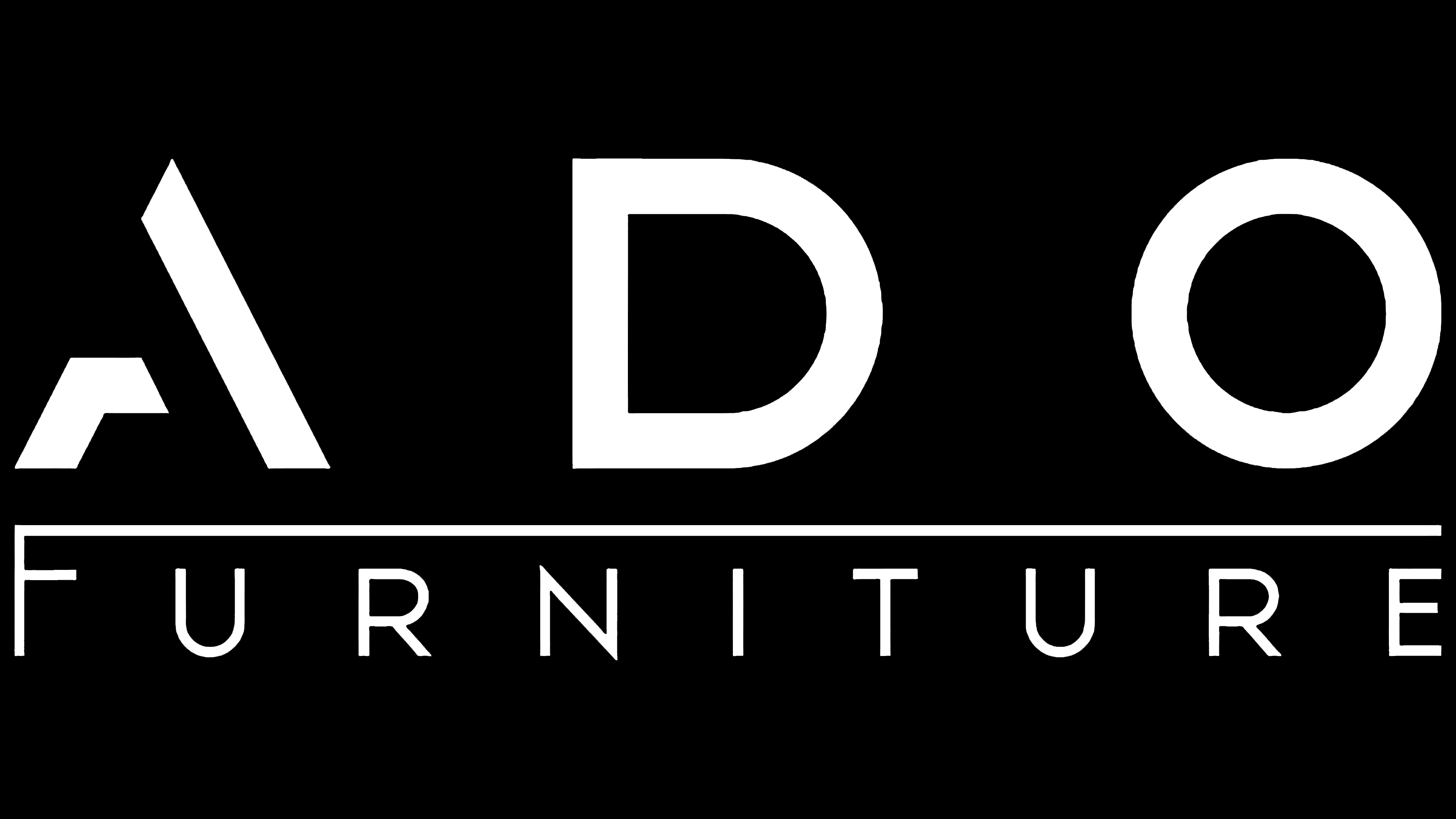
2019 – today
![]()
In July 2019, ADO Furniture was officially registered, and a new logo was developed. It is more elegant and meaningful.
The main element, ADO, has been preserved. The name is written in large, wide letters with a letter space between them. Below, we added the English inscription “Furniture” (furniture) in a thin, elegant font along the entire length of the ADO. In addition to the word “furniture,” which directly indicates the direction of work, three more visual elements have been added to the logo to complement the impression:
- Stylized letter “A.” The upper part of the first stick and jumper was removed. Thanks to this, it imitates a sofa, bed, or armchair in shape.
- A thin dividing line is added between the top and bottom of the logo, formed by the elongated upper stick of the letter F. This makes the letter look like a bed. The dividing line shows two stages in the firm’s existence.
- The ADO font has been changed to a crisp, more pronounced corner style. It conveys the curves of the furniture and the features of the metal frame, forging details since ADO is also engaged in metalworking.
In general, the logo has become more elegant. It showcases the design work, which conveys the enterprise’s creative spirit.
Font and Colors

The emblem is exclusively black. It symbolizes the basis, draft, and sketch, and the designers’ willingness to realize each client’s dream by painting the product in the colors they choose. The black lettering on a white background is in keeping with the Scandinavian style, using basic black, white, and gray. The airiness and spacing between the letters complete the impression.
The font of the word ADO is Rexton Regular with a modified author’s “A.” For furniture, an analog of Axios Regular was chosen.