“The client is completely safe. To do this, we use all possible technologies from video surveillance to access codes,” the ADT logo says. The emblem represents versatility, protection from all sides, and the formation of a safe field around the user.
ADT: Brand overview
| Founded: | 1874 |
| Headquarters: | Boca Raton, Florida, U.S. |
| Website: | adt.com |
ADT is at the forefront of security in both the real and the virtual world. This corporation appeared in 1874. At first, its main occupation was the telegraph business. Then she moved on to the production of security and fire alarms. The range of services is much broader: it includes radio frequency identification, access control, video surveillance, cybersecurity, carbon monoxide detection, and much more. ADT is headquartered in Florida and is owned by New York-based Apollo Global Management.
The company serves thousands of private and corporate clients. Still, few know that behind its simple name and unremarkable logo hides an amazing story that is part of the biography of an inventor named Edward Augustin Calahan. This man invented the ticker tape when he was the chief telegraph operator at Western Union. The second important discovery he made in 1870. Having discovered a thief in his house, Edward invented the telegraph warning system and connected all neighbors.
This was the beginning of ADT Corporation, which completely reoriented its business to create a safe environment in real life and on the Internet. In terms of identity, the service provider has always been consistent and avoided daring experiments.
Meaning and History
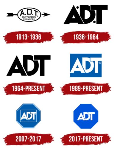
The history of the ADT logo began over a hundred years ago. Since then, it has come a long way – from an abbreviation in an oval pierced by an arrow to a modern, stylish monogram in a blue octagon. The current version looks like a road sign. And not in vain because this is a call to stop, pay attention, and listen to the safety rules, which ADT helps to comply with.
What is ADT?
ADT is an American company responsible for protecting property in residential homes, warehouses, enterprises, offices, and other facilities. It develops access control systems, intercoms, fire alarm systems, video surveillance kits, and various security equipment. It has monitoring centers to track alarm signals throughout the United States. The abbreviation “ADT” stands for “American District Telegraph.”
1874 – 1913
At the moment, during this period of the company’s development, the brand’s logo and emblem are unknown.
1913 – 1936
This version featured a white oval with a black border, pierced through by a horizontally flying arrow. In the oval was written “A.D.T. PROTECTION SERVICES. The designers divided the words into three lines and centered them.
1936 – 1964
The designers of the logo combined “A,” “D,” and “T” so that “A” covered “D” from below and “T” from above. Dots in the form of small black circles appeared to the left and right of the central letter.
1964 – today
In the middle of the last century, the company began to use a simplified wordmark without a ring. In the new version, the inscription resembled a monogram because the “A” and “T” partially overlapped the “D.” All three letters were bold and black.
1989 – today
In 1989, designers made the acronym white and placed it inside a blue rectangle. This option is still relevant.
2007 – 2017
At the beginning of 2007, the corporation acquired a completely new logo. The letters “ADT” were inside a dark blue octagon. Simultaneously, they were placed in a rectangular white frame, and another white line ran along the octagon’s inner contour.
2017 – today
The latest redesign made the image simpler and more versatile. The designers opted for a lighter shade of blue and removed the subtle white borders.
ADT: Interesting Facts
ADT Inc. is well-known for its security services and long history in the security industry.
- Early Days: In 1874, ADT started as a telegraph company named the American District Telegraph. It used telegraph signals for emergency alerts between homes and a central office.
- Security Systems Beginnings: Shifting from telegraphs, ADT moved into security systems, introducing alarms for fire and burglary by the late 19th century.
- Innovative Alarm System: The 1940s saw ADT launch the first automated burglar and fire alarm system, a big step in security technology.
- Expanding Services: Now, ADT offers more than burglar alarms. Their services include smart home automation, fire, flood, and health monitoring.
- ADT Pulse®: Introduced in 2010, ADT Pulse® ventured into home automation, letting customers remotely control their security systems and home devices via a smartphone app.
- Large Customer Base: With millions of customers in the United States and Canada, ADT is one of North America’s biggest security companies.
- Blue by ADT: Launched in 2020, Blue by ADT is a DIY smart home security system that offers self-monitored security solutions without professional installation.
- Google Partnership: Also, in 2020, ADT and Google partnered to develop advanced smart home security solutions, combining ADT’s expertise with Google’s technology.
- Safety Standards: ADT has been crucial in developing industry safety and security standards, helping to protect consumers and enhance service quality.
- Awards and Recognition: ADT has earned many awards for its services, technology, and contribution to the security industry, highlighting its excellence in customer service and innovation.
ADT’s evolution from a telegraph company to a leader in electronic security services showcases its innovation, adaptability, and dedication to safety and security.
Font and Colors
The octagonal figure with the word “ADT” is the only corporate emblem. It has the simplest design, except that the letters are superimposed on one another. This monogram dates back to the 1950s and was used in different ways: either on a blank or rectangle. Now its background has the shape of an octagon.
Non-standard placement of “A,” “D,” and “T” does not interfere with font identification. Perhaps this is a redesigned version of the standard sans serif typeface. The letters are bold and proportional. Their lines are the same thickness.
The logo looks like a road sign because of the characteristic color combination: the octagon is tinted in a bright and fresh blue shade (# 005DA9). The abbreviation is completely white (#FFFFFF). The ADT Corporation owners also noticed this feature and began to use the logo for advertising, placing it on the road’s side on single poles.
ADT color codes
| Navy Blue | Hex color: | #0054d9 |
|---|---|---|
| RGB: | 0 93 169 | |
| CMYK: | 100 45 0 34 | |
| Pantone: | PMS 2728 C |


