


![]() Advanced Engine Management (AEM) Logo PNG
Advanced Engine Management (AEM) Logo PNG
The Advanced Engine Management (AEM) logo visually represents drive and speed. The internal dynamics of the emblem are conveyed through tilt, chaotic lines, and bright colors that symbolize aggressive energy. Everything here suggests that the company produces spare parts for upgrading cars and improving their performance.
It is an American company that produces devices for car after-sales service to improve technical performance. Its main focus is engine run activation, upgrading with innovative electronics, and providing software support. That is why the AEM logo is associated with accelerating cars. The brand name is the basis of brand identity and stands for Advanced Engine Management. The firm emerged in the early 2010s. Its current owner is Holley Performance Products Inc. The headquarters is located in Hawthorne, California.
AEM is short for Advanced Engine Management. This is an American company that develops and produces equipment to improve the technical capabilities of sports and passenger cars. It offers innovative products, including electronic ones. The brand has existed since the first half of the 2010s. Holley Performance Products, an automotive corporation, now owns it. The head office is located in Hawthorne, California.
The company was created to support racers and car enthusiasts who strive for high speeds and flawless performance. Its core product is high-performance electronics designed to be perfect, fast, and agile. That’s why AEM focuses on designing, manufacturing, and assembling engines, digital instrument clusters, fuel injection systems, clutches, transmissions, ignition components, and more.
Meaning and History
Everything the company does is reflected in the Advanced Engine Management logo, which it has only one of. It accurately conveys its objectives because a graphic designer designed it. All products, from fuel pressure sensors to air filter cleaners, are marked with this eye-catching symbol. It tells you that the machine is in perfect technical condition and has been professionally upgraded.
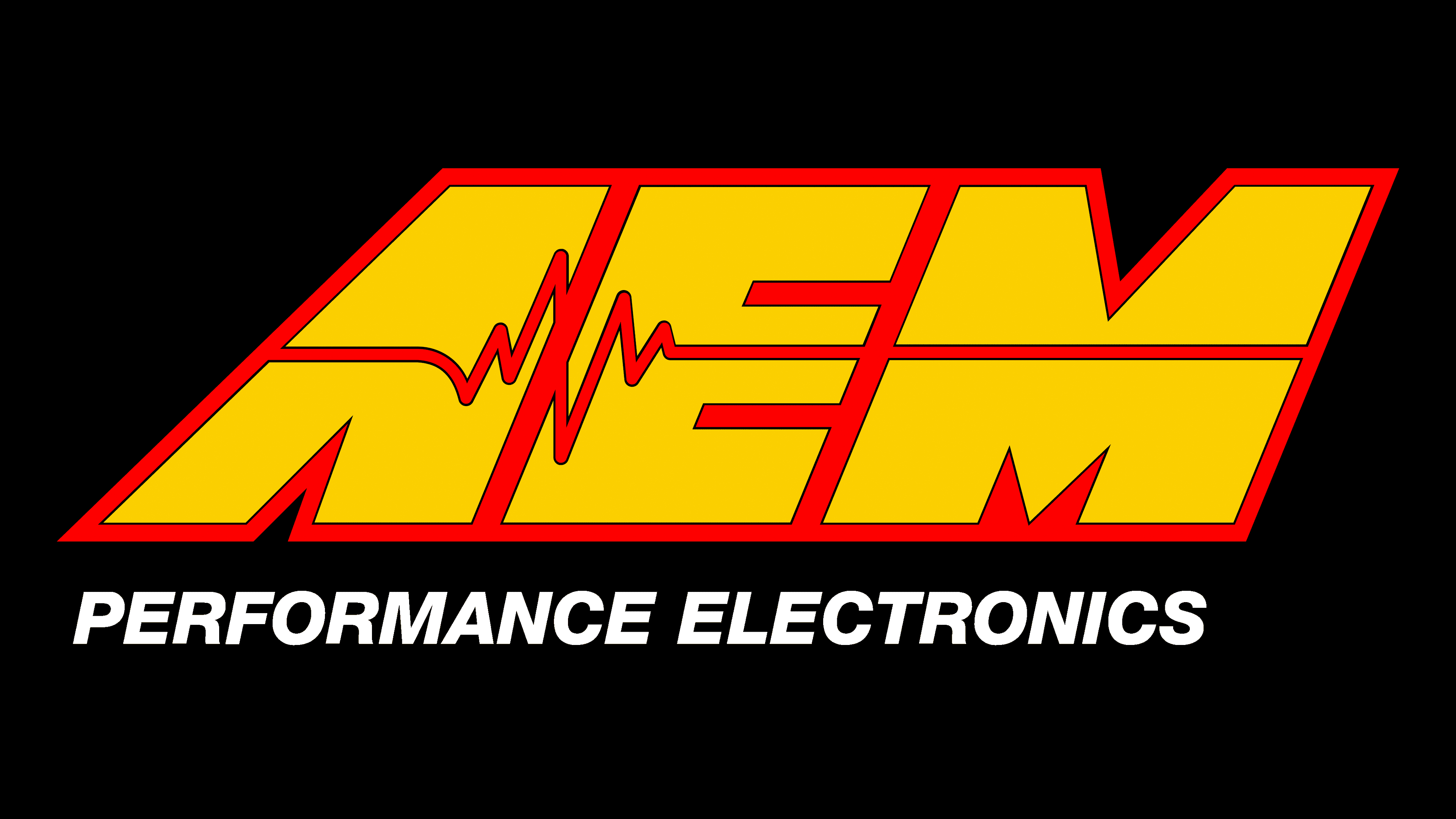
The visual identity mark consists of stylized text rendered as a graphic. This is a drawing made up of letters. The company name, Advanced Engine Management, in abbreviated form, plays a key role. The abbreviation “AEM” is located with a slight right-hand slope. Along the entire perimeter, a thin line forms a kind of frame. At the same time, each sign has its own border, so they look very crowded, even though there is a small distance between them.
There are several versions of the same emblem: two use a bar chart, and one does not. On the official site’s logo, a zigzag line is at the junction of the first and second letters. A straight line stretches to the third from them. It also captures the adjacent symbol, replacing the classic crossbar in “A.” At the bottom is the phrase “Performance Electronics,” a continuation of the company’s name and professional slogan. In other variants, there may be an inscription “Engineered to Outperform.”
Font and Colors
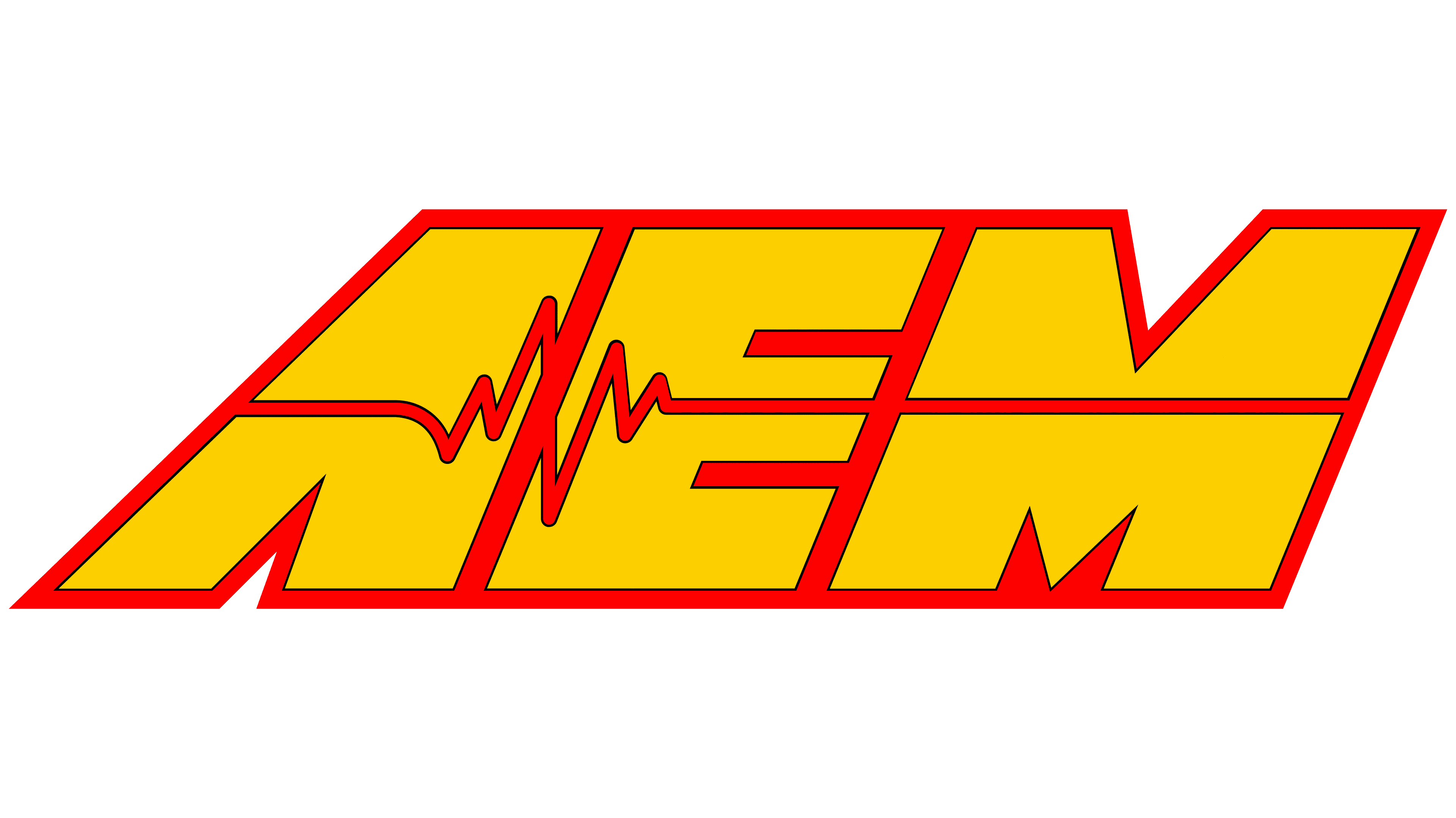
For its designation, the automotive tech company chose a custom typeface based on a large-format sans-serif. Massive geometric glyphs reflect the scope and vision of innovative equipment manufacturers for vehicles of all kinds. The letters are smooth, proportionately accurate, and cursive. An interesting emphasis is placed on “A,” which lacks the classic crossbar and is replaced by a thin diagrammatic line. The corporate palette of the emblem is bright. It is dominated by yellow (#fee800), red (#fa1c26), white (#ffffff), and black (#131112).