The A&E logo is concise and full of contrasts. It represents the TV channel as a universal one, capable of presenting different points of view on every issue. The emblem has a mesmerizing solemnity, a play of light and shadow.
A&E: Brand overview
A&E is an American cable television channel. It broadcasts crime investigations, educational shows, series, dramas, and documentaries. Its broadcasts cover America, Australia, Canada, and Europe. In the United States, the channel is watched by 95 million households. It is owned by A+E Networks, a company that owns several channels.
Meaning and History
The company had to work on the emblem for a long time to make it concise and memorable. The first versions of the signs were unsuccessful due to the long name and wrong color solutions. However, A&E managed to find an original version of the emblem that best fit the theme of the cable channel. Therefore, the rebranding after 1987 includes only minor edits, leaving the overall composition unchanged.
What is A&E?
A cable channel is operating in the field of feature films, documentaries, and series. It has broadcast and produced such notable films as Law and Order, Pride and Prejudice, The Lost World, and Emma.
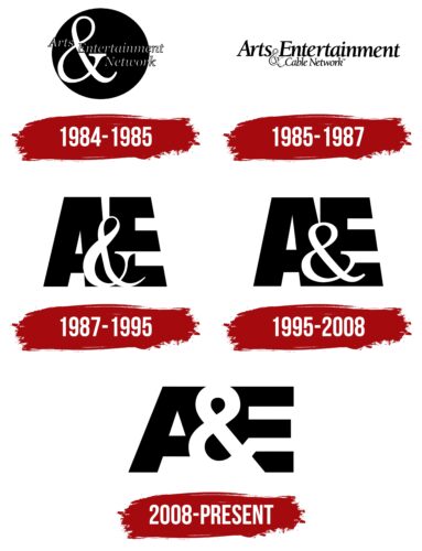
1984 – 1985
The first logo of the company was a black circle with a large & sign. In front of it was the word Arts, and after it – Entertainment Network in two levels. A circle was depicted:
- The globe of the Earth. Initially, broadcasting began in North America, but other continents were planned.
- Broadcast area. The propagation of waves from the point of the signal.
- Point. The channel provides the viewer with comprehensive, detailed information.
- Purpose. Each report of the channel hits the target: the most relevant topics, interesting questions, and useful programs.
The name of the company was obtained by combining parts of the names of two founding companies – ABC Alpha (ARTS) and The Entertainment Channel – the emphasis on & indicates the merger process.
Thin small letters made the inscription almost invisible against the background of a huge &, which became a disadvantage of the sign.
1985 – 1987
A year later, they tried to correct the flaws with a new logo. They removed the dark background, and the first part of the name was presented in large black letters. On the right side of the sign, under the word Entertainment, they placed a small indication that it was a cable network.
However, the lettering turned out to be too bulky and long. Therefore, the second sign did not last long either.
1987 – 1995
Two years later, an original interpretation of the inscription appeared, which formed the basis for further emblems. Black letters A and E, above which in the center is a white symbol &. Glyphs E are tilted so as to balance the first tilted element A. Therefore, the design resembles a rocket soaring into the sky. The method indicates a desire for growth and development. An attempt to reach out to other areas and directions to introduce new programs. At this point, the company acquired the rights and began producing episodes of the documentary Biography, which took center stage on the airwaves.
1995 – 2008
In 1995, the channel’s name was officially shortened to A&E Network. The change reflected a shift in focus from art to shows and documentaries. The change was timed to coincide with the launch of The History Channel and the company’s tenth anniversary.
The new sign is now slightly wider, reflecting the expanded audience and list of shows. The appearance of the ampersand also changed – it became smoother.
2008 – today
Changes in 2008 were timed to the release of the movie “The Andromeda Strain,” which was planned to turn into a TV series. Loyalkaspar Studios worked on the character. The idea was for the new sign to represent the channel as progressive, created with the help of modern programming languages.
All elements of the emblem are presented as equal in size. Therefore, the ampersand closed the A and E parts, completely separating them. This technique demonstrates versatility, clarity of image and sound, and beauty of the picture on the screen.
Font and Colors
The emblem is built on the play of black and white colors. The company works in the fields of history, art, and documentary film. Therefore, black and white motifs indicate the antiquity of the past and events. They reflect bright and solemn art and music premieres, artists, and musicians in white shirts and tails.
- Black – conveys distribution, wide audience reach, broadcasting through a network.
- White – speaks to the coverage of new and interesting facts, constant variety, and the addition of new shows and series.
The letters of the inscription are straight and large. Straight glyphs indicate the channel’s accessibility, ease of customization, and ease of understanding. The size and boldness of the characters indicate a wide audience reach.
A&E Logo Color Codes:
- Black: Hex code: #000000; RGB: 0, 0, 0; CMYK: 0, 0, 0, 100; Pantone: PMS Process Black C
- White: Hex code: #FFFFFF; RGB: 255, 255, 255; CMYK: 0, 0, 0, 0
FAQ
What is A&E known for?
This American broadcasting giant, known as A+E Networks, is a joint venture between Hearst Communications and The Walt Disney Company through its General Entertainment Content division. It operates various channels that air a variety of programs ranging from reality shows to documentaries.
Who owns A&E Networks?
A+E Networks is co-owned by Disney-ABC Television Group and Hearst Communications and has a global reach of more than 335 million households in 200 territories and 42 languages.
Is A&E a privately held company?
As a privately held company, A&E Television Networks LLC specializes in entertainment and was founded in 1983. The company is headquartered in New York, NY.


