


 AEG Logo PNG
The AEG logo embodies the electric age, symbolizing progress that transforms life and production. Starting with lighting, the company evolved into a creator of technologies shaping the future, from household appliances to factory automation.
Emil Rathenau founded AEG in Berlin in 1883. AEG, originally Deutsche Edison-Gesellschaft fur Angewandte Elektricität, specialized in electric lighting. It obtained exclusive rights to distribute Thomas Edison’s electric light bulbs in Germany and continental Europe. A key milestone came in 1887, when it built the first power plant in Berlin and began electrifying the city.
In the years that followed, under Rathenau’s leadership, AEG became a dominant force in Germany’s electrical industry. The company expanded into other aspects of electrical engineering, including electric streetcars, household appliances, generators, and motors. In 1907, AEG built the first high-voltage transmission line connecting Lauffen and Frankfurt am Main, setting the standard for long-distance electricity transmission.
During the tumultuous period of World War I, AEG began playing an important role as a supplier to the German armed forces, developing new technologies for submarines and chemical warfare. Between the two world wars, the company expanded its portfolio to include radio technology, movie equipment, and sound-recording devices known as tape recorders.
By the beginning of World War II, AEG had grown exponentially and employed over 190,000 people. The company played a significant role in the German war effort, making its manufacturing facilities prime targets for Allied aerial bombardment. After the war, AEG revived by shifting its focus to consumer electronics and household products such as televisions and washing machines.
In 1967, AEG joined forces with its competitor Telefunken to form AEG-Telefunken. In 1979, the company was acquired by Daimler-Benz. Today, the AEG brand lives on under Electrolux, the world’s leading home appliance manufacturer. However, its origins trace back to its key role in Germany’s late-19th-century electrification under Emil Rathenau’s leadership.
Meaning and History
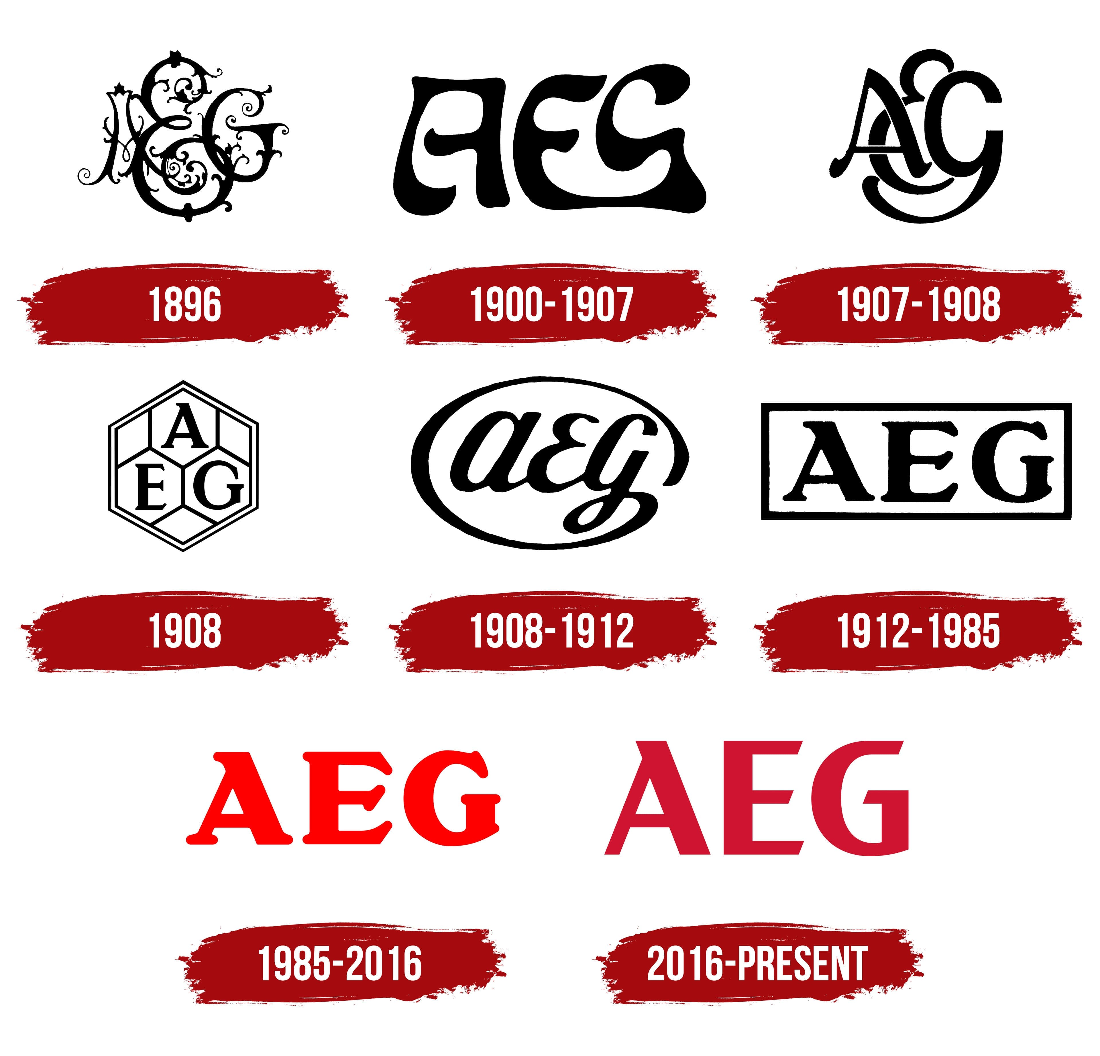
1896
1900 – 1907

1907 – 1908

1908

1908 – 1912

1912 – 1985

1985 – 2016

2016 – today

The AEG logo exudes confidence and solidity, reflecting a large, reputable brand. It is built on three capital letters that abbreviate the full name, Allgemeine Elektricitäts-Gesellschaft. The letters are rendered in a deep, dark red, symbolizing energy, strength, and confidence. The color palette emphasizes the company’s steadfast and serious approach to its work.
The letter “A” draws particular attention. Its design stands out: the right diagonal is wider and longer than the left, which doesn’t reach the top point. This creates a sense of upward motion, conveying a drive for growth and progress. The upper section of the letter is slightly pointed, adding sharpness and precision.
The letters “E” and “G” follow the same style, maintaining geometric accuracy. Diagonal cuts at the ends of the lines add sharpness and completeness to the composition. This detail underscores the design’s thoughtful, meticulous execution.
The large, robust font evokes reliability and stability. It lacks decorative elements or embellishments, giving the overall appearance a strict, minimalist feel. The straight lines and clear letterforms make a strong impression.
The AEG emblem conveys the brand’s core values: work, quality, and leadership. Every aspect of this design speaks to practicality and a focus on results.