The Aeroflot logo symbolizes its key values – safety, reliability, high level of service, freedom, and professionalism. The hammer and sickle at the bottom of the logo are symbols of socialist Russia. In this context, they reflect the legacy of the past and the company’s connection to the country’s history. The yellow curve symbolizes the aircraft’s wing, associated with the company’s air transportation activity. The Russian flag flying upwards and the signature “Russian Airlines” under the company’s name reflect its belonging to Russia and its national character.
Aeroflot: Brand overview
On March 17, 1923, Dobrolet, a joint-stock company known as the Russian Society for Voluntary Air Fleet, was established. This marked the beginning of civil aviation development in the Soviet Union, primarily focusing on cargo and mail transportation. Subsequently, on February 25, 1932, all civil aviation enterprises in the USSR were merged into a single entity called the Main Administration of the Civil Air Fleet, known as Aeroflot. This decision was made to streamline management and expedite the growth of civil aviation within the country.
During World War II in the 1940s, the airline actively participated in military operations by carrying out transport and combat missions. Post-war, the company shifted its focus to rebuilding and expanding civil air transportation.
On September 15, 1956, the brand made history by becoming one of the first airlines globally to operate jet-passenger aircraft. The inaugural passenger flight on the Tu-104 from Moscow to Irkutsk marked the dawn of the jet age.
In the 1960s, the company significantly broadened its international reach by initiating flights to numerous countries worldwide. The airline emerged as one of the largest airlines in terms of passenger volume.
In 1977, the brand introduced the supersonic passenger aircraft Tu-144 on the Moscow-Alma-Ata route, becoming the second airline in the world to offer regular supersonic passenger flights, following Air France.
By the mid-1980s, the company had peaked during the Soviet era, becoming the world’s largest airline by transporting over 120 million passengers annually. The brand operated an extensive network of domestic and international routes.
Following the dissolution of the Soviet Union in 1991, the company underwent restructuring, with various regional divisions evolving into independent airlines in the newly formed states. The brand then became the national carrier of the Russian Federation.
In 1992, the airline transitioned into an open joint-stock company, with the state maintaining a controlling interest. The company underwent rebranding in 1994, introducing a new logo and aircraft livery that remain in use today.
In 2006, the brand joined SkyTeam’s global airline alliance, significantly enhancing its international collaboration capabilities.
In 2011, the airline bolstered its presence in the domestic market by acquiring several regional Russian airlines, including Rossiya, Donavia, and Orenair.
In 2014, the company launched the low-cost carrier Pobeda to compete in the budget travel segment.
From 2016 to 2019, the brand continued modernizing its fleet by adding new Airbus A350 and Sukhoi Superjet 100 aircraft and placing orders for Russian-made MS-21 aircraft.
Meaning and History
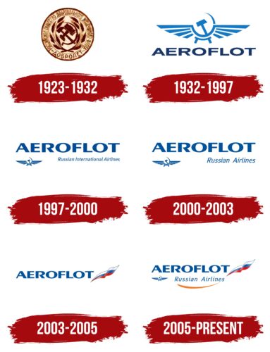
The Aeroflot logo, deeply rooted in Russian history, symbolizes the airline’s legacy of safety, reliability, and high service levels, blending elements from Russia’s socialist past with symbols of national pride. It features iconic Soviet-era imagery alongside modern symbols like the Russian flag, representing Aeroflot’s evolution from a state symbol to a contemporary global airline.
What is Aeroflot?
Aeroflot, Russia’s main airline, started in 1923. It’s grown to be a big name in global flying, using new planes for both local and international flights. It’s part of the SkyTeam group, known for great service and winning many awards. This shows its dedication to being the best.
1923 – 1932
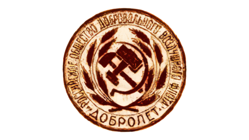
In this period, the Soviet Union was undergoing intense transformation and innovation, part of which was reflected in its advancements in air travel. The emblem of the first Soviet airline, Dobrolet, symbolized this era of change and ambition. Resembling the state emblem of the Soviet Union, the logo became an iconic representation of the new state’s identity and aspirations. The hammer and sickle, central to the emblem, signified the unity between workers and peasants, a foundational principle of the Soviet regime. This unity was further emphasized by the surrounding wheat ears, which symbolized prosperity, well-being, and the promise of new harvests, embodying the state’s commitment to agricultural success and the well-being of its citizens.
Around the emblem, the name of the new airline, Dobrolet, was inscribed along with its full title: “Russian Society of Voluntary Air Fleet.” The very name “Dobrolet,” meaning “good flight” or “flying for a good cause,” evoked a sense of freedom and noble collective effort towards the betterment of the Motherland. It reflected the optimistic spirit of the time, where aviation was seen as a technological achievement and a means to unite the vast country and contribute to its development.
The establishment of Dobrolet was a significant milestone in Soviet aviation history. It marked the USSR’s entry into commercial aviation and symbolized its ambitions to become a leading player in global air travel. The design and symbolism of its logo encapsulated the broader goals of the Soviet Union during this transformative period, aiming to showcase its achievements and the collective spirit of its people to the world. Through the visual elements of the hammer, sickle, and wheat ears, combined with the aspirational message conveyed by its name, the logo of Dobrolet became more than just a corporate brand; it was a manifestation of the Soviet Union’s vision for a future characterized by unity, prosperity, and progress.
1932 – 1997
From 1932 to 1997, the aviation industry saw significant developments, and at the heart of the Soviet Union’s contribution to this era was the emergence of a new emblem for its flagship airline. This emblem, introduced in 1932, would become the main symbol of the company for many decades. It featured a more stylized version of the hammer and sickle, blending seamlessly with sun rays rising behind them. This imagery was not just an artistic choice but a symbol rich in meaning. The hammer and sickle retained their significance as emblems of unity between the working class and the peasantry, fundamental to the Soviet ideology. At the same time, the sun’s rays suggested the dawn of a new era for aviation in the country.
The choice of blue as the dominant color for the emblem linked it directly to the sky and air travel, evoking feelings of freedom, exploration, and the vast potential of the Soviet aviation sector. Meanwhile, the radiant sunshine predicted a bright future for the airline, symbolizing growth, prosperity, and the blossoming of the Soviet Union’s ambitions in the aerial domain.
In conjunction with adopting this emblem, the airline was rebranded as Aeroflot. This new name, which was brief and memorable, soon became synonymous with Soviet, and later Russian, aviation. The typeface used for the Aeroflot logo also became iconic, recognized worldwide, and remained unchanged throughout the carrier’s history, further cementing its identity in the global aviation industry.
The introduction of the new emblem and the rebranding to Aeroflot marked a pivotal moment in the company’s history, reflecting not only the Soviet Union’s technological advancements and aspirations in aviation but also the cultural and ideological values it aimed to project domestically and internationally. The emblem and the name Aeroflot thus became symbolic of the Soviet Union’s progress and its standing in the global community, representing a legacy that extended well beyond the collapse of the Soviet state, persisting into the present as symbols of innovation, unity, and the pioneering spirit of Russian aviation.
1997 – 2000
The period between 1997 and 2000 was marked by significant transformation and rebranding efforts for Aeroflot, reflecting the broader changes occurring in Russia during the post-Soviet era. The 1997 update was a pivotal moment for the airline, symbolizing its adaptation to the new realities and aspirations of the Russian Federation, distancing itself from its Soviet past while aiming to preserve its legacy and identity as a national carrier.
This update harmonized the colors of the text and the emblem into a new shade of blue, a practical and symbolic choice. Traditionally associated with the sky, aviation, and vast horizons, blue was now deepened to a richer tone, suggesting reliability, professionalism, and the airline’s aspirations towards global standards and international presence. This change was not merely cosmetic but represented a strategic shift in the airline’s branding, aiming to appeal to a wider international audience while retaining its core identity.
The emblem of the USSR, which had been a prominent part of the airline’s logo, was significantly downscaled and repositioned to a less dominant location. This modification reflected the changed political landscape following the dissolution of the Soviet Union. The once powerful symbol of the hammer and sickle, which had signified the unity of workers and peasants under a single socialist state, had lost its relevance and authority in the new era. By reducing the size and prominence of this emblem, Aeroflot was signaling its transition from a state-run Soviet enterprise to a competitive player in the global aviation market, acknowledging its heritage while adapting to new realities.
A notable addition to the logo was the inscription that underscored the carrier’s new status: “Russian International Airlines.” This tagline updated and declared the airline’s evolving focus and strategy. It underscored Aeroflot’s expansion beyond domestic borders and its ambition to establish itself as a major international player, reflecting Russia’s broader efforts to integrate with the global community and market economy.
The rebranding efforts between 1997 and 2000 were thus emblematic of Aeroflot’s journey through a period of transition, mirroring the transformation of Russia itself. These changes in branding and strategy were not merely aesthetic but were deeply intertwined with the airline’s efforts to redefine its identity, mission, and values in a rapidly changing world. Aeroflot’s adaptation during these years illustrated its resilience and forward-looking vision as it navigated the challenges of the post-Soviet landscape to reclaim its position on the international stage.
2000 – 2003
The transition period from 1997 to 2000 was a significant time for Aeroflot, reflecting broader economic and political shifts in Russia. The turn of the millennium saw a crucial modification to the airline’s branding, aligning with its strategic and operational evolution. In 2000, a notable change was made to the additional inscription on the Aeroflot logo, streamlining it to “Russian Airlines” from the previous “Russian International Airlines.” This change indicated the airline’s response to the changing dynamics of the aviation industry and the Russian economy, particularly the company’s partial privatization.
Despite this significant change in the inscription, the rest of the emblem’s elements were preserved. This decision to maintain the core visual symbols of the logo underscored Aeroflot’s commitment to its heritage and identity. With its stylized representation of the Russian flag and the iconic winged hammer and sickle, the emblem continued to bridge the airline’s storied past and its aspirations for the future.
2003 – 2005
In 2003, Aeroflot underwent a highly anticipated rebranding, significantly departing from its Soviet-era symbols and heralding the end of its historical epoch.
The introduction of the Russian flag, fluttering in the wind, as a new and vivid element next to the sky-blue inscription was a deliberate move to infuse the brand identity with a sense of patriotism. This choice aligned Aeroflot with Russia’s national colors and emphasized the airline’s role as the country’s flagship carrier. The flag motif was designed to resonate with domestic and international passengers, conveying a message of national pride and the airline’s commitment to representing Russia on the world stage.
The emblem was reimagined to resemble a feather, a design choice that conveyed a sense of extraordinary lightness. This imagery was particularly evocative, suggesting the ease and grace of flight. The feather symbolized Aeroflot’s aspirations towards innovation, agility, and the pursuit of excellence in aviation. It was a departure from the heavier industrial imagery of the past, moving towards a more elegant and refined aesthetic that mirrored the advancements in aircraft technology and the improved passenger experience offered by the airline.
The rebranding also introduced large, rounded letters that communicated a sense of comfort and reliability, key attributes that Aeroflot wished to emphasize in its operations. This typographic choice was intended to reflect the airline’s dedication to passenger comfort, the quality of its service, and the reliability of its fleet. The modernized font and the generous spacing between the letters conveyed a contemporary and accessible brand image, aiming to appeal to a wide range of passengers, from business travelers to tourists.
This comprehensive rebranding in 2003 was a strategic effort by Aeroflot to shed the vestiges of its Soviet past and present itself as a modern, reliable, and distinctly Russian airline.
2005 – today
The updated Aeroflot logo thoughtfully bridges its historical legacy with a modern vision, incorporating several key symbols to craft a narrative of continuity and renewal. The logo holds onto the familiar elements of its predecessor—the company’s name and the Russian flag, thus maintaining a strong link to its national identity and heritage. These elements underscore Aeroflot’s pride in its roots and its role as Russia’s flag carrier on the international stage.
The orange semi-circle is a distinctive addition to the logo, reminiscent of a rising or setting sun. This element infuses the brand identity with warmth and optimism, symbolizing the airline’s commitment to providing its passengers with a welcoming and comfortable experience. The choice of color and shape here is strategic, conveying a message of hope and the promise of new beginnings, which aligns with the company’s focus on service excellence and innovation in air travel.
On the left side of the logo, the hammer and sickle reference Aeroflot’s Soviet past, acknowledging the airline’s foundational years and evolution through the decades. This symbol serves as a reminder of the airline’s historical significance and deep connections to the development of aviation in the Soviet era.
Contrasting with this, the flag’s depiction, seemingly caught in an upward gust, points towards Aeroflot’s aspirations for the future. It signifies the airline’s commitment to growth, improvement, and reaching new heights in the aviation industry. The flag represents Aeroflot’s national pride and determination to remain competitive and innovative globally.
Font and Colors
Aeroflot’s logo is carefully designed to reflect its rich history and future ambitions. The main part of the logo is a strong wordmark in a sans-serif font that looks bold yet refined. This font combines thick and thin lines to create a sense of durability and style. What makes the Aeroflot logo special is the unique twist on the “R,” distinguishing it from similar fonts like Greyhound Bold Extended and Indecise Expanded Semi Bold.
Right below the main wordmark, there’s a smaller phrase, “Russian Airlines,” in a lighter, italic font with curved lines. This font is similar to Jeunesse Pro Medium but has its own custom adjustments. It adds a touch of elegance and complements the boldness above.
The logo uses blue, white, and red colors, directly linking to the Russian flag. These colors do more than just look good; they convey Aeroflot’s values. Blue shows the airline’s reliability, white represents great service and clarity of purpose, and red adds a dash of energy, indicating Aeroflot’s growth and passion.
FAQ
What is the symbol of Aeroflot?
Aeroflot, the biggest airline in Russia, is easily recognized by its “winged hammer and sickle” symbol. This emblem has deep roots in Soviet history, combining the hammer and sickle, which stand for industrial and agricultural workers, with wings representing aviation. This mix highlights Aeroflot’s beginnings and growth during the Soviet era, showing how different sectors came together to push aviation forward. Even though Aeroflot’s image has gone through many updates, the winged hammer and sickle remain an important part of its logo. It shows the airline’s long history and development into a significant global player in the aviation industry.
Who owns Aeroflot?
Aeroflot, Russia’s main airline, is 51% owned by the Russian government, which has a big say in how Aeroflot runs. The other 49% is owned by regular people and companies that bought shares on the Moscow Exchange.
Founded in 1923, Aeroflot is one of the world’s oldest airlines and is crucial for flying within Russia and to other countries. Aeroflot’s shares being available to the public means anyone can invest in the airline.
What is the meaning of Aeroflot?
Aeroflot, Russia’s leading airline and national flag carrier translates to “air fleet” in English. This name aptly reflects its significant presence in both Russian and international aviation by merging “aero” (air) and “flot” (fleet) to denote its extensive collection of aircraft.
Established in 1923, Aeroflot is among the oldest and most pivotal airlines, deeply integrated into Russia’s aviation history and development. Aeroflot does more than transport people and cargo; it embodies Russian pride and progress in aviation. As times have changed, Aeroflot has adapted, embracing new technologies, responding to customer needs, and navigating global events.
Where is Aeroflot flying to?
Aeroflot, the leading airline in Russia, flies to many places worldwide, making it easy for people to travel to key economic and cultural centers. Here are some places Aeroflot goes to:
France: Aeroflot heads to Paris, landing at Orly Airport.
Georgia: Aeroflot flies to several places in Georgia. These places include:
- Batumi
- Sukhumi
- Tbilisi
These are a few spots on Aeroflot’s extensive route map. The airline’s efforts to add more destinations show its role in linking Russia with the world, supporting tourism, business, and cultural exchanges.


