 Aeropostal Alas de Venezuela Logo PNG
The Aeropostal Alas de Venezuela logo represents the airline’s rich history and strong connection to Venezuelan culture. It shows the airline’s commitment to bringing people and places together in Venezuela and worldwide. The emblem is all about growth and change, highlighting the airline’s journey through the years while remaining loyal to its roots and the essence of Venezuela.
Aeropostal Alas de Venezuela: Brand overview
Aeropostal Alas de Venezuela was established on January 21, 1929, as a French airmail company Compagnie Générale Aéropostale branch. Originally known as Compañía Aérea de Venezuela (CAVSA), it was created to manage postal routes between Venezuela and other South American countries during the region’s early stages of aviation development.
When Compagnie Générale Aéropostale went bankrupt in 1933, the Venezuelan government took over CAVSA and renamed it Línea Aeropostal Venezolana (LAV), increasing national control over key economic sectors.
Throughout the 1940s, the new company expanded its services, introducing regular passenger flights and postal operations. The company established new routes linking major cities in Venezuela and neighboring countries.
By the 1950s, the airline had upgraded its fleet with modern aircraft like the Douglas DC-3 and Convair 340, enhancing passenger comfort and extending its reach.
In the 1960s, the airline expanded internationally by adding routes to North America and Europe, launching flights to New York in 1961.
In the early 1970s, LAV entered the jet age by acquiring the Douglas DC-9, improving the speed and comfort of its services.
However, by the 1980s, the company faced significant financial challenges due to the economic crisis in Venezuela, poor management, and increased competition.
1994, the government restructured the company, renaming it Aeropostal Alas de Venezuela to enhance financial stability and operational efficiency. In 1996, most shares were sold to private investors to attract investment and improve performance.
In the early 2000s, the company worked to regain its market position by updating its fleet with Boeing 737-300s and expanding its route network.
Unfortunately, the company had to suspend operations in September 2014 due to financial difficulties and a lack of aircraft.
Despite efforts to restart operations from 2015 to 2017, the Venezuelan government’s plans to revive the company were not fully realized.
Meaning and History
Since its founding in 1929, Aeropostal Alas de Venezuela has proudly displayed its history through its logos. These logos, full of Venezuela’s national colors, tell the story of the airline and the country’s hopes for unity. The blue in the logos stands for the sky, while yellow and white highlight Venezuela’s beauty and desire for peace. Over the years, Aeropostal has changed a lot. It has merged with other companies, updated its look, and upgraded its planes from old ones with propellers to modern jets. These changes show how Aeropostal has managed to stay current. The logos have kept up with these changes, too. For example, they’ve included images of modern airplanes and designs that remind people of its beginnings in mail delivery, like a circle that looks like a postage stamp.
What is Aeropostal Alas de Venezuela?
Aeropostal Alas de Venezuela, a government airline founded in 1929 and based in Caracas, has been a key player in Latin American aviation. It flies to places in the Caribbean, South America, and the United States with its Boeing and McDonnell Douglas planes. The company keeps flying despite Venezuela’s tough economic times and older aviation infrastructure.
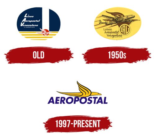
Old
The first logo of Aeropostal Alas de Venezuela was full of patriotic symbols, using Venezuela’s flag colors: blue, red, yellow, and white. These colors weren’t picked just to look good; they mean a lot, showing the country’s love for freedom and unity. The logo was a shout-out to the nation’s pride and what it believes in.
Over time, the logo got even deeper meanings. Blue stood for the endless sky where the planes fly. Yellow and white stripes were a shout-out to Venezuela’s landscapes that blend when seen from above. Yellow also nodded to the nation’s riches; white was all about peace.
The airline’s full name was shown in big letters against a blue background. The slanted words made it feel like the logo was moving, showing that the airline values speed. This style showed how Aeropostal is always looking to the future.
The logo has a red circle with an eagle inside, which looks like the old seals on letters. It’s a throwback to when the airline started as a mail carrier. The eagle means strength and high goals, telling everyone that Aeropostal is about good service and trust. The colors inside this part of the logo are a tribute to Venezuela’s first stamps from 1859, linking the country’s mail history to the airline’s look.
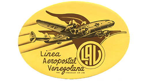
1950s
The logo shows a modern plane, marking the country’s air fleet update. It has propellers and smoke that hint at new turboprop planes, a big step for Venezuela’s aviation. An eagle in the design nods to the airline’s long history and dedication to connecting places.
The logo’s letters mix two different styles. The first big letters, “LAV,” are bold and solid, showing the airline’s strength and trustworthiness. The rest of the letters are slanted like cursive, which makes you think of speed and the excitement of flying. This mix also reminds us of the handwritten mail the airline used to carry, keeping us connected over long distances.
The logo features a circle that resembles a postage stamp, which shows the airline’s role as the national mail carrier. This stamp design links the airline back to its roots in mail delivery, confirming its place as a key part of the nation’s history. The logo ties together the airline’s past as a mail service with its current role as a modern flight company.
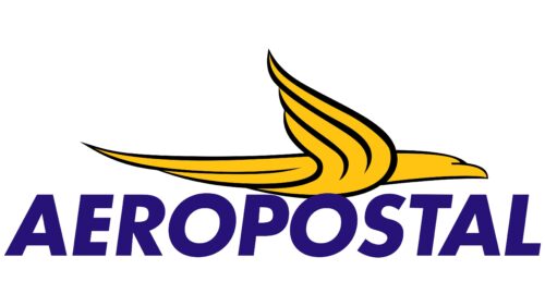
1997 – today
The airline’s logo shows a bird-airplane mix, with the front shaped like a plane’s nose and the wings made of feathers. It’s bright yellow with a black outline, making it pop. Above the blue word “AEROPOSTAL” with all capital letters tilted to the right, it looks like it’s on the move.
The logo shows the airline’s promise to connect places and its love for adventure. Yellow means they care about their passengers and want to make flying a great experience. The black lines show they’re serious about getting you safely where you need to go. The blue “AEROPOSTAL” suggests they’re a trusted airline with a long history.
The way “AEROPOSTAL” slants upward shows they’re always trying to do better and go further. The logo tells customers that flying with them is more than just getting to your destination—it’s about enjoying the trip.
Font and Colors
The Aeropostal Alas de Venezuela logo uses a bold, simple sans-serif font similar to Futura Paneuropean Bold Oblique. The “AEROPOSTAL” text is in all caps, giving off a strong and professional vibe. The clean look of the letters suggests the airline is modern and runs efficiently.
The logo combines yellow and purple, two colors that pop when put together. Yellow is used for the bird, which adds a friendly and hopeful feel to the image. It suggests the airline is all about reaching high and enjoying the trip. The text is purple, a color that makes you think of quality and a bit of mystery.
These colors work well together, making the logo stand out, which is perfect for an airline that needs to catch people’s eyes in busy places. The design is simple, which means you can tell it’s Aeropostal from far away, even with everything moving fast at airports and in ads.
FAQ
What is the airline code for Aeropostal Alas de Venezuela?
Aeropostal Alas de Venezuela’s airline code is VH. International aviation organizations set this code and help with flight plans, tickets, and baggage. Aeropostal uses VH mainly to book flights and handle airport tasks.
As of November 2021, Aeropostal had two McDonnell Douglas MD-82 planes. These planes are part of the MD-80 series, known for working well on shorter and mid-range flights. With two aircraft, Aeropostal plays an important role in the Venezuelan aviation scene, primarily operating domestic flights.
What is the fleet of Aeropostal Alas de Venezuela?
Aeropostal Alas de Venezuela, with the airline code VH, is one of Latin America’s oldest airlines. Its fleet has gone through many changes due to Venezuela’s economic and political problems. The airline has flown different planes, including small ones for domestic flights and large jets for international travel. They’ve been using MD-80 series planes from McDonnell Douglas because they are versatile, have plenty of space for passengers, and can fly the distances needed for Aeropostal’s routes, mainly within the region.
The types of planes Aeropostal uses can vary due to the constantly changing airline industry and Venezuela’s specific challenges. Aeropostal and other Venezuelan airlines face issues like getting plane parts, financial troubles, and meeting passengers’ needs.


