


![]() AEW Logo PNG
AEW Logo PNG
Wrestling shows combine elements of theatrical performance and martial arts, which is why companies associated with this sport use unusual emblems. The AEW logo seems brutal, youthful, and elegant at once. The wrestling promotion is engaged in competitions and advertising, meaning it needs the most attractive visual symbol.
Founded in 2018 by Tony Khan and members of The Elite, including Cody Rhodes, All Elite Wrestling emerged from the success of All In, the independent event that showed there was room for a large wrestling promotion outside the WWE system. AEW entered North America with national ambitions, not as a small regional group, and quickly built its identity around television, touring events, and pay-per-view shows.
Tony Khan gave the company a strong financial base. He is the son of Shahid Khan, owner of the NFL’s Jacksonville Jaguars. That connection helped bring early attention to AEW. The promotion launched Dynamite as its main weekly show, then expanded with Rampage and Collision. It also used YouTube programs to develop lower-card stories, introduce younger wrestlers, and keep fans engaged between major broadcasts.
AEW built its roster through a mix of independent talent, former WWE performers, international names, and wrestlers from partner promotions. Major events in cities such as Las Vegas helped the company appear to be a national player rather than a niche project. Its programs were often compared with NXT, especially during periods when both brands competed for the same wrestling audience.
By 2024, AEW had become one of the key forces in modern wrestling media. Its agreement with Warner Bros. Discovery secured long-term television coverage. It kept its weekly shows in front of a broad cable audience. CBS Sports reported that the late September premiere of AEW Dynamite ranked second among cable broadcasts, behind only the NBA.
Meaning and History
![]()
What is AEW?
It is a professional wrestling company specializing in organizing and hosting wrestling shows. It offers an alternative wrestling style focusing on spectacular matches and a sports-oriented approach. The company holds regular televised shows, major tournaments, and pay-per-view events featuring both well-known industry stars and young, promising athletes.
2019 – 2023
![]()
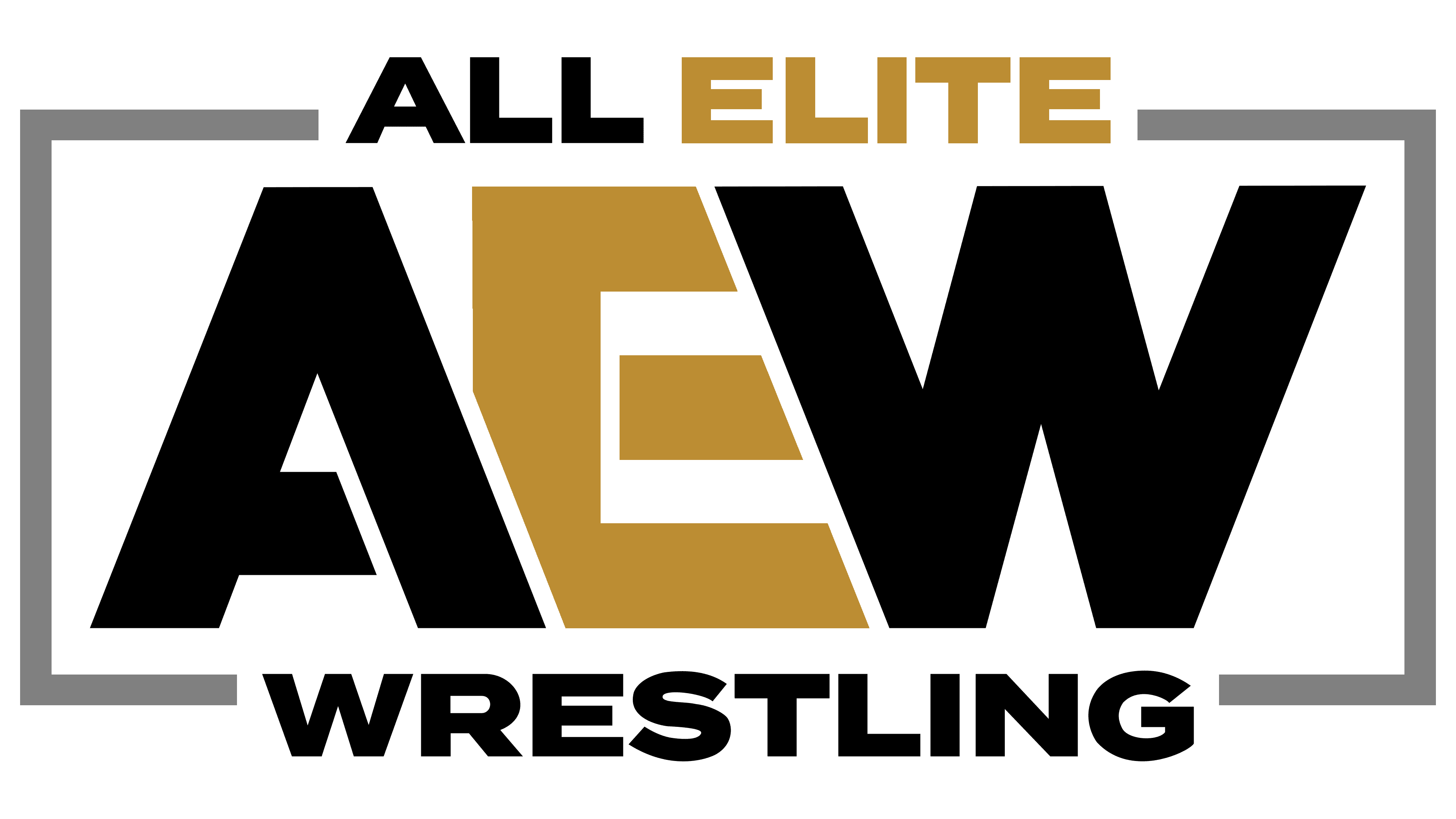
The promoter’s logo perfectly aligns with the direction of work and the company’s goals. The emblem consists of a stylishly designed inscription with a gradient on a black background. In the center of the composition is a large abbreviation, AEW, which stands for All Elite Wrestling (all elite wrestlers).
All indicates the desire for complete leadership in their niche.
The word Elite refers to a team of 7 famous wrestlers, three of whom have worked together since 2016 (Omega and the Jackson brothers, nicknamed Young Bucks). This team supported Khan’s undertaking, left their other contracts, and promoted AEW, which led to their team name being included in the company name and logo.
Now, the wrestlers are even more strongly associated with the emblem, as a trio of Elites have earned vice-presidential positions for their merits and are part of the company’s management elite.
The expression All Elite in the logo also indicates that the agency signs contracts with the most successful and talented wrestlers – the direction elite. In the future, they will perform only at the promoter’s events.
The letters in the logo are very close together, which suggests a contact sport. In this case, A and W are painted white in the foreground. This indicates an emphasis on young and promising wrestlers who are given a chance to prove themselves.
The letters cover the E, which is made of gold, in the background. This choice demonstrates that the Elite Club was the agency’s founding and that the team’s composition is the golden fund of wrestling. The color hints at the company’s champion titles awarded to tournament winners and the belts, whose rich decoration is in gold tones.
The company’s full name is written above and below the abbreviation, and linked by white lines forming a rectangle around AEW. The figure personifies the arena and its rope fences. The decoding of the abbreviation leaves no doubt about what exactly the company does.
All letters of the inscription have cracks and dots, which signify “masculinity.” Such an idea is a tribute to the players’ scars and injuries, a symbol of blows and the result of furious battles.
The black background adds a sense of brutality to the composition. Most fights occur in a dark hall with one ring illuminated, as the black substrate color demonstrates. The audience’s attention is focused on the center of the arena; in the logo, a large inscription inside the schematic ring attracts attention.
The logo’s composition is clear and harmonious, and well-thought-out battle scenarios allow the creation of high-class entertainment shows in the arena.
2023 – 2024
![]()
The All Elite Wrestling (AEW) logo has retained its recognizable shape while being simplified. Previously, the letters featured cracks and dots, adding a rough and worn effect, but these have now been removed, making the design cleaner. The rest of the composition remains unchanged.
From the very beginning, the brand has focused on a new aesthetic. While the older version of the logo, with its distressed lettering, symbolized the company’s rebellious spirit, the updated version looks more professional, maintaining its energy but without excessive roughness.
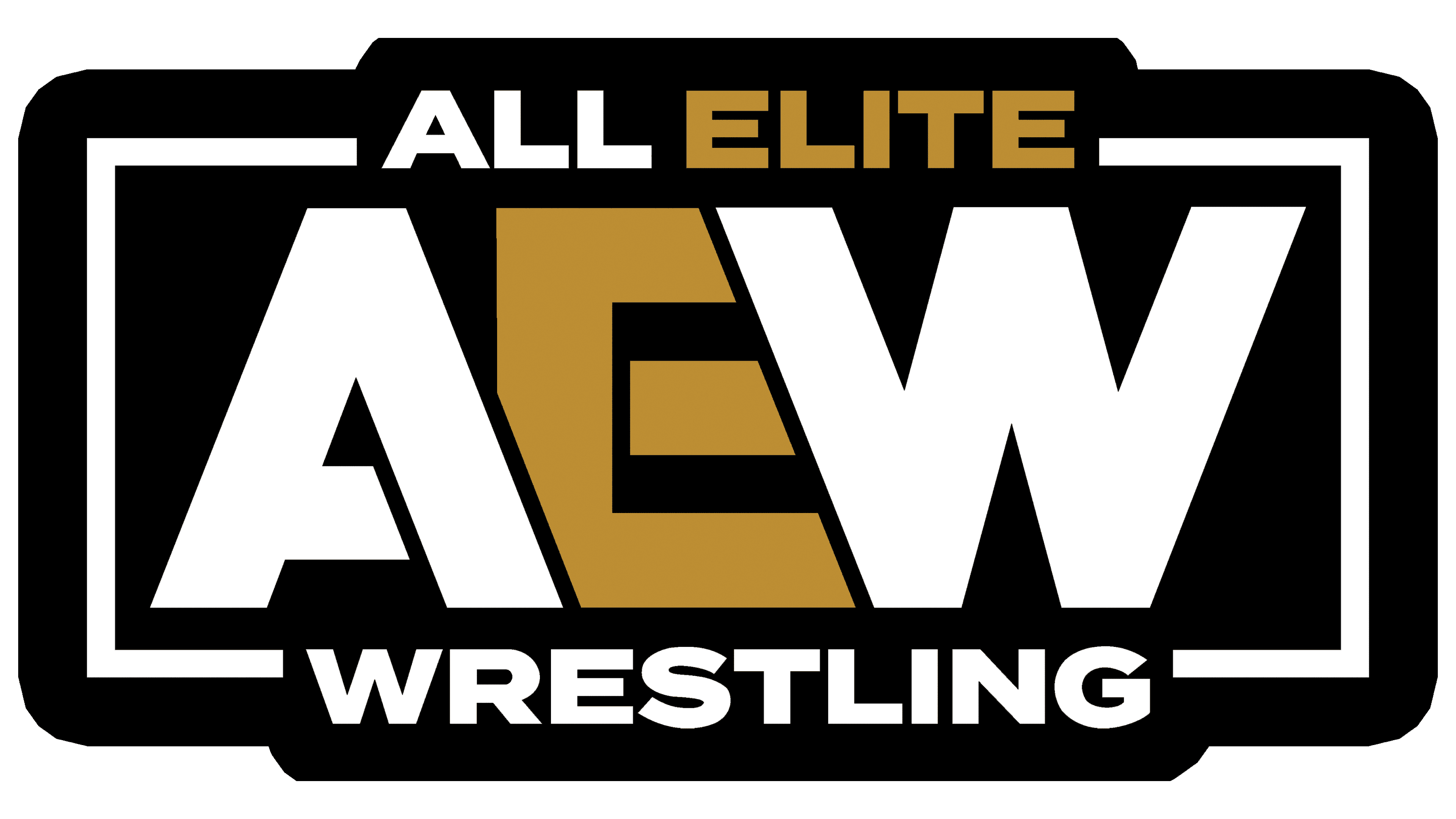
2024 – today
![]()
The new logo has become more minimalist and focused. Unlike the previous version, the frame has been removed, with “ALL ELITE” at the top and “WRESTLING” at the bottom. Now, attention is focused on the large “AEW” abbreviation, which fills the entire space.
The letters remain bold, white, and sharply angled. The gold gradient inside the “E” has been retained, adding a metallic effect. The black background enhances the contrast between the white letters and the gold element.
While the previous version had a bulkier design with frames and additional text, this version appears simpler yet maintains the same character.
Font and Colors
Primary colors: black, white, and gold.
- Black dominates the composition, creating a sense of danger, mortal combat, and male energy. It is the prototype of the wrestling hall.
- White is a perfect contrast with black. It indicates the company’s youth and shows its search for young talent.
- Gold demonstrates elite sports entertainment, which shows that the agency is the best. With its help, young athletes achieve great popularity, fame, and high income.
The contrast of black and white is a prototype of the struggle between good and evil. All the characters on the stage represent one side. Most wrestling scenarios are based on the confrontation between positive and negative heroes. At the same time, gold is a victory for the best and a reward for them.
The inscription font is similar to Leon Heavy.