The Air France Hop logo combines minimalism and communicative design. It is a microcosm of the airline’s reputation for efficiency and innovation. It appeals to an audience that values reliable service and a hassle-free experience.
Air France Hop: Brand overview
Air France Hop, initially called HOP!, is Air France’s way of improving regional flights. The story begins in 2013 when Air France combined three smaller airlines into HOP! to better compete and manage its flights in France and Europe. In its first year, HOP! started flying over 100 routes with planes designed for short trips.
By 2015, as part of Air France-KLM, HOP! got more integrated into Air France, updating its planes and looking to match Air France’s style. A year later, it introduced new designs for its planes and uniforms, showing its close connection to Air France.
The airline kept improving its flights and services, making connecting through major Air France hubs easier for passengers. In 2019, it changed its name to Air France Hop, making its link to the national airline clearer and highlighting its role in French and European air travel.
Air France Hop is important to regional flying, helping passengers connect to larger Air France flights. But, like the rest of the aviation industry, it faces uncertainty about the future, depending on how quickly air travel can bounce back.
Meaning and History
What is Air France Hop?
Air France Hop, formerly known as HOP!, is a French regional airline. The airline operates numerous flights under the umbrella of its parent company, Air France, thereby expanding the French flag carrier’s reach into regional markets. Since its inception, the airline has been committed to providing seamless service within France and neighboring countries.
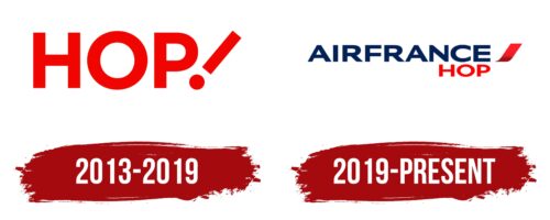
2013 – 2019
Air Corsica’s logos tell the story of an airline that has been at the heart of the Mediterranean since 1989. It aimed to connect Corsica’s beauty with the broader world when it started. Over time, its logo changed, reflecting Corsica’s culture and the airline’s growth.
The original logo featured the “Moor’s Head,” a symbol of Corsica, showing the airline’s deep connection to its heritage. Even as Air Corsica updated its logos, this symbol remained, highlighting tradition and the evolving world of flight.
Each logo redesign represented growth, and a nod to modernity, yet the essence of Corsica stayed intact. Changes in design, fleet updates, and new routes influenced the logos, incorporating clean lines, bold fonts, and shades of blue that recall the sea and sky.
Today, Air Corsica’s logo symbolizes its evolution from a local service to a major airline. It invites people to be part of its ongoing story, connecting Corsica with the wider world through every flight.
2019 – today
The Air France Hop logo is simple and practical, with an easy design on the eyes. It combines text and images in a way that feels clean and minimalist, perfectly capturing the airline’s aim for easy and stylish flights.
A unique part of the logo stands out – an icon on the right that looks like a red stripe going diagonally. It has a light gradient, making it look dynamic and moving. This icon is shaped like a slanted rectangle, which makes the logo look like it’s in motion, suggesting that Air France Hop is all about fast and efficient service. The icon ends in a point on one side, pointing the way forward, while the other end is rounded, making the whole logo feel friendly and welcoming.
On the left side of the logo, there’s a neat, two-level text with the brand’s name in bold, easy-to-read letters without any fancy details. This makes the logo look modern and straightforward, showing that Air France Hop’s flights are for everyone.
Font and Colors
The Air France Hop logo is simple. It uses a plain, modern sans-serif font that’s easy to read even from far away. The design is clean, with letters of the same thickness and no extra details. This simple style shows that the airline cares about being clear and efficient.
The logo has two main colors. The name “AIRFRANCE” is dark blue, representing trust and dependability. This blue is like the sky at dusk and reminds people of the airline’s long history and importance in France.
On the other hand, “HOP” is bright red, a color full of life and energy. It catches your eye and shows that Air France Hop is about getting things done quickly and well. The red slash after “HOP” looks like it’s pointing forward, which makes you think of moving ahead and making progress.
The logo’s simple letters and mix of blue and red show that Air France Hop is a reliable airline excited about the future.
FAQ
What is the symbol of Air France?
Air France’s symbol is a special seahorse logo from an earlier airline, Air Orient. This logo, known as the “hippocampe ailé” or “winged seahorse,” mixes the image of a seahorse with wings. It represents the airline’s ability to fly overseas and in the skies. Interestingly, Air France staff have a fun nickname for this logo: “la crevette” or “the shrimp.” This shows how much the employees love and feel connected to their airline’s symbol.
The seahorse logo was kept when Air France was created by combining several airlines, including Air Orient. This was a way to honor Air Orient’s legacy and the important routes it established.
What is the horse in the Air France logo?
The horse in the Air France logo is special. It’s a mythical creature recognized around the world. Known as the winged seahorse, the logo blends two mythical elements. The head is from Pegasus, and the horse is from Greek mythology. Pegasus stands for strength, freedom, and creativity, often associated with wisdom and artistic inspiration.
The tail draws from Annam’s dragon, which is significant to Vietnam’s royal family. In Vietnamese culture, dragons symbolize power, nobility, and good fortune, acting as guardians linked to rain, which is vital for agriculture. This reflects a respect for Vietnam’s culture and history. The winged seahorse symbolizes the unity of different cultures, histories, and myths, positioning Air France as a connector between nations.
What does Air France hop mean?
Air France Hop, previously called HOP!, is Air France’s wing for shorter regional flights. It connects small towns to bigger cities, working like a bridge to the wider Air France network. The airline started on December 21, 2012, after Air France merged three smaller airlines: Airlinair, Brit Air, and Régional.
By combining these three companies, Air France Hop got a mix of planes and routes that covered a big part of France and some areas outside it. This was all about reaching more places, including those that are hard to get to, and making sure everyone has a chance to connect to Air France’s larger network.
What happened to Air France hop?
Air France Hop, which started in 2013 as HOP!, has seen a lot of changes over the years. It was the part of Air France that handled shorter regional flights, helping connect smaller places with bigger airports. This setup made it easier for people to tap into Air France-KLM’s wider network. HOP! was created to make Air France’s regional services better and more recognizable.
But in 2020, Air France decided to merge with HOP! right into itself. This big change made things simpler and more efficient inside the Air France-KLM group. So, the HOP! the name would go away, and everything about HOP! — its planes, routes, and operations — would become part of Air France. The goal was to offer smoother, more connected services to passengers under the well-known Air France brand, especially for those shorter flights. This move shows Air France’s effort to keep up with the aviation world’s ever-changing nature, making sure they stay efficient and meet their customers’ needs.


