The Air Holland logo symbolizes the airline’s dedication to connecting the Netherlands to the world and reflects the country’s historical spirit of exploration. It represents the company’s role in the aviation industry, highlighting the efficient and friendly service synonymous with Dutch culture.
Air Holland: Brand overview
In the 1980s, Air Holland, a small Dutch charter airline, started operations. Founded by entrepreneur John Block in 1984, it started with two Boeing 757-200 planes leased from Braniff. The goal was to connect Dutch tourists with popular Mediterranean destinations and beyond.
Starting with promise, Air Holland added a third Boeing 757-200 by 1986, reaching new places like the Canary Islands, Scandinavia, and Austrian ski resorts. This growth showed the airline’s aim to make the world more accessible to Dutch travelers. By 1987, with another Boeing added, it became the top charter operator of this model in Europe.
1988 was a highlight for Air Holland, flying a record 800,000 passengers. It looked like a success from the outside. Yet, financial troubles were brewing due to high costs and fuel price changes. These issues led to bankruptcy in 1990, making Air Holland one of the first in a series of European airline failures caused by economic challenges and market issues.
Air Holland’s impact goes beyond its operational years. It pioneered using the Boeing 757 for charters, setting new service standards. Many former employees went on to contribute to the Dutch tourism industry.
Air Holland’s story is a reminder of the aviation industry’s ups and downs. It’s about ambition, growth, and learning from financial challenges. Even though it didn’t last long, Air Holland made a lasting impact on Dutch aviation, showing the value of innovation and connecting people across the globe.
Meaning and History
Air Holland’s logo has been a key part of its identity in the airline industry, evolving alongside the company’s growth and the global aviation market’s shifts. From the start, the logo symbolized trust, innovation, and quality, drawing from the Netherlands’ heritage and the airline’s ambition. This helped Air Holland stand out in a competitive field.
Over time, changes in the logo reflected Air Holland’s reactions to new trends, customer needs, and its changes. Moving towards a simpler, more modern design showed the airline’s focus on staying current and efficient. The colors and designs of the logos always paid homage to the Dutch roots, emphasizing the airline’s connection to its home country.
What is Air Holland?
Air Holland started in 1984, hoping to make its mark in the busy world of airlines. John Block, the entrepreneur behind it, faced tough challenges, including money problems and tough competition. The airline worked hard to grow and attract passengers, but it had difficulty becoming stable and making money. In 2004, it had to stop flying, but it left behind important lessons about competition and staying strong in a tough market.
1984 – 1990s
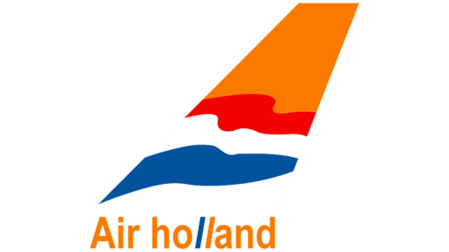
From 1984 to the 1990s, Air Holland’s first logo featured an airplane’s tail fin, clearly showing it was an airline. The logo used bright colors tied to the Netherlands, connecting the airline to its national roots.
Orange was a key color in the logo; it’s important to the Dutch. It represents the House of Orange and the country’s fight for independence from pain. The logo used a shade of orange that suggested warmth and national pride, especially on the tail fin and the text.
The logo also showed the Dutch flag’s colors on the tail fin, making it look like it fluttered in the wind. This added motion to the logo and showcased the Netherlands’ national colors.
The orange in the logo also brings to mind the sun, offering warmth and welcome on Air Holland’s flights. It hints at success and a bright future for the airline.
In the logo’s text, two ‘l’s lean to the right, different from the other letters. This small detail might suggest the many stories and experiences Air Holland carries. The use of orange and blue colors represents the sky and the sun, creating a feeling of calm and brightness around the airline.
1990s – 2004
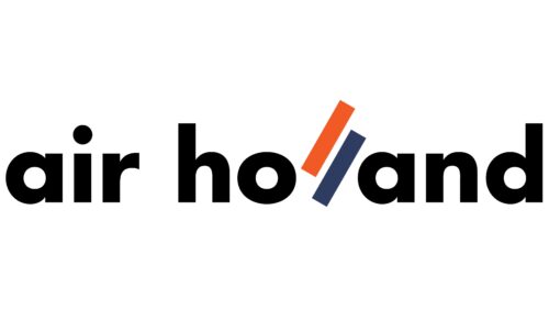
The Air Holland logo stands out with its unique touch of two “l”s, colored orange and dark blue, placed diagonally. This design turns ordinary black text into something special. The orange “l” brings to mind the sun and the dark blue sky, adding meaningful colors beyond just looking good. They symbolize what Air Holland is all about, flying through vast skies to sunny places.
The logo uses lowercase letters for a friendly and modern vibe. Except for the special “l”s, the text is in a font similar to Trenda Black by Latinotype, giving it a clean and up-to-date look. This mix of a unique element with consistent lettering creates a perfect balance, making the logo memorable and showing Air Holland’s dedication to making flying a bright and expansive experience.
Font and Colors
The logo uses a bold, modern, sans-serif font. Each letter is capitalized, making the logo strong and clear. The font’s clean lines and even thickness make it look modern and efficient.
The abstract letter L features two main colors: bright orange, dark blue, and black. These colors likely were chosen for their strong contrast and the elements they represent. Orange is vibrant, symbolizing energy and creativity, and it’s often linked to the national color of the Netherlands, reflecting the airline’s heritage. Dark blue represents professionalism, reliability, and trust—qualities important for an airline. This color choice hints at the sky, aligning with the company’s aviation focus.
Overall, the logo’s design, through its color and font choice, conveys confidence, modernity, and a connection to the Netherlands.
FAQ
Where is Airline Holland from?
Air Holland was an airline from the Netherlands. It stood out for flying people and goods to places in Africa, Asia, and the Mediterranean. The airline was good at changing its services to meet the needs of passengers and businesses. Besides flying, Air Holland also rented out planes to other airlines, with or without the crew and everything else needed for the flight.
But, like many airlines, Air Holland had its tough times and had to shut down on March 25, 2004. It couldn’t overcome its challenges despite trying hard to keep going in a tough industry.
Air Holland’s main office was in Oude Meer, near Haarlemmermeer, where Schiphol Airport is located, one of the busiest airports in Europe. This shows how important Air Holland was in Dutch aviation. The airline played a big role in connecting different places worldwide until it stopped flying.


